Article by: Judy Polan
I realized a few years ago that our upstairs bathroom — with its leaky tiles, rusty faucets and crumbling walls — was due for a major rehab. I still loved its retro seafoam-green bathtub and sink, and its champagne-bubbly black and white wallpaper, so I wanted to hold on to those features and design around them. The room lent itself to an art deco treatment, and I knew that the aesthetic would make it chic at minimal cost.
There’s just something about art deco — the exuberant decorative style that had its heyday in the period between the two world wars — that has beguiled the public for nearly a century. Perfectly suited to both grand communal spaces (think Radio City Music Hall and the Chrysler Building) and intimate home interiors, it has never really fallen from fashion since its introduction at Paris’ Exposition des Arts Décoratifs in 1925. Since then art deco’s signature parallel lines and repeated geometric motifs have been incorporated into vacuum cleaners and ocean liners, toasters and martini shakers. The style exudes an urban, industrial essence, as well as a sense of optimism and fun.
Here are some art deco bathrooms that inspired me and a couple of photos of our new bathroom. I hope they inspire you.
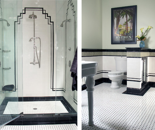
With its jazzy tile pattern, classic black and white color scheme, and streamlined, linear look, this bathroom projects the art deco sensibility in spades. The ziggurat pattern in the tiling evokes the image of a skyscraper; it’s a popular deco look. It’s based on an ancient Mesopotamian design. (Egyptian motifs were popular during the King Tut craze of the 1920s.)
This bathroom exudes the self-confidence and futurism of the art deco age. This flamboyant fan-shaped mirror would look great in a larger space (such as the ladies’ room at Radio City Music Hall), but the simple white sink and black accessories (as well as the shower’s relatively restrained tile pattern) manage to tone down the energy level.
As people began to speed across the ocean in airliners and across the continent in locomotives, design became filled with allusions to transportation. The parallel vertical lines on this vanity base recall a rocket preparing for liftoff and express the style’s sense of speeding headlong into the future. The broad curving line of the top evokes ocean liner furniture and gracefully avoids sharp edges that would detract from the desired sleekness.
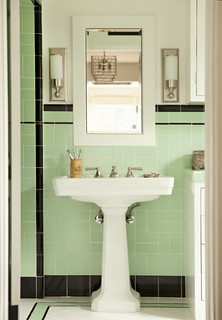
This bathroom has the whole art deco package, with its classic color combo of black, white and seafoam green; creative linear touches in black; and elegant glass and chrome wall sconces. The vertical-horizontal dynamic is enhanced by the placement of the green wall tiles, which alternate between horizontal and vertical pairs.
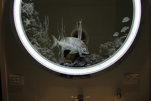
Cleverly incorporating the nautical look that is a hallmark of art deco design, this recently made piece functions as both a light and a mirror. Circular windows have always evoked the portholes on ocean liners, and this one even comes with a fish.
A shiny black vanity top rests on a sturdy chrome base against a backdrop of black and white ceramic floor tiles and glass light fixtures, evoking the high-gloss aura of art deco. The wallpaper’s pattern of powder-gray lines (reflected in the mirror) echoes the open vertical spaces in the light fixtures, providing a clever softening touch.
This bathroom is a little more restrained than the usual art deco confection, but it still includes the basic elements. The chrome towel rack at the foot of the tub is a nice touch, while the suspended shower curtain ring and elongated shower stem give the room the illusion of greater verticality.
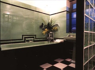
Cleopatra would have loved this elegant black, white and apple-green bathroom, with its ziggurat motif and touch of Nile-blue glass. The gleaming walls are made of Vitrolite, a lustrous structural glass that was very popular in the 1930s. You could get a similar look today with back-painted glass tile.
This is a corner of our new bathroom. We redid the wall in period-appropriate (and easy-care) subway tiles, with a horizontal line of green glass tiles on the shower wall and a vertical black line that’s out of view. A green glass shelf (with rounded corners) and chrome plumbing fixtures complete the look — although we’re still searching for a circular, black-framed mirror that will fit in the small space above the sink.
We treated ourselves to an accent panel depicting Charles Rennie Mackintosh’s popular Glasgow rose. We’ve incorporated Glasgow roses into other places in our house; we like the idea of repeating favorite motifs from room to room. Mackintosh’s visionary design work — most of it executed during the era of Victorian fussiness — is often considered a foundation of art deco.


