11 Ways to Update Your Kitchen Without a Sledgehammer
 Wednesday, January 29, 2014 at 9:08AM
 OK, so you have a perfectly good kitchen. The layout works; the cabinetry is solid; but it just needs a little uplift. There are plenty of relatively minor changes you can make that don’t involve restructuring your life and house. Here are a few.
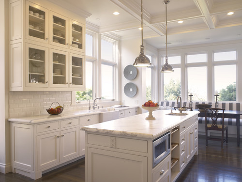
1. Repaint your cabinets. A fresh coat of paint can transform a kitchen from dark and dingy to light and airy. If you are a few years away from that big kitchen reno, this is a great time to have some fun with color.
2. Upgrade your countertop. Upgrading a dated countertop will give new life to your entire kitchen and add value.
3. Install a new backsplash. If your cabinetry and countertop work nicely but your room lacks pizzazz, a new backsplash can add lots of personality and really dress up a kitchen. A bit of texture, sparkle or gloss will give simple cabinetry a lot of presence.
4. Make a statement. New jewelry always picks up my mood. It can do wonders for your kitchen too. New hardware can dress up plain cabinets, while standout lighting fixtures can add a surprising wow factor.
5. Change your faucet. A detachable hose with a hand spray comes in handy for so much more than just giving a bath to the cat. I prefer a faucet with a flexible braided water-supply hose. It looks better than a plain black rubber hose and will last longer.
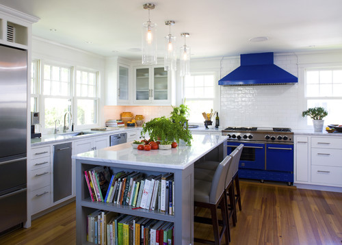
6. Expand your horizons. Need more surface area? Don’t think you need to start from scratch. If you have an island, you can introduce a different material on an added eating counter either below or above the counter.
The standard counter height is 36 inches. A nice option, like you see here, is to add an extension at table height (30 inches is typical). The great thing about adding a table-height extension is that regular kitchen and dining chairs will pull up to the counter comfortably. If you prefer a higher surface, you could go with bar height (40 to 42 inches).
7. Consider refacing. New cabinet fronts and doors can dress up the cabinetry boxes if the layout already works and they are solid.
8. Rethink the uppers. Open shelving offers an opportunity to display collections or just keep frequently used items accessible. Wine comes to mind, but that’s just me.
9. Add some cozy touches. A runner is a great addition to a galley kitchen. I don’t know why we are disciplined to treat our kitchen like it has a different set of rules when it comes to decor. I’m all for adding a table lamp for an unexpected element in a kitchen.
10. Add a floating island. If a new bank of cabinetry is beyond the budget, try a ready-made freestanding piece to add extra storage and a surface for working and eating surface.
Add a new top to a freestanding piece of furniture and extend the edge for an eating counter. The minimum overhang would be 10 to 12 inches, but there are a few considerations when extending the top. Take care not to shift the balance of weight so much that the piece is unstable (people love to rest their elbows, adding weight to the surface). Also you may need to add brackets to support the overhang.
11. Add a showstopper. A simple kitchen with simple cabinetry is downplayed by a showpiece range. Playing up one feature is a great way to detract from less interesting elements.


Reader Comments