twitter Facebook Google+

                 linkedin pinterest houzz  

Click for the BBB Business Review of this Countertops in Denver CO 

Google Review 

Sales & Promotions!

Architects, interior designers, and more ∨

Hire a decorator to find that just-right couch and coffee tables for your living room.
Find wall shelves, a customizable closet organizer and stylish furniture for home to whip your closet into shape.
Remodeling and Home Design

Qualify Us Now! ProView 

Cambria logoUp to $45,000 interest free for your project!Finance by Cambria

 convenient and easy.

  • No Money Down
  • Interest-free financing for up to one year without payments
  • Financing up to $45K for any project that includes Cambria (including cabinets, flooring, sinks, plumbing, install & more)
  • Secure paperless telephone application
  • Credit decision in less than 10 minutes


Entries in Design Trends (6)

Tuesday
Feb112014

10 Design Tips Learned From the Worst Advice Ever

Article by:

Bad advice is like a stomach flu in a small home. Sooner or later, everyone gets it. But when it comes to bad home design advice, unfortunately it’s not just a 48-hour ordeal — it can drag through a lifetime. 

Don’t get me wrong. It’s hard not to listen to your best friend, mother or uncle telling you what’s best for you and your home. Sometimes, though, you just have to take that advice in stride, kindly say, “Thank you” and then go with your gut. 

We asked Houzzers what was the worst home advice they’d ever been given and, ironically, a lot of great advice got unearthed. The most important takeaway? “Whatever the worst advice we’ve been given, kudos to all who said no.” 

1. Learn two valuable words: “Um, no.” When someone suggests something to you, you might find that what you really mean to respond gets buried in formality and politeness. “Well, that’s a good suggestion. I see your point; I guess I could consider painting my fireplace, but let’s hold off on that for a little bit …” 

Sometimes what you really need to say is flat-out, “Um, no. I don’t want that.” 


When a house inspector suggested to badlelly, “Sure, the parquet floors are in great condition, but if I were you, I’d replace them all with some nice laminate,” the response was simple: “Uh, no.”

Suedee spoke a couple of choice words when a builder’s consultant said there was no need to add insulation to the interior walls for sound absorption, even for the wall between the main bathroom and the family room: “Um, awkward.”


2. You definitely don’t have to listen to loved ones. Just like you have to find the strength to be curt, mastering the art of rejecting advice from the people you care about is key. Watch how it’s done. 

“Hi, Mom! Good to hear from you. What’s that? I should install blue carpet like we had in our kids’ rooms growing up? Ha! That’s a great idea. We could pretend it’s shark-filled water in the living room when guests are over. I’ll keep that in mind. Anyway, I’ve got to go. Thanks for the suggestion. Love you! Bye.” 

See how easy that is? The last thing you want is to be stuck with something you hate just because you wanted to please somebody else. 

Take it from marthafish: “When house shopping, most of the houses I liked were near busy roads. The Realtor and my husband convinced me that I would get used to it and it wouldn’t bother me. And according to the Realtor, I wouldn’t hear it inside my house. Wrong! It drives me crazy. I can’t sit outside. New windows are on my list of home improvements.”

I’m sure indianpatti’s mom had the best intention when she phoned up to “express her extreme dislike for the drapes in my home. ‘Y
ou should get the European lace curtains like I have.’ OMG! Our home is modern. Lacy curtains? LOL!” writes indianpatti.

Jdingles learned the hard way. “Back in the ’80s, I had a gorgeous red velvet high-back chair. My friend said she hated it and that I should give it away. I did. Months later my chair was on the cover of an interior design magazine. The new owner described it exactly as mine and got it from my local goodwill for $10! She designed her entire room around the chair — just as I had imagined.”
 

3. In fact, you don’t have to listen to anybody at all. There will always be people around who want to offer their two cents. By all means listen and take the idea into consideration, but don’t be afraid to employ the “Um, no” strategy (see point No. 1). 

“An investor friend told us not to buy the home we were considering,” says LB Interiors.” It needed work, and most people could not see beyond what was not there. I saw its potential. We were young and were starting out with our first home. Wrong advice, as we live in one of the best areas and, with being artsy and creative, have made many worthy changes over the years. It was a great decision.”

A Realtor told jae_57 to list the house “at $40,000 less than what we wanted because the 180-degree view of the Sierra Nevada mountains wasn’t that big a deal. We didn’t do it. Sold in a matter of weeks for above asking.”
 

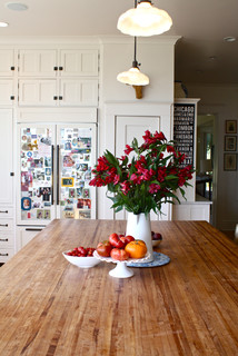
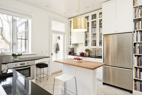
4. Pssst: You don’t have to like granite. No, really. You don’t. I swear. Do your own research on materials. You might find that quartz or butcher block (shown here) works best for your living needs. 

“I was told I must get granite counters,” says 
Darzy. “No, I don’t. I love the uniformity and no maintenance of quartz.”

Closet Classics of Andover says the worst advice received was to “get black granite countertops. They are so hard to keep up with and keep looking clean. Even the slightest fingerprint or smudge shows up. I wouldn’t do it again.”

Spurfnickety also deflected the peer pressure about granite countertops and was happy to do so. “I have always loved soapstone. We installed soapstone and after seven years have absolutely no regrets.”


5. Newer isn’t always better. There will always be someone tempting you to rip up, pull out and replace with something newer and shinier. Trends come and go, but the past always has great character. Look at what you have, how it’s aged and how it has held up. You might find that what you have is the best you can get. 

Bungalowmo knows this firsthand. “Worst advice: ‘You should rip out those old drafty windows and put in vinyl.’ Anyone who knows me knows what I did with that advice. And yes, I jiggled the handle afterwards.”


6. Don’t take the first no as your answer. There may be times when you’re told what you’re asking for just isn’t possible. But you might just have a contractor who doesn’t know how to do what you want, and instead of admitting this, will try to steer you in a different direction. In this day and age, almost anything can be done with the right professional and for the right price. 

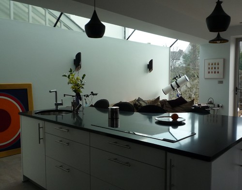
Luciana stuck with her dream and ended up with the kitchen she wanted (shown here). “The kitchen seller told me I couldn’t have a grand-piano shape for the island because most people like straight lines,” Luciana writes. “I couldn’t understand why he kept on refusing to even show me how it would look. I realized he actually didn’t know how to use his software to draw free lines. He only knew how to design a kitchen using the standard cabinets/appliances featured by his computer program. Luckily for us, a more computer-savvy colleague of his heard me insisting, realized the problem and showed him what to do.”
 

7. Never, ever let anyone touch that. Whether it’s a great view, an old floor with character or an architectural wonder, don’t let anyone talk you into taking away what you love most about your home. 

ASVInteriors’ home has gorgeous views of a lake and mountains, but an architect suggested covering them up. “We detailed our plans carefully. He returned proudly with a plan that would have put up 2-meter by 3-meter glass panels in green, white and blue all around the sides and front of the house to effectively pen us in. That went nowhere,” ASVInteriors writes.

Take it from S. Thomas Kutch, too: “The worst advice ever was a kitchen remodel in a beautiful Craftsman-style cottage. The owners had contracted me to design and manage the construction. The finish carpenter they had brought on wanted to distress all the clear fir Craftsman woodwork in the house with a blowtorch to give it more ‘character.’ Hey, I was kind. I made sure he only hit his head once on the granite front steps as he tumbled down them.”
 

8. Guess what? You may be able to leave that tree just where it is. Why do people hate trees so much? Linda was told hers was too close to the foundation. “The tree was probably a hundred years old when the house was built, and that was 83 years ago,” she writes. “I am not about to cut down a healthy tree just because it has huge leaves that have to be raked. Not to mention the thousands of dollars needed to remove the tree and the thousands to add central A/C to replace the value of a permanently shaded roof.”

Donnamay53’s husband insisted they remove the Japanese maple tree in the back because it was blocking the view to the backyard. She convinced him otherwise, and last year a family of birds moved in and nested there for a few weeks (shown). “Are we glad we kept the tree?” she says. “You bet!”

Fondag wasn’t so fortunate. “I was told to sprinkle weed blast around the edge of our new fence. The very next day, the leaves began to fall off our beautiful silver maple tree, and within a week it was dead,” Fondag writes. “I was just sick. And by the way, it didn’t kill the weeds.”
 

9. Don’t you dare skimp on paint. It’s no secret that a fresh coat of paint is a rather inexpensive way to make a space look great. That’s why it’s not wise to skimp on it. 

Just ask Erin. A paint store employee convinced her to go with a cheaper paint. “Terrible advice!” she says. “The paint was horrible, and I was stuck with it because I already started using it. Never get cheap paint! Never!”
 

10. Don’t think bigger is always better. You might think more space will solve all your clutter problems, but you might find that you’ll just fill more room with more junk. You might want to reconsider your lifestyle before you jump at the chance to upsize. 

For example, Amber was told she could never have enough bedrooms. If a three-bedroom house is good, then four, five or six must be amazing, right? “Yeah, I have used the extra rooms as guest rooms, sewing rooms, even a train room, but they end up as junk rooms!” she exclaims. “That extra box spring or old mattress? Broken chair that I should have thrown away? The boxes or art I am not currently using? They all go into those useless rooms that I pay to heat and cool. Now I’m moving into a three-bedroom. It’s just what we need, but I have a lot of junk to get rid of.”

Wednesday
Aug072013

6 Lessons in Scale From Well-Designed Bathrooms

Article By: Sarah Burke

How we mix objects of different sizes, masses, proportions and patterns — in other words, how we work with scale — is a big part of good design. Architects and designers use scale to create interest and balance, and taking it into account leads to good design in even the smallest rooms of a house. To see what I mean, take a look at the lessons in scale from these six bathrooms.

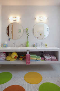
1. Use similar shapes in different sizes. Using similar shapes — rectangles and squares or circles and hexagons, for example — in different sizes can add interest and subtly draw the eye around the space. 

Unlike most bathrooms, where rectangular and square tiles have a significant presence, this bathroom has round elements — hexagonal tiles, round mirrors and round floor mats — that create an environment that is both fun and minimalist. 

The white hexagonal tiles on the walls, floors and bathroom vanity make the space feel large and bright.


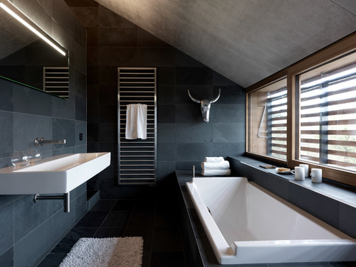
2. Play with one main material. Choosing one main material for your bathroom's palette will help harmonize the elements, creating a visual flow that's easy on the eyes. 

Here's an obvious example of how using one main material produces a calm feeling. The large 12-by-24 tile reduces the amount of grout lines, adding to this bathroom's expansive feel. And the simplicity of one material allows the art in the room — the silver steer head — to have a real presence.

3. Vary the sizes and shapes of materials and furnishings. Transitioning between sizes of furniture and materials connects various parts of the space in a different way. 

There are many good examples of scale in this classic bathroom. There is a nice transition in scale from floor to ceiling, with the small basket weave tiles on the floor, the medium subway tiles for the wainscoting and the large drywall that leads to the ceiling. 

The leaded window design relates in pattern and proportion to the basket weave floor tile. And because the ceilings are quite high, I love this tall wooden chest next to the cast iron tub. It helps connect the space from floor to ceiling.


4. Create collections.Using grouped items in the same scale adds rhythm and variety to designs.Don't overlook the relationship between wall sconces and the vanity in the bathroom. 

Because this vanity's mirror is as wide as the vanity, the lighting above the mirror needed to span the same width. Instead of adding one large horizontal light fixture, this designer used a collection of three sconces above the mirror, creating a nice rhythm and tapping into the power of three.


5. When working with one material, use it in different sizes. The floor and window-wall planks in this wonderful barn bathroom are one size, the vanity-wall planks are narrower, and the ceiling planks between the rafters are yet another size. 

Using the same material in various sizes — one way of working with scale — made this bathroom simply beautiful.


6. Use contrasting shapes. Sometimes the use of the same shape can create harmony in a space, and sometimes the use of different shapes can create a contrast that works. 

In this creative bathroom, small white floor tiles contrast nicely with 4-by-4 glossy black ceramic wall tiles. The black and white palette allows the wall mural to make its statement

Wednesday
Jul242013

Open vs. Closed Kitchens - Which Style Works Best for You?

Article By: Vanessa Brunner

For centuries the kitchen was strictly a workspace. Often tucked in the back of the house, it had room for just the bare essentials. But a peek at many new kitchens today reveals a very different approach: the open-concept kitchen at the heart of the home. 

"The kitchen was really a closed-off spot for a long time," says John Petrie, president-elect of theNational Kitchen & Bath Association. "Now people want the kitchen to be an active part of the family home." Although open-concept kitchens are by far the more popular choice today, some homeowners are embracing elements of the past — namely a separate, more closed-off layout. Could we be shifting back to the kitchens of yesteryear? 

We asked three kitchen experts for their thoughts on the two kitchen styles, and how you can decide which one is right for you. 

How the Walls Came Down

Twenty years ago the term "cocooning" arose in the home design world. Home life shifted as people spent more time at home. "Home was a safe place, a refuge and where you wanted to be," says Petrie.

The desire for a cocoon fueled the open-concept kitchen, allowing homeowners to spend more time with family and friends while cooking and cleaning. "It also showcased a shift to a more casual lifestyle," says Andrea Dixon of Fiddlehead Design Group. "People weren't afraid to expose reality — i.e., a messy kitchen." 

"When the walls came down, the kitchen became an integral part of the home," says Petrie. Kitchens soon became the center of the house — the room that everything else revolved around. 

Today this layout has become the go-to kitchen style, particularly for families. The combined layout allows for optimum multitasking — parents can prepare dinner, watch the news and help with homework at the same time. "I'm a huge open-concept-kitchen fan," says Anthony Carrino of Brunelleschi Construction. "I find that the benefits far outweigh those of throwing the kitchen into another room. Ninety-nine percent of our clients ask for an open-concept kitchen." 

The Case for a Closed Kitchen

The kitchen is already the most expensive room in the house to remodel, and turning a closed kitchen into an open plan can add to the cost. Tearing down walls means dealing with plumbing, electrical and structural work on a huge scale. Sometimes the added expense means compromising in other areas. 

For homeowners who'd rather invest in other parts of their kitchen — appliances, materials or cabinetry — reworking the layout may not be worth it. "You have to think about what's best for you," says Petrie. When it comes to allocating your kitchen budget, which is more important, he asks, "an efficient, functional kitchen with better appliances? Or an open layout that connects to the rest of your home?"
 

While most of Dixon's clients ask for open-concept kitchens, some prefer a closed-off space. "There will always be some people who are uncomfortable with letting guests see their 'unmentionables,'" she says. "It's definitely a more formal layout, but it ultimately comes down to personal preference." 

If you want to leave your smells and mess behind when serving meals, a closed layout could be for you.
"You can get creative with a closed kitchen, too," says Carrino. If space allows, a small booth, fold-down table or rolling bar can make a closed kitchen more of a social space.
Cons of a Closed Layout
Of course, a closed-off kitchen's isolation also can be its main downfall. This layout doesn't allow for direct access from the kitchen to the dining table, or vice versa. And it's difficult to interact with friends and family while whipping up meals, since most of the room is reserved for the work triangle.
Choosing What's Right for You
There's no set formula that can tell you which kitchen layout will work better in your home. Part of having a conversation with a designer is trying to figure out what's best for you. Start with a list of needs and wants, and go from there. "You've got to consider the way you live in your home and the way you use your home," says Carrino. "How do you use your kitchen? How do you foresee using your new kitchen?"
Everyone's needs are different, so don't let yourself sway with trends. "A family with kids that need supervision might decide to do an open-concept plan with a large multifunctional island," says Dixon. "But a couple who loves to entertain might opt for a closed-concept space so they can prep courses ahead of time and not spoil the surprise. It totally depends on your lifestyle."  


Wednesday
Apr242013

Three Emerging Global Design Themes

How will fashion, architecture, materials and culture influence the future of design? The Formica Group design team shares its unique perspective in the new 2013 Trend Vision Report. The report outlines three major themes: PURITY, NUTOPIA and CLASH - and highlights the related trends. Here's an excerpt ...

THEME 1 | PURITY

PURITY is an über-modern style that ties together technology with the soft and feminine. Biomorphic shapes are digitized and bring about a new aesthetic language. Light-infused, filtered colors complement clean and pure textures. White is central along with translucent of pale pastels that blend seamlessly with intense dark bases of spruce, sweet violet and mocha and vibrant neon accents of coral, hot pink, absinthe and turquoise. Synthetics are authentic and elegantly shiny surfaces create futuristic interiors. 

Photo Credit: Formica Blog | Share the Love

Photo Credit: Formica Blog | Share the Love

Purity Key Terms: serenity | feminine | soft tech | futuristic | translucency | biomorphic shapes | simplicity | light | the white story | prismatic | color gradients

THEME 2 | NUTOPIA

NUTOPIA emerges from the chaos of the new world and the resulting desire to maintain balance and serenity by going off-grid mentally and physically. Good quality products will be key; luxurious materials must endure. Craftsmanship, artisanal processes and blended materials will be important, as will environments in warm colors, prints and styling. 

Urban farming and gardening are key inspirations for a host of new environmental greens and earth tones. There is a certain nostalgic feel with sun-bleached colors and ash roses. Mustard seed evolves, championed by brighter shades of melon. Lowlights of prune, navy and olive provide contrast and newness. Wood, preferably reclaimed, is the essential material.

Photo Credit: Formica Blog | Share the LovePhoto Credit: Formica Blog | Share the Love

NUTOPIA KEY TERMS: slow - artisanal processes | the hand-made | complex crafts meet simplified aesthetics | preserving local knowledge and traditions | get rid of excess stuff | primitive - archaic aesthetic | a touch of vintage | upcycling | urban farming | deceleration | living off-grid | slow food | preserving the heritage

THEME 3 | CLASH

CLASH is the most provocative of the three trends. It deals with growing urbanization, participation by the people and frustration with politics, education, housing or jobs. Reflecting today's harsh realities, communities will be formed by cultural magpies that pick and choose from the multi-cultural societies in which they live.

A new generation is seduced by rebel aesthetics. The base palette for CLASH is grays (think concrete and asphalt, oxidized or corrugated metal), accompanied by very vibrant colors and patterns from the spectrum palette to intensive orange and yellow. Yellows and mints are essential for the coming year. Blue stays prominent, especially in fashion. Geranium and hunter green are important to manipulate harmonies. While the palette shown is quite pretty, CLASH is all about disharmonious combination.

Photo Credit: Formica Blog | Share the LovePhoto Credit: Formica Blog | Share the Love

CLASH KEY TERMS: industrial aesthetic | color blocking and shocking | urban decay | upcycling | street art | style clash | contrast - opposites | geometric - loud graphic pattern | metal | corten steel | burnt wood | concrete | yarn bomb


(*You are reading an article originally posted to Formica Groups's Blog "Share the Love")

Tuesday
Apr232013

Wanted Dead or Alive: 10 Criminally Outdated Design Features

What worked in 1980 doesn't necessarily work now. Don't believe us? Look in your closet. Chances are, you've weeded out the parachute pants, leg warmers and shoulder pads. Similarly, interior design choices are cyclic. Even expensive, must-have features eventually become outdated and need to be replaced. 

Is your home stuck in a time warp? That's fine, if that's what you like. But if you're contemplating selling, you'll want to eliminate the generation gap between your house and potential buyers. Where to start? These 10 outdated features are among the biggest offenders.

#1 Colored Porcelain

Photo via Zillow BlogToilets should not be red or pink or black or blue or green. This should go without saying, but neither should your sink or bathtub. Think white. If not white, think bisque. Just say "no" to the bathroom rainbow.


#2 Mauve

This color was hot in the 1980s and 1990s. Dusty rose found its way into home via carpeting, furniture, drapery, bedding and wall color. What's the season's 'it' color? The folks at Pittsburgh Paints suggest a palette made of red berries, modest muted stone and solid, reliable brown. Of course, if you're intent on selling, neutrals are still the safest way to go.

#3 Wood Paneling

This once popular wall covering will send potential homebuyers running the other way (unless, perhaps, it's solid, well-cared-for wood in a traditional cabin in the woods). You can paint over the wood grain, but you'll be left with the telltale grooves of the paneled surface. You can skim the paneling with plaster, sand, prime, and paint to make it look like drywall. A more expensive, time consuming option is to remove the paneling and rebuild or repair the underlying walls. 

#4 Popcorn Ceilings

Photo via Zillow BlogAlso known as cottage cheese or acoustic ceilings, this spray-on or paint-on ceiling treatment primarily was used from the late 1950s into the 1980s. These bumpy, dust-loving ceilings can be softened with water and scraped off with a trowel or putty knife. It's a messy job and one you may want to leave to a pro since the earliest versions of these ceilings contained asbestos. Note: the only thing more outdated than a popcorn ceiling is a dropped, acoustic-tile ceiling that was installed to hide a popcorn ceiling.


#5 Fluorescent Lighting

Photo via Zillow BlogYes, we know that compact fluorescent light bulbs are energy efficient, and we know that new technology allows for warmer, softer, dimmable lighting. Those aren't the lights on our most-wanted list; the real offenders are those commercial-style tube lights that are great for office buildings and not-so-great on kitchen ceilings. Replace one of these stark fixtures, an you'll soon be seeing the light. 

#6 Gold-plate

When it comes to faucets and other plumbing fixtures, gold is the odd man out. Some designers predict that gold - in the form of brushed or matte faucets - may make a comeback, but today's buyers appear to be much more interested in brushed nickel or oil-rubbed bronze. Shiny builder-grade brass is simply not an aesthetic for the ages. 

#7 Faux Finishes

Photo via Zillow BlogSponge painted walls were hip in the 1990s. Now, they just look like walls that didn't get a good coat of paint - same for rag rolling and stippling. The one faux finish that seems to have stood the test of time is a Venetian plaster finish, but even this Old World look must be done well and in the right setting. Prime, paint and get rid of the faux.

#8 Wallpaper Borders

Wallpaper is making a comeback, wallpaper borders are not. If you've got a 6-to-12-inch wide borer hanging at the top or beltline of a room, take it down; it's simply not doing you any favors. Babies' rooms are the one place where borders are still stylish. Even then, you'd be wise to consider a removable wall decal instead of paste-on trim. 

#9 Bad Carpet

Photo via Zillow BlogWall-to-wall carpet that's worn or stained can make your home incredibly difficult to sell. Clean dirty carpets. If they can't be cleaned, replace them. Even if they are in great shape, buyers will run the other way when they see carpet in outdated colors or patterns (floral! plaid!). Worst of all: shag.

#10 Counterproductive Countertops

Buyers hate worn, cracked laminate countertops and backsplashes. They're also not crazy about ceramic-tile countertops with grimy grout or plastic cultured marble vanities. Today's most fashionable countertops are wearing granite, marble, limestone or soapstone. If natural stone doesn't fit into your budget, you can update with new, more affordable counters in concrete, tile or laminate.


(You are reading an article originally posted on Zillow Blog