twitter Facebook Google+

                 linkedin pinterest houzz  

Click for the BBB Business Review of this Countertops in Denver CO 

Google Review 

Sales & Promotions!

Architects, interior designers, and more ∨

Hire a decorator to find that just-right couch and coffee tables for your living room.
Find wall shelves, a customizable closet organizer and stylish furniture for home to whip your closet into shape.
Remodeling and Home Design

Qualify Us Now! ProView 

Cambria logoUp to $45,000 interest free for your project!Finance by Cambria

 convenient and easy.

  • No Money Down
  • Interest-free financing for up to one year without payments
  • Financing up to $45K for any project that includes Cambria (including cabinets, flooring, sinks, plumbing, install & more)
  • Secure paperless telephone application
  • Credit decision in less than 10 minutes


Entries in Cabinetry (51)

Tuesday
Nov042014

9 Ways to Spice Up Your Kitchen Cabinetry

Article by:

Freestanding cupboards, mix-and-match colors, contrasting textures, individual drawer pulls — kitchens can be as creative as their owners. If sleek, clean-cut units don’t get you excited, take inspiration from these nine ways to get a more varied look in the kitchen.

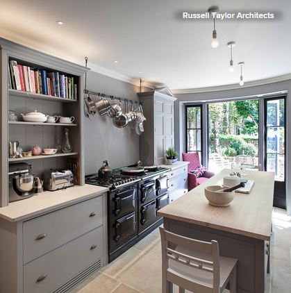
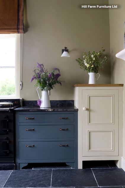
1. Mix cabinet styles. This kitchen’s cabinets are all the same trendy gray, but they sidestep predictable symmetry because two pieces are different styles. They work together, but their drawers have different depths and storage options. A rail for pots and pans creates more variety.


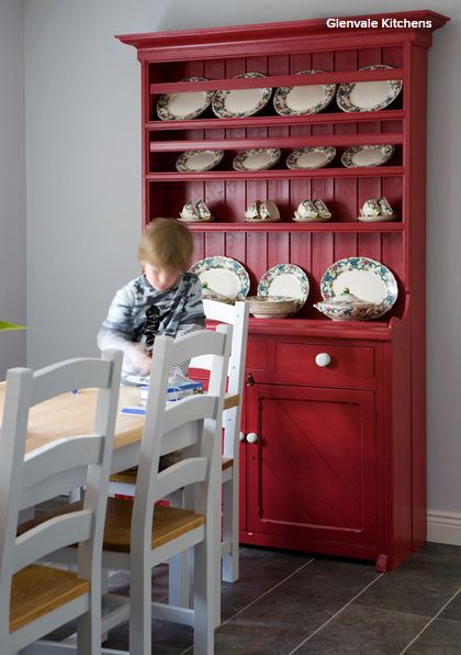
2. Feature a key piece. To keep things interesting in a kitchen with matching cabinets, add a standout storage unit. It could be a plate rack or a bright or weathered dresser. It will break up the rigidity of a single-finish kitchen and let your personality shine through.


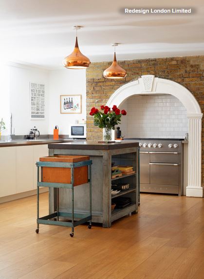
3. Work in an island. For impact in a large kitchen, an island needs to be a “hero” piece that can carry the space. This weathered central island doesn’t conform to any norms. Along with the industrial storage on wheels, it adds just the right amount of character.


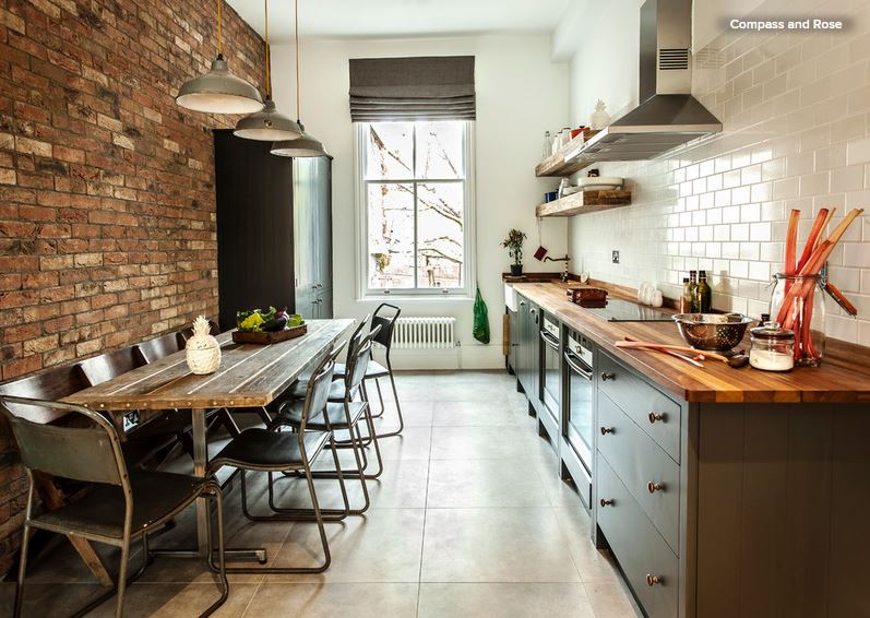
4. Try an urban loft style. A strong dose of industrial style livens up this slim kitchen. Wood, metal, gray paint and ceramic surfaces mix easily, thanks to similar tones. Then there are the contrasts: Bare bricks are mirrored by glossy metro tiles, waist-level units by a taller cabinet. Matching kitchen pieces in this space could have looked too uniform; these look freed up and innovative.

5. Go two-tone. A blend of two shades — palest green and natural bare timber — brings a breath of fresh air to this kitchen. Tongue and groove cabinets and two types of handles are extra custom twists.

6. Compare and contrast. A creative kitchen doesn’t have to be off-the-charts unusual. Simply combining two tones, two surfaces and two heights does the job. Carefully crafted finishes give the space a quality feel.


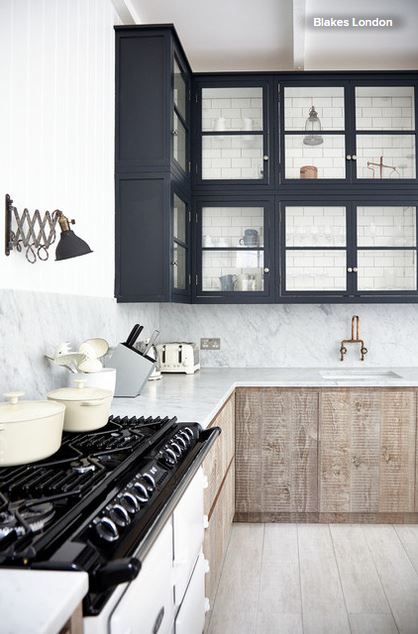
7. Cast it in monochromes. The dark-on-light color scheme here adds visual interest, and the contrast of raw, waxy timber and smooth marble creates a look that’s unique.


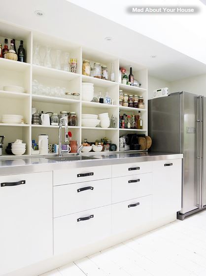
8. Add your own handles. This kitchen works its magic with off-the-shelf Ikea units with tactile leather handles. They handles are eye catching and pleasant to hold — significant, when you consider how often they’ll be used. Open shelving on top combines with a stainless steel countertop that wouldn’t be out of place in a chef’s kitchen.


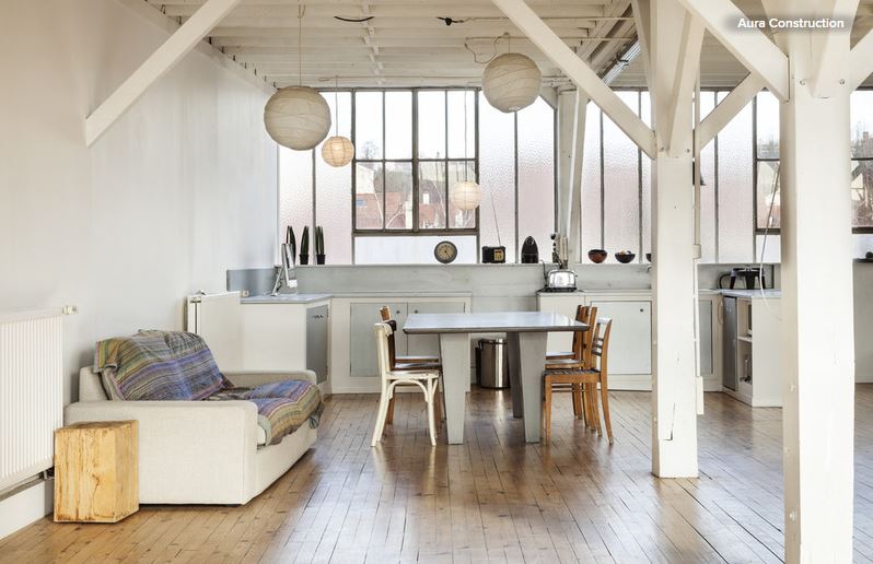
9. Pare it back. This converted industrial warehouse is a dramatic space, so the designer wisely didn’t try to make the kitchen steal the show. Zinc-colored doors inside pale frames, metallic tones and a pared-back 1960s vibe for the furnishings help this kitchen work in its setting — proof that statements don’t always have to be shouts.

Wednesday
Oct292014

Pet-Friendly Design: Making Room for the Dog Dish

Article by:

When I say there is nothing quite so unpleasant as stepping in a dog’s water dish, I speak from experience (no thanks, Augie). Like a good pet owner, I keep my pup’s water bowl filled with fresh water. It’s located in the kitchen, where I inevitably get busy and distracted and step in the drink. It has happened a lot, which goes to show you really can’t teach an old dog new tricks.

When I next remodel, I’m going to plan for this condition, using the clever ideas from these fellow pet owners as inspiration.

In this project, by Buckenmeyer Architecture, finding a space for the dog dishes was a key design consideration. “A recess at one end of the island keeps the bowls out of the way,” says Marty Buckenmeyer.

Judging from the gray around his or her muzzle, I’m guessing this sweet dog is a little long in the tooth. I’m sure the elevated bowls are appreciated.

The designers at Haddad Hakansson employed a similar strategy in this kitchen, but they placed the bowls at the end of a cabinet run as opposed to an island. It’s a smart move in a kitchen that has the room. “One of the highlights of this space is the custom dog dishes,” the designers write. They are “inset into a small slab of white quartzite. The cabinet above has a tilt-out tray for dog treats.”

Perhaps the feature helped the space win first place in the 2014 NKBA northern New England kitchen design competition. And, as you can tell by the blur running toward the eating area, it clearly has won the popular canine vote too.

In this kitchen, by Shannon Ggem, the lucky dog can pretend he or she is eating in the wild, thanks to a dining niche lined with artificial turf.


A closer look reveals the other features. Not only does the space have bowls printed with a grass image, but it has a faucet with an above-counter control. As the designer says: “No bending!”


With built-in bowls and the same material treatment as the kitchen island, this dog eating area, by Studio Zerbey Architecture + Design, is almost undercover.


This niche, by Plain & Fancy by Dandamudi’s, is outfitted with a pullout drawer and an easy-to-clean stone surface.

Some smart and space-endowed homeowners take the dog dishes farther from the kitchen triangle. In this project, by Kathleen Donohue, Neil Kelly, the eating area is under the command center.


In this project, by Anthony Wilder Design/Build, an eating and storage area for the dog is tucked into the end of a wall. Below are the bowls; above are dog accessories and treats.


This mudroom, by Dreamstructure DesignBuild, is outfitted for everyone — four-legged and two. Due to the recessed and elevated nature of the bowls, you’d be unlikely to step in them — but if you did, you might be wearing your boots.

Monday
Oct062014

4 Secrets to a Luxurious Bathroom Look

Article by:

Ever looked at a beautiful bathroom and wondered what takes its design to the next level? You’re not alone. Many homeowners want to know how some bathrooms get that mysterious designer je ne sais quoi. I’ll let you in on a few secrets. Because the overall material costs are low in a small space like a bathroom, it’s a great place to spurge a little on a few features. But it also helps to know where to spend and where to save. Here are a few of my favorite tricks for getting a nicely finished look for a lower cost.

Use a Smoky Glass

One of the rarer features I love is a smoky glass shower enclosure. It balances an air of privacy and sophistication with visual openness, and doesn’t add much to the cost versus clear glass.

(Also, notice how placing lights in front of the mirror rather than above it virtually doubles the amount of lighting, making the overall effect glowing and warm.)


If you do prefer the most open look, a clear glass panel is still a worthwhile upgrade from a shower curtain for creating a sense of modernity that gives a bathroom that sought-after spa appeal.


Tile Tricks

Taking tile from floor to ceiling is important in making a traditional or modern space feel high end …


… but that doesn’t mean you have to spend at the high end. Rather than tiling a whole room partway up, consider tiling just one or two walls top to bottom in a statement stone. You’ll still get that finished look without paying to tile the whole space.

Also consider running one type of tile across the floor and a wall for a strong, singular statement. And, of course, leaving the remaining walls white makes the veining the star of the show.


If you’re looking to tile all the walls without breaking the bank, especially if your layout doesn’t leave any walls safe from splashes and splatters, I would recommend classic subway tile over a faux stone. But to create a little drama, choose a dark grout …


… or a modern pattern like this simple stacked layout with a wide tile.


Mirror Power

A large mirror has so much power. It cuts down on tile costs by filling much of a wall (while reflecting the material you do invest in) and can virtually double the size of the room, making it feel like a vast personal oasis …

… even if the room is a more modest size. Consider taking a mirror wall to wall. Notice how the wall here feels tiled, even though in fact there are only a few inches of stone backsplash below the mirror.


The Vanity

I designed this bathroom for a recent condo renovation; it has many of my favorite features described above, translated in a small space. You’ll notice that among all the attention-stealing details, there is a humble Ikea vanity, which I have used in multiple renovations. It’s sleek and simple, and the cantilevered style helps the room feel more open. Best of all, it costs about $480.

Tuesday
Sep232014

8 Ways to Get a Handle on the Junk Drawer

Junk drawers get a bad rap, and while it is (mostly) well deserved, there is a way to get that beast sorted and organized once and for all. From creating categories to making smart choices about what goes in and what stays out, these eight tips can help transform junk drawers into “really useful stuff” drawers, ones that keep small items right where you need them.

1. Have more than one small-stuff drawer. A single drawer for small items is simply not enough for most households — and overstuffing is what turns a “really useful stuff” drawer into a junk drawer. It starts innocently enough — you want to quickly clear off a counter because guests are coming, so you slide a few random screws, a rubber band and some pocket change into the drawer. The thing is, it’s a slippery slope. Once that drawer starts to look disorganized, it’s easy to just forget the whole thing and start shoving in every loose item that crosses your path.

2. Come up with categories.
 To stop that from happening, begin by choosing a few categories of small-stuff drawers. Then you can stop thinking of them as junk drawers entirely, and start thinking of them based on the theme of their contents. For instance:

  • Household tools drawer
  • Office supplies drawer
  • Electronics drawer
  • Crafts or gift-wrapping drawer
  • Drawer for personal items you need to get out the door

3. Know the two ways to sort. There are certainly other ways to sort your belongings, but these two ways are simple and effective.

  • Like with like. A family member of mine sorts her kitchen tools into two drawers: “scoopy-stirry” (spoons, ladles etc.) and “cutty-pokey” (knives, vegetable peelers etc.). Sounds a little silly, but it works, and once you know where these drawers are, you can quite easily find what you need, even if you are not familiar with her kitchen. Other like-with-like categories might include tools, paper goods, and electronics and power cords.
  • Complete a task. The second way of sorting is to corral everything you need to complete a task from start to finish. In one drawer in my home, for instance, I have envelopes, stamps, pens, checks and an address book. You might want a drawer near the front door to keep your keys, wallet, cell phone, sunglasses and other personal items.

Here is a good example of a well-tended tool drawer. It contains useful, everyday tools — tape, twine, scissors and screwdrivers. This is not the place for arcane tools and specialized equipment used only once or twice each year. Which brings us to the next point.

4. Know what doesn’t belong. In addition to your small-stuff drawers, it’s helpful to have another location for small items that you rarely use. While your measuring tape and box cutters may deserve a spot in a small-stuff drawer, those random screws do not. 

An over-the-door shoe organizer hung inside a utility closet makes an ideal spot for stowing random items that do not belong in a small-stuff drawer.


5. Always label loose parts. If there were only one tip I could ensure that you take away from this, it would be this: Never put a loose part away without labeling it. An easy way to do this is to pop the item in a zip-top bag, place a piece of masking tape on it and write what it is on the tape using a Sharpie. This way when you go to get rid of your old speakers, you can quickly find all of the cords that go with them and get rid of those, too. I started doing this recently, and it has changed my (organizing) life.

6. Keep it where you use it. Are your kids always doing art projects in the kitchen? Keep a drawer for arts and crafts supplies there, instead of down the hall. When items are stored in the room where they are used, they are far more likely to be returned to the right place.

7. Find the right container for the job. Not everything needs to lie flat in a drawer. If your drawers are deep enough, consider standing some items upright in simple glass jars. 

Experiment with upcycled containers — egg cartons are good for sorting tiny items, and jam jars work wonderfully for paper clips.


8. Think outside the drawer. Not everything needs to be in a drawer. Papers are better off in flat boxes (labeled, of course) or files. Baskets with drawer inserts placed inside have the advantage of being portable, so you can bring them right where you need them.

Tuesday
Sep162014

The Kitchen Storage Space That Hides at Floor Level

The humble toe kick is an often-overlooked design detail, and maybe for good reason: It stands practically underfoot, serving in fact only to give our feet a place to rest while we’re working at the counters and cupboards above. However, whether in the kitchen, bathroom or elsewhere, there is much you can do with a toe kick, so it’s worth taking a moment to think about this small design detail. Here are a few helpful design tips for the last place you’d ever think about looking.

Toe kicks are, as a rule, typically 3 to 4 inches high, and recessed 3 inches underneath a cabinet. This gives you room for your feet — or your toes, anyway — while you’re standing at the counter without wasting cabinet space or creating a pocket that’s too deep to clean.


However, a toe kick doesn’t have to be wasted space. Drawers for extra storage are the perfect use for this overlooked space.


They work great for wide, flat items, like specialty pans you don’t use every day …

… or a stepladder for when you need to reach those tall upper cabinets.

A toe-kick drawer can also house your pet food if you prefer to keep it out of the way between meals — or if your pet is a bit of an overeater!

Get a clean, classic look by matching the cabinets to avoid a visual break (especially perfect with statement wood floors).


For a richer, traditional look, add faux feet to the cabinet fronts to give built-ins a furniture-inspired feel.


Stainless steel (especially with stainless steel appliances) will let your toe kicks make a subtly modern statement.

Or you can use a hint of color or repeat a beautiful tile — both work great in darker spaces to add some life.

Underlighting isn’t just for cabinets. Glowing toe kicks look great in a space with other modern LED light sources (like in a ceiling alcove).


To make toe kicks disappear, try painting them black or using a dark material …

… or give them a mirrored finish, and your cabinets will appear to float.

Want other uses for your toe kick? Try a modern central vacuum system. You can incorporate a hidden suction port in the toe kick so crumbs and dust can be swept away without your even bending over.


And a toe-kick heat vent will keep you toasty during a meal in your breakfast nook or banquette.

Your guests (and you) will appreciate the extra effort, even if they have no idea that your toe kick packs such a design punch!