The Best Colors for Your Spring Redesign
 Thursday, April 18, 2013 at 12:10PM
 You probably already know that certain colors make you feel certain ways. For instance, you might adore purple and absolutely hate yellow, or you might be attracted to every shade of green under the sun. But did you know that colors truly can affect how we think and feel? Before you reach for that paint swatch and make a commitment to a certain color in your home, make sure you know what each color might mean for your mood, appetite and even your metabolism.
The color you choose to brush on your walls can have a major effect on your everyday life. You want to create something that not only reflects the way you love to feel, but also conveys what you believe in and dream about. So without further ado, here are some of the most popular colors and what they really mean.
Red
 Photo Credit: Eclectic Dinig Room by Boston Interior Designer (m) + charles beach INTERIORS
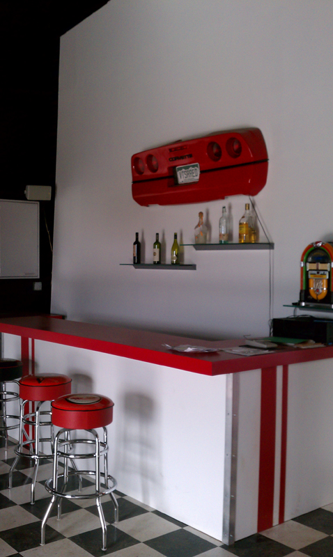
Everything from deep red to cherry fire-engine red can be appealing, but keep in mind that red is know to boost appetite. This makes it a perfect option for the dining room or kitchen. In fact think about some of the biggest fast food-restaurants - what color is their signage? Most of them have at least a touch of red. But avoid putting red in your office, because it has also been shown to cut down on the effectiveness of studying.
Blue
 Photo Credit: Modern Home Office by Chicago Photographer Cynthia Lynn PhotographyFeeling blue? Then you might be very productive! Blue is known for curbing appetite and keeping production levels high, so put it in your office. It is also great for calmness and serenity, as well as being a favorite color for men, so blue accents in the man cave might be an excellent idea.
Green
 Photo Credit: Traditional Hall by Weston Architect Oak Hill ArchitetThis color mimics nature, so is it any wonder that it brings to mind good health and tranquility? Turn to green for your bedroom, reading room or anywhere else that you want to relax. Green is also an excellent color for those who have a strong affinity for nature, for obvious reasons.
Yellow
 Photo Credit: Traditional Living Room by Wooster General Contractor Weaver Custom HomesThis cheerful, warm color is a popular one for nurseries, but unfortunately, it has been shown to make babies cry. Keep the peace by keeping yellow in your kitchen, mudroom or sunroom. Yellow can give you more energy and even boost your metabolism.
White
 Photo Credit: Traditional Entry by Los Angeles Artist & Artisan Blue Tangerine ArtIf you want to create the illusion of space, white is the way to go. This innocent, pure color creates the perfect backdrop for any kind of decor and keeps the room airy at the same time. Pair white with a big mirror for big impact.
Brown
 Photo Credit: Traditional Home Office by Charlotte Interior Designer Carolina Design Associates, LLCThose who choose brown are practical, careful people. Put this in your office, living room or use it as an accent color. However, be sure to spice it up with a containing color; brown can also mean "boring" if you use too much of it.
Other Colors to Consider
What about colors that are a bit off the beaten path? Experts have plenty to say about that, too.
- Pink is a feminine color that makes people feel safe and happy.
- Purple brings to mind royalty and wealth; in fact, many kings throughout history have worn purple robes, the sign of power.
- Orange gets attention and conveys excitement and enthusiasm, so use it in a room where busy people are, such as the playroom for the kids.
Finally, keep in mind that black conveys exactly what you probably think; death, mourning and darkness. Black can make a great accent or furniture color, but you might want to steer clear from putting it on your walls, as it can also make a room look smaller.
Now that you know, what color will you choose for your springtime design?
(You are reading an article originally posted on Build Direct Blog.)
 Black,
  Blue,
Blue,  Brown,
  Color Trends,
  Green,
  Pink,
Pink,  Purple,
  Red,
Red,  Redesign,
  Spring,
  White,
  Yellow in
  Color Trends & Guides,
  Decorate & Design,
  For the Home


