twitter Facebook Google+

                 linkedin pinterest houzz  

Click for the BBB Business Review of this Countertops in Denver CO 

Google Review 

Sales & Promotions!

Architects, interior designers, and more ∨

Hire a decorator to find that just-right couch and coffee tables for your living room.
Find wall shelves, a customizable closet organizer and stylish furniture for home to whip your closet into shape.
Remodeling and Home Design

Qualify Us Now! ProView 

Cambria logoUp to $45,000 interest free for your project!Finance by Cambria

 convenient and easy.

  • No Money Down
  • Interest-free financing for up to one year without payments
  • Financing up to $45K for any project that includes Cambria (including cabinets, flooring, sinks, plumbing, install & more)
  • Secure paperless telephone application
  • Credit decision in less than 10 minutes


Entries in Cabinetry (10)

Monday
Jan132014

Bathroom Remodel Insight: A Houzz Survey Reveals Homeowners’ Plans

Article by:

Older and younger generations often have widely differing viewpoints. But who knew bathrooms could be so divisive? In a recent Houzz survey, we asked homeowners planning a bathroom remodel or already in the process of one about their needs and desires. Of the 7,645 people who responded, young and old homeowners tended to fall into two clear groups. 

Homeowners 65 and older are more likely to skip adding a bathtub than those under 35. This could be for any number of reasons, but it’s likely that younger homeowners may have or expect to have children, who would be more likely to use a tub. Plus, those 65 and older likely choose showers because they’re more accessible for aging in place.

Bathtubs have traditionally boosted resale value (which 31 percent of the respondents said was the driving factor for their bathroom remodel), but older people may be planning to hang on to their homes longer, so resale isn’t as much of an issue.


For those adding tubs, freestanding models top the list, with 33 percent of respondents preferring them over drop-ins, undermounts and other styles. 


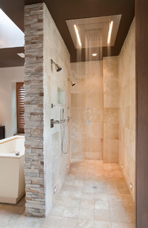
Young and old are also split on how they like their showers. If you’re under 45, you’re more likely to choose a rain shower and multiple showerheads. If you’re over 55, you likely prefer hand showers and sliding bars.


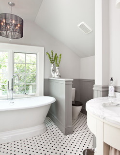
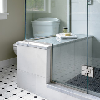
Meanwhile, there are two camps when it comes to, er, No. 2. The survey found an even split when it comes to toilet exposure: 52 percent of people want an open toilet versus one behind a closed door. Younger homeowners (25 to 34 years old) prefer tankless or wall-mounted models over the traditional two-piece ones. 

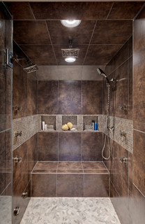
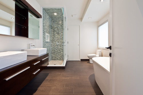
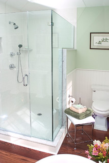
Upgrading features and fixtures was the main reason cited for remodeling a bathroom (49 percent). Frameless glass is one of the more popular choices. About 79 percent of people will choose all-glass enclosures for their main shower, and 54 percent will chose frameless glass.


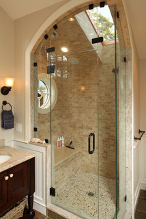
Lighting is important too, whether it’s bringing in the natural sunshine with skylights or adding more LED lights. New windows top the list too, with 48 percent of respondents saying they plan to add a window and 41 percent a lighted vanity mirror. And if that’s not enough, 7 percent say they’ll add a showerhead with LED lights.


Also, 42 percent of all respondents are planning to add a shower seat. I think it was Winston Churchill who said, “Why stand when you can sit?”


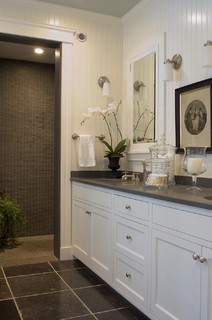
White cabinets are the preferred color choice, with 32 percent of homeowners saying they’ll choose this ultimate neutral hue.


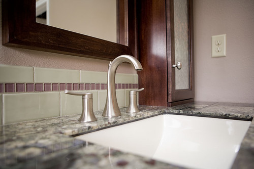
Brushed nickel (26 percent) and polished chrome (24 percent) are the front-runners for faucet finishes.

Thursday
Jan022014

Conquer Clutter With Drawers: 14 Inventive Solutions

Article by:

For many years drawers knew their place in the home. They were filled with a jumble of junk in the kitchen, stocked with sweaters and shirts in the bedroom, and crammed with pens and rubber bands in the office. But designers have begun to recognize the flexibility of this design staple. There’s nothing like an easy-to-access drawer to organize — or hide — the essentials of daily life. 

Consider these options to conquer the clutter in your home. 

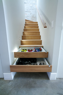
This narrow stairway features a truly ingenious storage solution: two of the risers are fitted with drawers to make a pile of shoes disappear in a flash.


Tired of tying up your kitchen outlets charging phones, tablets and laptops? Install a power strip in the back of a drawer and let your electronics recharge sight unseen. Just make sure the drawer is shorter than normal to allow room for the power strip’s cord in the back. 

Make edibles a design detail: Display your pasta or legumes in glass-fronted drawers. Brightly colored varieties (think red beans and spinach pasta) look best.


Instead of wrestling the ironing board out of the closet whenever you need to touch up a shirt, get one of these nifty folding versions that fit into — guess what? — a drawer.


Wine lasts longer and tastes better if it’s stored away from the light. This drawer, with its handy wooden cradles, keeps vino safe and close at hand. Don’t put the drawer near the oven, though, as heat is also a no-no. 

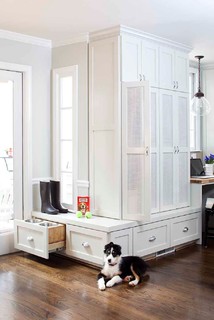
Even doggies appreciate their own dining area. Keep their bowls off the floor and out of the way with a pet-friendly drawer that slides out at mealtime.


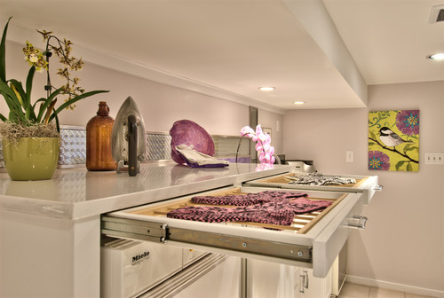
Forget drying delicates over a shower rod or the back of a chair. These skinny drawers are fitted with water-resistant racks that allow air to circulate, so your clothes will be ready to wear before you know it. 

Store clothes, sheets and blankets in drawers tucked under a platform bed. These beds work especially well in small rooms where there’s no space for a dresser. 

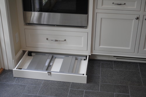
To eke out storage in every last corner of your kitchen, utilize the space under the cabinets with kick drawers. (They’re tucked in behind the cabinet’s toe kick.) This one hides a folding step stool to reach those high shelves, but you could also use this space to hold trays or cookie sheets. 

Clean up your entryway and keep track of outerwear by hiding it in discreet drawers. The ones here are faced with beadboard that matches the wainscoting.


Instead of there being a traditional ladder to access the top bunks in this kids’ room, a cleverly designed stack of drawers acts as a staircase. 

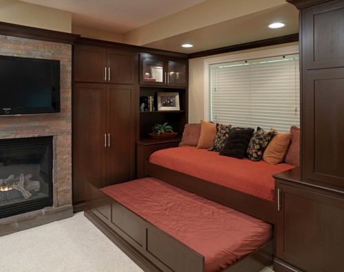
Need extra space for guests? Add a bed in a drawer that disappears under a window seat when it’s not needed. 

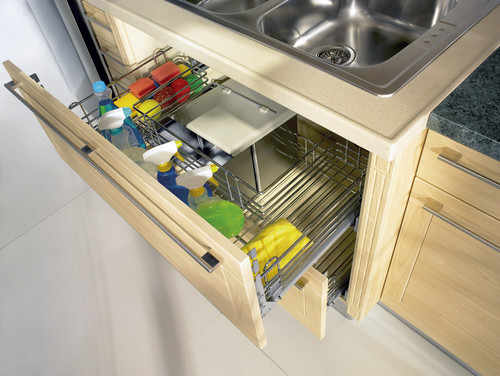
The pipes under a kitchen sink have always made it difficult to organize cleaning supplies. This drawer, with its U-shaped wire basket, is designed to fit around the piping, so you can easily access spray bottles, sponges and scrub brushes. 

This airy kitchen nook not only provides comfy benches for seating, but the drawers underneath can hide kitchen equipment.

Monday
Nov252013

Serveware Storage That'll Serve You Well

It’s time to get those awkward serving platters safely stored so you can enjoy a season’s worth of cocktail and dinner parties without losing your head. Seriously, precariously stacked platters are dangerous. Consider these ideas for keeping your platters secure but handy, so they’re ready when you need them at party time.  

Stacking too many heavy platters on top of one another in an overhead cabinet is a recipe for disaster. It’s great to have a variety of platters to handle whatever dish you’re serving, but that assortment means your platters probably don’t stack well. 

Keeping platters up high is actually a great space saver; the key is to fashion a deep shelf with partitions so platters can be stashed sideways. Standard upper cabinets are 12 inches deep, whereas base and floor-to-ceiling cabinets measure 24 inches, making the latter the most obvious cabinetry option for large platters.

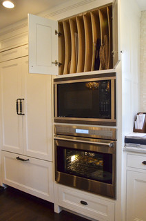
Going vertical. The team at Dearborn Cabinetry included tray storage over this built-in microwave, making efficient use of the work area’s height. Built-in dividers placed in narrow increments keep upright platters safe, visible and reachable.


The top tier of a floor-to-ceiling pantry is ideal for partitioned platter storage. It keeps trays available when needed but out of the way of the pantry’s more frequently used areas. Keep a folding stool nearby to lessen any temptation to climb up shelves.


The comprehensive shelving system in this closet-style pantry takes the need for a stool out of the platter-finding equation. This setup includes vertical storage for muffin pans, another one of the tricky-shaped tools so often used around the holidays.


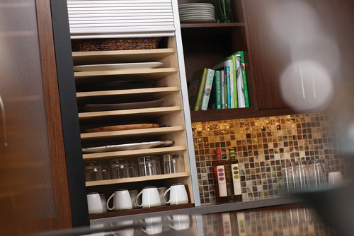
Horizontal stacks. If you still prefer to stack platters, use a deep cabinet or appliance garage and set horizontal shelves in a narrow formation, like in this setup by Dura Supreme. Take advantage of a cabinet’s predrilled borings, if it has them, by adding as many shelves as you need to maximize capacity. You can get additional shelves from the manufacturer or have new ones made to match.

Show it off. Plate racks are an ideal way of putting your favorite dishware on display. If your home is older, you just might be lucky enough to have a built-in plate rack. If not, a carpenter can recess one within a wall (as long as the recess is free of plumbing, electricity or venting) and match the rest of the kitchen’s finishes.


This rack keeps platters near the ovens and island but doesn’t get in the way of the kitchen’s everyday work zones.


These two vintage racks turn an empty wall into effective (and pretty) platter storage.


A more extensive version such as this tall rack allows ample space for plates and platters by placing them sideways. Because its location doesn’t hinge on a connection to cabinetry, it can be hung at any level that makes the most sense. 

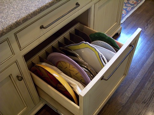
Don’t forget base cabinets. If your platters are heavy or you use them often, keep them at hand in deep, partitioned drawers like this one from Cabinet Concepts. No stools needed to find what you’re looking for. 

A single, full-size pullout behind cabinet doors provides room for larger platters. Its location directly under a large countertop ensures an ample workstation for filling up a big serving dish.


Take advantage of shallow spaces. If storage is a difficult thing to find room for, make room in unexpected places, like shallow drawers. In this kitchen the otherwise wasted space below the base cabinets has been utilized for valuable storage.


Friday
Oct182013

Woodipedia: Is It Cherry or Is It Alder?

Article By:

Stains have made it very easy to color one type of wood to make it look like another kind. But there are two species of wood that really do look alike in their raw state: cherry and alder. Here's how to tell the difference. 

When you think of a cozy country kitchen, most likely you are envisioning warm-colored cherry cabinets. "Cherry was one of the most popular cabinet woods in rural areas throughout the country, because it was so widely distributed across the United States," notes Andy Richmond, vice president and certified appraiser at Garth's Antiques in Delaware, Ohio.

Yet there is another wood species that features a milder version of cherry's reddish tones and grain patterns. Alder is affectionately referred to by woodworkers as "poor man's cherry." With a coat of finish, it can easily pass for cherry to less-discerning eyes. 

Cherry basics. When we speak of cherry, we are really referring to black cherry — Prunus serotina. A distinctive element of most cherry wood is gum spots, or pitch pockets. They're short, black streaks that look like hardened resin deposits.

Sometimes cherry has pin knots — tiny brown circles that again add visual interest. High-end cherry is figured, meaning undulating rays of light seem to shoot across the grain, lending the board a shimmering depth. This radiant effect is called chatoyance.


Alder basics. Commonly known as red alder, Alnus rubra grows principally in the Pacific Northwest, where it is the most commercially abundant hardwood. The consistent grain pattern and quiet coloration of alder is polarizing. Some people like it for exactly that reason, while other people find it boring. Alder can have pin knots, but it doesn't have gum spots.

You'll sometimes hear references to clear or knotty alder, but those are just general descriptions. "That's not a grade," says Walt Maas, manager of Bohnhoff Lumber in Vernon, California. "There are industry standards for grading lumber — like there are for grading meat. Each type of wood has its own specifications that professional hardwood lumber graders follow." 

This makes it easier to compare prices when shopping. However, Maas notes that some companies put their own proprietary grades on lumber, which makes comparison shopping more difficult.
 

Differences between cherry and alder. There are three main differences. First, alder is significantly softer, so it weighs less. Second, alder is cheaper. And finally, alder has no sapwood, which is the creamy colored wood on the edge of a board. Like walnut, cherry is known for having a lot of sapwood. 

Cost. Cherry's price is somewhat dependent upon the amount of sapwood. Most boards have more heartwood (the pinkish-red color) on one side and noticeably more sapwood on the opposite side. The percentage of each on a single board influences pricing. Another factor is board width. Wider boards of all species are more expensive.

Maas reports that the current wholesale price of cherry at his yard is $3.20 per board foot. Alder is priced substantially lower, at $2.70 per board foot.
 

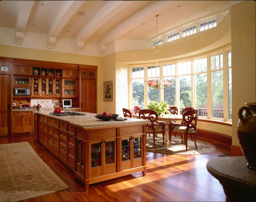
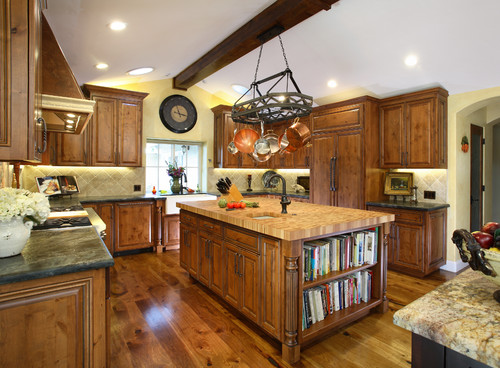
Color. While alder is fairly even in color, cherry's basic red cast can have a whole spectrum of variations. This makes it difficult for woodworkers to color match the boards on large projects. Gene Leslie of Rancho Cucamonga, California (who made the cherry cabinets shown here) evened out the disparate tones by treating all the wood with lye to artificially age it while maintaining the clarity of the grain. Amateurs need to be thoroughly educated on this process before attempting it, however, since lye is highly caustic. 

When making tabletops and cabinet door panels, woodworkers frequently cut off the sapwood to feature the prized heartwood. The sapwood is then used for the interior structures, especially in drawer construction.
 

Durability. Black cherry rates 950 on the Janka scale for hardness, which puts it on equal footing with soft maple but far below tougher hard maple (1,450) and black walnut (1,010). 

Alder is rated 590, ranking it as a very soft hardwood, slightly above poplar (540).


Not cherry. While there are no wood types erroneously identified as alder, there are several misnamed cherries. Chief among them is Brazilian cherry, also known as Jatoba. It's an extremely popular flooring choice these days, not only because of its cherry-like color, but also because of its durability. Brazilian cherry rates 2,350 on the Janka scale. (Remember, hard maple is 1,450.)


Other woods masquerading as cherry are Patagonian cherry, Bolivian cherry and African cherry, which is also known as Makore.
 

Finishing. Cherry and alder are both prone to blotching when finishing coats are applied. Again, some people accept this as a beautiful trait of real wood, while other woodworkers try every finishing trick in the business to minimize it. It's a good idea to ask for a finished sample. 

UV stability. Cherry naturally patinates to a darker, richer color over time. American antiques specialist Andy Richmond notes that antique cherry furniture can resemble mahogany.

It's also a notoriously UV-unstable wood, which some woodworkers use to their advantage. To quickly and painlessly deepen the color of some cherry boards, woodworker Gene Leslie intentionally leaves them out in the sun after milling them.
 

Sustainability. Domestic hardwoods have been endorsed by the U.S. Deptartment of Agriculture as a preferred green building material — in large part due to the responsible harvesting methods practiced by the American hardwood industry. The other important factor in the sustainability of American hardwoods is the minimal transportation requirements, compared to those of imported exotics.


Monday
Jun102013

Cleaning Up in the Laundry Room

ARTICLE BY ANITA SHAW

Downstairs, lurking somewhere in a dark corner of an unfinished basement, is a cramped area housing the washer and dryer. It’s an image most people can relate to as, at one time or another, we have stood in a “laundry room” like this.

Well, that image can be banished from memory, as today’s laundry rooms are not only bright and airy, they are places where people actually enjoy spending time. They are incorporating many amenities from other areas of the home and acting as gathering spaces for a variety of activities. And, the desire for these spaces to incorporate high-end design and functionality is definitely on the rise.

“I consider laundry spaces to be almost on the level with kitchens and baths,” states Tina Kuhlmann, principal designer, Primrose Design Interiors in San Diego, CA. “People are in and out of there all of the time. It’s a really integral part of the kitchen and the family.”

While storage is a necessity in the laundry room, Lee Taylor, showroom manager for Taralla Kitchen and Bath in the Bronx, NY, notes, “the look of the cabinets and countertops are sometimes more important. These rooms have become an extension of the kitchens and living spaces.”

Photo: Kelly Keul Duer and Virginia Vipperman | Designer: Cameo Kitchens

Laundry necessities

The approach to designing today’s laundry rooms is much the same as with other rooms, according to designers. It’s critical to understand how clients not only wash and dry their clothes, but also use the surrounding space.

Families tend to do laundry in different ways, so it is important to know their habits, stresses Mike Macklin, designer, Cameo Kitchens in Falls Church, VA. “If the family brings their laundry down in baskets and promptly takes the basket back to their rooms, open shelving is a practical way to go. But, if the laundry tends to pile up, storage behind doors may be a better idea.”

“I put a lot of things behind doors because I know people are messy,” stresses Kuhlmann. “Very few of us live like the catalogs look.”

Of course, a surface to act as a folding area is critical, and one size does not fit all. “When I’m dealing with empty nesters, they often ask for a place to fold that is nice and at back level, so there isn’t a lot of bending over,” comments Kuhlmann.

“Many of our customers opt to use washers and dryers that fit under the counter,” notes Macklin. “This provides a counter space more than long enough to fold and organize clean laundry.”

An oversized sink is an important element, according to several designers. “I always include a laundry sink with a pull-down faucet,” states Kuhlmann. “The pull-down faucet is really nice because you can get in there and spray those stains out or pretreat.”

It can also be used to wash delicates and, once those delicates are washed, areas for hanging become very important.

“Sometimes I’ll do a tall hanging cabinet for delicates because people don’t always want to dry them in a dryer, and they don’t really want to look at them, either,” reports Kuhlmann. She has created cabinets to hang delicates that function like a closet. She includes open-weave bronze or copper on the door, sometimes backed by fabric, to allow for air circulation for drying.

“Drying racks and drip areas are a big deal,” adds Lynley Serratt, CKD, CBD, Allied ASID, director of sales and marketing, Palmer Todd in San Antonio, TX. She reports that her firm has done pull-out drying racks in the space between the top of the front-load washer and dryer and the cabinet above.

Photo: John Lennon Photography | Designer: Tina KuhlmanAnd, while ironing may be akin to drudgery, ironing boards are important to the room’s design. However, tucked away and out of sight is the preference for this household item. Kuhlmann likes to put the ironing board behind a finished door panel so that it looks like it’s part of the cabinetry.

Laundry plus

In addition to the items people expect to find in the laundry room, there are several surprise amenities that are finding their way into the design. Charging stations for the family’s multitude of electronic devices have found a home here, as have beverage refrigerators and flat-screen televisions.

Of course, innovative storage is a must, especially in rooms that serve multiple purposes.

“Organized space for coats, hats, backpacks and sports equipment is essential [when this area is combined with a mud room], and bench seating can be an effective means of hiding these necessities,” reports Macklin.

“These rooms are used by all members of the house on a daily basis for staying organized, and for keeping the clutter out of the rest of the house,” she reports.

“I tend to like drawers in the laundry room that aren’t as deep – maybe three or four of them. That way, you don’t lose things in the bottom,” remarks Kuhlmann. If a larger drawer works better for the space aesthetically, she will often add a hidden drawer within the larger one that can roll fully to the back of the drawer.

Lighting – both natural and installed – is key to the space for both function and spirit. Since time will be spent in a laundry room that serves multiple purposes, windows that bring in daylight are essential to the overall design. And, according to Kuhlmann, good undercabinet lighting is important, especially for matching dark socks!

People also like to personalize the space with add-on features. “You can explore your personality a bit more in this room because, typically, it’s just one family member running the show, unlike a kitchen or bath where you have to compromise,” explains Jenny Rausch, CKD, president, Karr Bick Kitchen and Bath in Brentwood, MO.

Photo: Denash Photography | Designer: Jenny Rausch

She has created laundry rooms with glass tile, marble tops and crystal chandeliers. “If you love an expensive backsplash tile, the good news is that, in a laundry room, you probably won’t need that much of it,” she stresses.

Kuhlmann agrees. “A tile backsplash is a significant amount more money, but you can have a lot of fun with it. It gives the difference between looking at a dry wall surface and that punch of design.”

Kuhlmann also likes putting solid surface countertops in the laundry room when she can. “Nobody wants to be scrubbing tile grout,” she comments.

Rausch stresses that the laundry room can be just as profitable as a kitchen because the same materials are used in both spaces. “Lighting, cabinets and tile carry high margins, and all can be done to the max in these dream laundries,” she comments.

“It’s important to pay attention to all of the details,” continues Rausch. “It’s not just a laundry room – it can be a sanctuary.”

While the idea of laundry room as sanctuary may not have caught on as of yet, the laundry room as mud room, gift wrapping center or craft space certainly has.

Wrapping areas are very popular in the laundry room, according to Kuhlmann, and she will incorporate storage for rolls of ribbon and wrap, scissors, tape and the like.

Kuhlmann has done laundry room dog washes, too. “I’ll install a shower pan and a handshower low on the wall for when your pet comes into the mud room and has muddy feet,” she explains.

“We expect more requests for laundry room renovation in the future, as customers seek to maximize every inch of their home,” concurs Macklin. “The laundry room will be more of a home center and an important component of the home’s design.”

“Call it what you will, the laundry room has become this wonderful multi-use space that’s not just about laundry anymore. It’s almost like a secondary multi-purpose room adjacent to the kitchen, and if we educate our clients in that general direction, they’re going to want it that much more,” states Kuhlmann.

(You are reading an article originally posted on ForResidentialPros.com)