twitter Facebook Google+

                 linkedin pinterest houzz  

Click for the BBB Business Review of this Countertops in Denver CO 

Google Review 

Sales & Promotions!

Architects, interior designers, and more ∨

Hire a decorator to find that just-right couch and coffee tables for your living room.
Find wall shelves, a customizable closet organizer and stylish furniture for home to whip your closet into shape.
Remodeling and Home Design

Qualify Us Now! ProView 

Cambria logoUp to $45,000 interest free for your project!Finance by Cambria

 convenient and easy.

  • No Money Down
  • Interest-free financing for up to one year without payments
  • Financing up to $45K for any project that includes Cambria (including cabinets, flooring, sinks, plumbing, install & more)
  • Secure paperless telephone application
  • Credit decision in less than 10 minutes


Friday
Aug092013

9 Features to Consider for Your Dream Bathroom

Article By: Gabrielle Di Stefano

Bathrooms were originally designed to be no-frills, functional, hardworking rooms. But today's endless design layouts and fixture choices provide us with the opportunity to create a space that we can actually enjoy being in. Now, the challenge is to design a bathroom that offers the functionality of yesteryear while reflecting our personal style. 

No matter what size or shape of bathroom you're working with, these tips can help you add personality and luxury to your space, without compromising on practicality. 

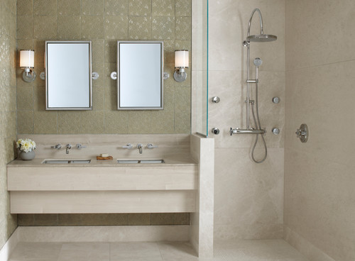
Narrow bathrooms can have plenty of personality. Have fun with a smaller space like this with over-the-top wallpaper and glamorous fixtures and fittings. Custom vanities, like the ones in the photo, offer ample storage and style. 

Tip: Installing mirrored glass on at least one wall creates the illusion of space. Mirrors on opposing walls work even better. If your towel rail is on a wall where you want a mirror, work with your glass manufacturer to install the mirror around the rail.


Double-duty bathrooms work hard, so put effort into designing a workable space. This bathroom makes good use of existing plumbing fixtures with acompact washer/dryer. Additional storage for cleaning products and clothes would be valuable, too. 
 
Tip: A standard washing machine is often deeper than standard cabinetry. Keep this in mind if you are buying a flat pack vanity and you want to hide your appliances behind a hinged door.


Comfortable seating is very nice for giving yourself a pedicure or enjoying some sun and solitude.

Tip: Upholstered seating fabric in bathrooms works best if it is mold resistant, so choose an outdoor fabric for these areas. 

If you're blessed with an extra-large bathroom, you have the opportunity to work in a healthy mix of natural and artificial lighting, zoning of major wet areas, plenty of storage and a place to sit.

Tip: Try a mix of darker timbers and soft furnishings in a large space to prevent it from looking and feeling too much like a public bathroom.

shower niche is a practical and stylish vessel for all our necessities. A permanent tiled niche not only looks great, it won't gather mold, as a plastic hanging storage unit can.

Tip: Tiling can make or break a bathroom. If you want a contemporary-looking shower, employ a craftsman tiler to miter the tiles, rather than installing prefabricated edging — this will create a seamless-looking niche.


Of course, privacy is always important in a bathroom. Unlike other rooms, bathroom window treatments need to let in natural light while keeping prying eyes out. Sheer blinds are a practical option, while opaque film is a cost-effective solution.


Tip: If you have the space for a luxurious bath under a window like this one, install window shades with a top-down optionto let light in without sacrificing privacy.


Dual sinks are more of a necessity than a luxury in a family bathroom. They help avoid arguments and keep the morning ritual moving.

Tip: A minimum of 6 feet of overall counter space is best if you are installing two sinks.
 

Shower seating doesn't need to look like it belongs in a hospital. If you are renovating your shower, ask the builder to frame out a seat ready for tiling. In smaller showers, a corner seat will take less room. 

Tip: If you don't have the room or budget for built-in seating, a small stool constructed from a waterproof material like stone is a thoughtful addition to any shower.


Floor heating is a popular and energy efficient way to warm bathrooms. This heating method provides an even temperature throughout the room and offers programmable thermostats. Reducing the air flow from the outside is perfect for people with allergies. 

Tip: Even if you're not renovating or building a new bathroom, you can put in floor heating. Some manufacturers have heat mats that can be stapled onto the subfloor or up between the joists.

Wednesday
Aug072013

6 Lessons in Scale From Well-Designed Bathrooms

Article By: Sarah Burke

How we mix objects of different sizes, masses, proportions and patterns — in other words, how we work with scale — is a big part of good design. Architects and designers use scale to create interest and balance, and taking it into account leads to good design in even the smallest rooms of a house. To see what I mean, take a look at the lessons in scale from these six bathrooms.

1. Use similar shapes in different sizes. Using similar shapes — rectangles and squares or circles and hexagons, for example — in different sizes can add interest and subtly draw the eye around the space. 

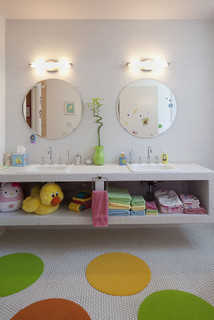
Unlike most bathrooms, where rectangular and square tiles have a significant presence, this bathroom has round elements — hexagonal tiles, round mirrors and round floor mats — that create an environment that is both fun and minimalist. 

The white hexagonal tiles on the walls, floors and bathroom vanity make the space feel large and bright.


2. Play with one main material. Choosing one main material for your bathroom's palette will help harmonize the elements, creating a visual flow that's easy on the eyes. 

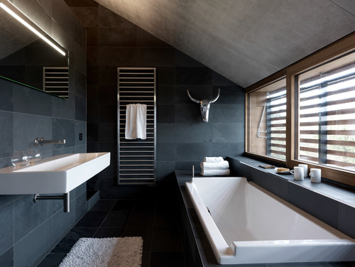
Here's an obvious example of how using one main material produces a calm feeling. The large 12-by-24 tile reduces the amount of grout lines, adding to this bathroom's expansive feel. And the simplicity of one material allows the art in the room — the silver steer head — to have a real presence.

3. Vary the sizes and shapes of materials and furnishings. Transitioning between sizes of furniture and materials connects various parts of the space in a different way. 

There are many good examples of scale in this classic bathroom. There is a nice transition in scale from floor to ceiling, with the small basket weave tiles on the floor, the medium subway tiles for the wainscoting and the large drywall that leads to the ceiling. 

The leaded window design relates in pattern and proportion to the basket weave floor tile. And because the ceilings are quite high, I love this tall wooden chest next to the cast iron tub. It helps connect the space from floor to ceiling.


4. Create collections.Using grouped items in the same scale adds rhythm and variety to designs.Don't overlook the relationship between wall sconces and the vanity in the bathroom. 

Because this vanity's mirror is as wide as the vanity, the lighting above the mirror needed to span the same width. Instead of adding one large horizontal light fixture, this designer used a collection of three sconces above the mirror, creating a nice rhythm and tapping into the power of three.


5. When working with one material, use it in different sizes. The floor and window-wall planks in this wonderful barn bathroom are one size, the vanity-wall planks are narrower, and the ceiling planks between the rafters are yet another size. 

Using the same material in various sizes — one way of working with scale — made this bathroom simply beautiful.


6. Use contrasting shapes. Sometimes the use of the same shape can create harmony in a space, and sometimes the use of different shapes can create a contrast that works. 

In this creative bathroom, small white floor tiles contrast nicely with 4-by-4 glossy black ceramic wall tiles. The black and white palette allows the wall mural to make its statement

Tuesday
Aug062013

TopShop Newsletter August 2013


Summer's End: Don't miss out on our summer savings events! New Showroom Features!
Is this email not displaying correctly?
View it in your browser.
 

Summer's End

Who would have thought the summer would fly by so quickly? It seems only yesterday we were breaking out the BBQ's, getting the boat ready, and venturing out into Colorado's great wilderness. Now, September is just around the corner and we have one last month to take advantage of these hot summer days. Don't miss out on your opportunity to save money during our summer savings events. We are offering various discounts on Kraftmaid and Omega cabinets. Included in our event is precut granite vanity countertops and in-stock vanities at steep discounts. We also have installed a new touchscreen design kiosk into our showroom to help facilitate your dreams into becoming reality. Stop in soon to check it out. The best part is you can save any designs you make and access them later on! From all of us here at American Cabinet & Flooring have a great rest of your summer and be sure to "Like Us" on Facebook. Follow Us on Twitter @AmerCabAndFloor.
Designing Your Kitchen: How to Configure the Sink
You've decided on your kitchen sink material and how it will be mounted, but have you thought about how many bowls you need? This is partly an aesthetic issue, as some prefer the simple clean lines of a single bowl sink, but you should also take into consideration how you use your kitchen.

New Designer: Rick Carpenter 

American Cabinet & Flooring would like to welcome a new designer to our team Rick Carpenter! Rick has 25+ years experience in residential cabinetry, granite, and flooring. He is an excellent new asset to our team bringing a wealth of knowledge for your designing and installation needs. Call him today 303.996.6026!   
$200 In-stock Vanities with granite tops - Assorted colors
Receive a $500 Visa Gift Card When You Purchase an Omega Kitchen
$100 In-stock Granite Vanity Tops - Assorted colors
50% Off Flooring Remnants - Great for small projects on a tight budget!
5% off All Omega Orders
  

Before and After: New Project in Broomfield

Countertops: Cosmic Black Granite from Galleria of Stone
Designer & Installer: Randy Wilson
Photo By: Travis Rosenbloom

New Development in Denver

Cabinets: Quality Brand with Seacrest 2 style doors and a Clove finish
Countertops: Formica with a waterfall edge and a Natural Canvas finish
Designed by: Dolly Mossman
Photos by: Travis Rosenbloom
 

Friday
Aug022013

Install Your Kitchen Sink for How You Like to Cook and Clean

Article By: Jennifer Ott, Assoc. AIA + LEED AP

Once you've decided on the material for your next kitchen sink, you'll want to decide what kind of installation to do. There are four basic categories of sink mounting types: 

  • Apron front sinks, also known as a farmhouse sinks, have a broad, exposed front edge and are usually quite wide and deep.
  • Undermount sinks get attached to the underside of the countertop for a clean look.
  • Drop-in sinks are installed on top of or over the countertop.
  • Integral sinks are made from the same material as the countertop, often fabricated as a seamless unit within the countertop.

Usually aesthetics and cost rule this decision. Drop-in sinks tend to be the most budget-friendly, primarily because you can easily install them yourself in an affordable laminate countertop. Undermount and apron front sinks often require professional installation and can only be mounted to a sturdy and non-porous countertop material, which can add considerable cost to the project. Integral sinks are generally the most expensive type, due to the cost of the material and fabrication. Read on for more information and examples of each to help you make your selection. 


Apron Front or Farmhouse Style

These charming sinks are right at home in traditionalor cottage-style kitchens with their exposed fronts and potential for decorative detailing. Apron front sinks are typically wider, deeper and heavier than the other sink types, so they require at least a 36-inch-wide sink cabinet. The sink cabinet must also be able to accommodate the apron front.


Of course, apron front sinks are no longer just for old-world or farmhouse-style kitchens. There are many stunning modern versions of the apron front sink available today, such as the brushed stainless steel beauty pictured here. Also, while these sinks have traditionally come with a single bowl, they now also come in divided, two-bowl versions.

These are certainly attractive sinks, but if you are considering installing one in your kitchen there are a few issues to keep in mind. I've heard a few complaints about how easy it is to accidentally break a dish or glass against the apron when aiming to place the item in the sink. 

Also, if you go for a stainless steel or copper version, be aware that the apron could get scratched up from contact with belt buckles or metal buttons on your jeans. And, unless it is installed as an undermount (with the countertop extending over the sink edge), there will be a seam between the sink and countertop, where moisture and gunk can collect.
 

Undermount

This is my favorite mounting type for a sink. I like the clean look, not to mention the easy-to-clean design. You can undermount a sink to any sturdy, non-porous countertop, such as natural stone, concrete, quartz and solid surfacing. I have heard of successful applications to wood countertops, but extra care must be taken to protect the wood from water. There are also laminate countertop manufacturers that claim you can undermount a sink to their material. Discuss with your countertop retailer to see if this is an option for you. 


Depending on your particular undermount sink, you may have some options regarding the reveal — or how much or little of the top of the sink is visible just below the inside edge of the countertop. I tend to prefer a no-reveal, or zero-reveal, look — just a smooth, straight drop from the countertop into the sink. This makes the sink and surrounding countertop area super easy to clean, as there is no ledge for food particles to collect in. You can also specify a "negative reveal" where the countertop extends over the edge of the sink. 

I think a slight negative reveal —⅛ inch or less — is fine, but any more than that and you run the risk of breaking dishes on the overhanging lip of the countertop as you lift them out of the sink. I would also be wary about not being able to see and maintain the water-tight seal between the sink and countertop — it can be difficult to view with a negative reveal.


Drop-in

This is a popular sink style for those on a tight budget, for those installing a sink within a porous countertop body material (such as wood or laminate) or those looking to repurpose a vintage sink or get a vintage look.

This type of sink is installed over the countertop, into a cutout, and then sealed around the edge where the sink lip meets the countertop. The obvious downside to a drop-in sink is that the raised lip makes it more difficult to wipe food particles directly into the sink, as you can with an undermount sink.


Where undermount sinks have a clean, minimalist feel, drop-in sinks are very charming and work well in rustic or farmhouse-style kitchens. Similar to apron front sinks, drop-in sinks can be a real eye-catching decorative element in a kitchen.


Integral

If you'd rather your kitchen sink blend in, and you are installing stone, metal, solid surface or quartz countertops, think about having an integral sink fabricated. Your countertop fabricator simply forms a sink using the countertop material. The look is very clean and seamless — perfect for a contemporary kitchen. 


Here's a close-up of an integral sink. These sinks have no nooks and crannies for food particles to collect in, making cleanup a breeze.


An integral sink is one of the more expensive mounting types because these sinks are usually custom designed and manufactured. You are paying for the raw material as well as fabrication and installation, which can be costly. But for those with the budget for it, it's certainly an appealing option.


Wednesday
Jul312013

Your Space Can Help You Get Down to Work. Here's How

Article By: Laura Gaskill

Do you work best in the middle of a bustling scene or do you need utter peace and quiet? Are you a minimalist or a stuff lover? Do you do your best thinking while gazing out a window or would you rather be on your feet, moving things around? Designing your home office with your organizing and working style in mind will help create a personalized space that suits you to a T. 

See if one of these eight ideas for customizing your workspace does the trick for you.
 

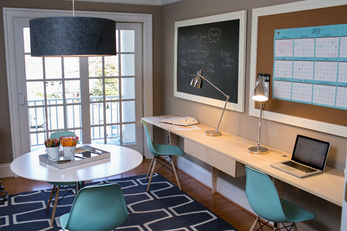
If you like to move around: Give yourself several options of places to work within a space — a traditional desk along one wall can hold your laptop, while a round table in the center of the room is available to sit and read, make notes or brainstorm. A standing-height desk is another great option if you like to move around, and it is healthier than sitting to boot. 

If you like to be surrounded by bustling activity: Do you work best in cafes and other busy spaces? Then consider designing a workspace you can share with your kids or housemates, or set up shop in the kitchen where the action of everyday life can flow around you. Be sure to make room for speakers, and turn on favorite music or podcast while you work. You could even try listening to real coffee shop sounds courtesy of Coffitivity, a free online site that provides ambient background noise while you work. 

If anything remotely office-y makes you squirm: There is no rule that says you must outfit your home workspace with a desk and desk chair. A dining table can be called into duty as a spacious desk, and any comfortable upright chair can be used as a desk chair, as long as you are not logging many hours at a time in it. 

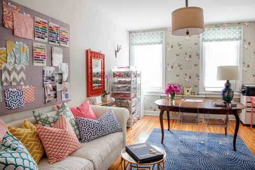
If you do choose a proper desk chair for ergonomic reasons, there are still many ways to bring more home into your home office — try a cushy rug, colorful wallpaper, a pretty table lamp and artful accessories.
 

If you are a daydreamer: Rather than fight the tendency to daydream, embrace it. Set up your desk in a spot with a view — upstairs looking out a window (but far enough from the window that glare is not an issue) could be ideal. Or, place your desk facing out into a large room, so your eyes have somewhere to go when you glance up from your work. In a tight spot, try hanging an inspiration board, wallpaper, artwork or a mirror, and use plants to create a sense of depth. 


If you are a visual person: For visually minded folks (myself included), keeping important materials in view is a must. Try creating your own giant calendar using chalk paint in different hues. Or craft a giant bulletin board where you can pin to-do lists, calendar items and inspiration. Just be sure to limit what you put up to the truly essential, and edit regularly — too much visual stimulation and it becomes hard to focus.


If you are easily distracted: If the slightest noise or activity makes you lose your concentration, you need to cultivate a private space. Try to wrangle your own room if at all possible. If that can't be done, choose the quietest, least-used room, and do what you can to protect your own corner. 

The desk shown here, with its built-in screen reminiscent of a study carrel, is ideal for blocking out distractions while you work. You could also use a decorative folding screen or open-backed shelving to carve out workspace within a larger room.


If you are a minimalist:A few just-so pieces are all you need to outfit your workspace. Perhaps a beautiful live-edge wood desk, like the one shown here, will help inspire you to keep your space as clear as your minimalist heart desires. Make the move toward a paperless office, and you can do away with nearly all files and drawers.


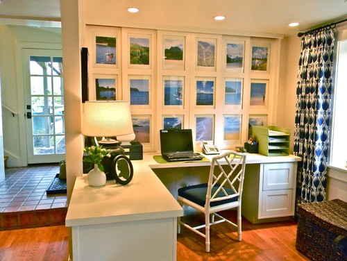
If you like to surround yourself with stuff: The polar opposite of the minimalists in their paperless offices, stuff lovers feel more comfortable with a happy amount of clutter. An L-shaped desk is great for those who like to toggle between spread-out papers and working on a laptop, and plenty of file drawers and cabinets provide storage for anything you might need close at hand.

Tell us: When and where do you do your best work?