twitter Facebook Google+

                 linkedin pinterest houzz  

Click for the BBB Business Review of this Countertops in Denver CO 

Google Review 

Sales & Promotions!

Architects, interior designers, and more ∨

Hire a decorator to find that just-right couch and coffee tables for your living room.
Find wall shelves, a customizable closet organizer and stylish furniture for home to whip your closet into shape.
Remodeling and Home Design

Qualify Us Now! ProView 

Cambria logoUp to $45,000 interest free for your project!Finance by Cambria

 convenient and easy.

  • No Money Down
  • Interest-free financing for up to one year without payments
  • Financing up to $45K for any project that includes Cambria (including cabinets, flooring, sinks, plumbing, install & more)
  • Secure paperless telephone application
  • Credit decision in less than 10 minutes


Wednesday
Jul172013

Love to Bake? Try These 13 Ideas for a Better Baker's Kitchen

Article By: Charmean Neithart

Having a baker in the family is a mixed blessing. Who doesn't love the aroma of sugar and butter circulating through the house? That's the good news: Baking equals good-house vibes. The bad news: That's a lot of calorie temptation to contend with on a regular basis. Yummy carbs are so hard to pass up. 

Baking is specific; it's really a science, if you think about it. Designing or modifying a kitchen for a serious baker requires some thought, even some field research. I recently put together some ideas for a baking enthusiast making some tweaks to her kitchen. Some ideas are suitable for small kitchens, while others work best in kitchens with a larger footprint. 

Grab a glass of cold milk — the cookies are in the oven. Here are a baker's dozen ideas to consider while you wait. 

1. Open shelves. Bulk storage of dry ingredients like flour and sugar is easily accessed from convenient open shelves.


2. Rolling cart. Design with function in mind. If you are short on wall space for cabinets or open shelves, consider a rolling cart placed close to counters that holds ingredients and equipment.


3. Tray and baking pan storage. Upright tray storage is ideal for bakers, because what's inside is easy to view and access; cabinets made specifically for trays are narrow and tall. Tray storage can also be placed in upper cabinets above ovens or a microwave.


4. Storage drawers and bins. Drawers are ideal for storage. Being able to view ingredients and kitchen equipment from above is practical. Also, bins with airtight lids keep ingredients fresh. 

 5. Tool display. A collection of paint-dipped bread boards is hung just like an art installation here. Even if tools are just for looks, hang them out in the open. This could also work with rolling pins or cake molds.


6. Roll-out drawer. Plan for a small roll-out drawer within your cabinet design. Use narrow drawers such as this for storing cookie cutters and measuring spoons.


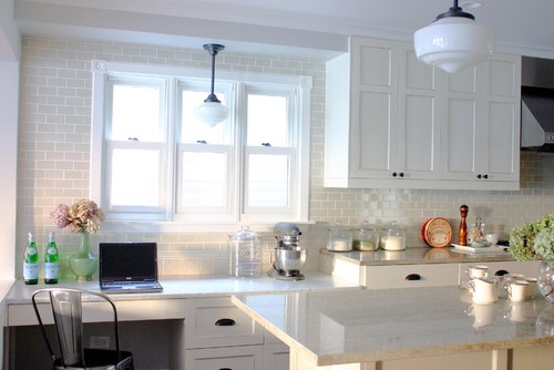
7. Tech corner. Plan for a small space where you can wire in a TV, desktop or laptop computer or just display an iPad. There are thousands of recipes and how-to videos online. Include a tech corner next to your countertop and bake right alongside your favorite demonstration video or cooking show.


8. Double ovens. If you have the space and budget, get wall-mounted double ovens; they're dreamy for bakers. 

Consider looking into convection heat as well.Convection ovens work with fans that recirculate heat, which is great for evenly baked cookies and crusts. Even baked goods such as croissants develop acrispy, even texture with convection heat.


9. Built-in step stool. If you have trays or pans stored in tall upper cabinets, consider a built-in step stool for easy access.


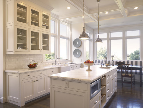
10. Workstation. If you bake on a regular basis, go ahead: Set up a workstation right on top of the countertop. Just like in a real bakery, make the countertops your work areas. Solid-surface countertops like marble and granite are ideal for rolling out dough. Display your tools and equipment right where you use them.


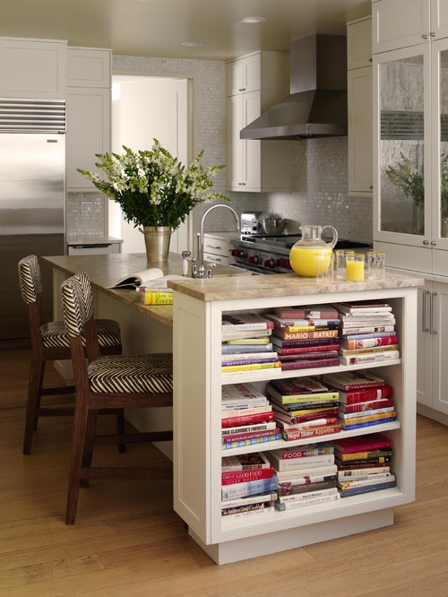
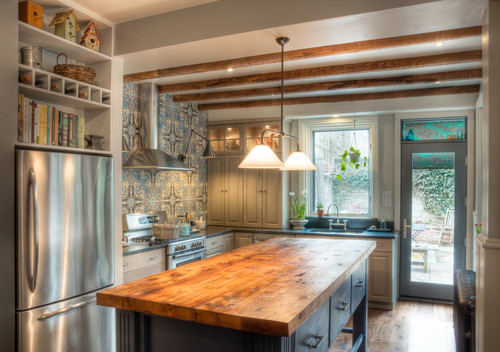
11. Cookbooks. Consider a bookshelf close to a working area. You may want to create easy access for frequently used books or recipe folders. A shelf next to a center island, for instance, is practical and good looking.


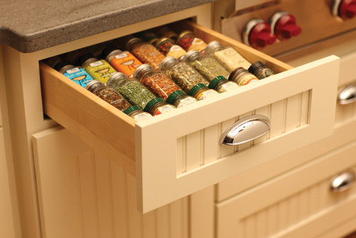
12. Spice drawer. Keep the cinnamon, nutmeg and all the rest at arm's reach. A drawer allows for a top view of frequently used spices and toppings. If you are into organization, alphabetize the spices within their rows. 
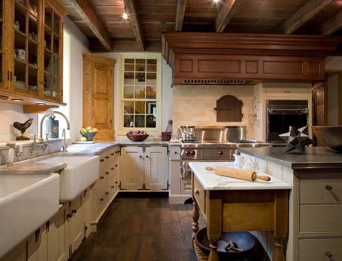
13. Pastry table. Plan a space for a pastry table in the main work triangle. Old-fashioned pastry tables are typically lower than standard countertops. A marble or similar solid surface is ideal for rolling out pastry or bread dough.
Monday
Jul152013

Homeowner's Workbook: How to Remodel Your Kitchen

Article By: Rebekah Zaveloff

You've decided to remodel your kitchen. Now what? Not knowing where to start, many homeowners fall into two camps. Some start by looking at appliances. Others start by collecting inspiring kitchen photos. Some decide they need more room. Others simply want to upgrade their current kitchen. Homeowners may find themselves in this exploration stage for a year or longer before they start interviewing kitchen designers or general contractors. 

Once you've pondered long enough and you're ready to green-light a kitchen remodeling project, then what? We'll start with the first 9 steps and we'll get into the nitty-gritty details under specific steps as we move through the complete workbook. 

Step 1: Think about what you need

This step is all about how you use your kitchen, and finding the layout and features that fit your household's lifestyle. Get ideas from every resource possible, including Houzz guides and photos, showrooms, books, magazines and blogs. 

Think about your priorities: how many people will be cooking and gathering here, and how they'll need to move around in it. Do you need an addition? Or can you work with your existing kitchen footprint?

If you haven't already, start saving photos of kitchens with features that suit your style. Your collection can be organized and beautiful like a scrapbook or it can be filled with random, unorganized images. I actually prefer the latter, because I like to randomly stuff images into my folders and ideabooks and go back to them later on for edits. 

Step 2: Research and plan

Ready to green-light that project and take the plunge? The best place to start is by formulating what's commonly referred to as a scope of work and figuring out your preliminary budget. 

Both of these may be subject to change, so don't feel like you have only once chance at this. Budget and scope are intertwined and often change many times during the design process as you become more educated and able to reconcile what you want and what you can afford. As a homeowner, you're not expected to walk into this knowing what everything should cost. Remember, this is an educational process. 

Step 3: Find the professionals you will need

Even if you're going the DIY route, unless you're building your own kitchen cabinets and doing your own electrical and plumbing, you're going to have to work with a professional at some point. It may be as brief as leaning on your salesperson to help you in selecting and ordering your appliances or cabinets, but it's something to plan on either way. 

Some people start by visiting big-box stores or cabinet showrooms where they can see everything. Many homeowners get referrals from friends or colleagues and start by hiring an architect or designer. Still others might work on their own with a builder or contractor. Pros are available to help you with everything from contracts and permits to space planning, budgets, choosing finishes and fixtures, shopping, ordering products, helping you set up a temporary kitchen, and managing your project from start to finish.

Step 4: Schematic design

This phase includes sketches, space planning, preliminary floor plans and elevations showing the layout and cabinet sizes. I try to keep my clients focused more on layout and space planning, even though the temptation is to talk about what the kitchen will look like. But I find that getting caught up in the look too early can distract from the space planning phase. 

Plus, you need a plan in order to figure out what materials will go where, and how many square feet you will need, and ultimately how much this will cost. I like to begin the contractor interview process early and give them a preliminary drawing packet and scope of work so we can get some ballpark construction numbers. At the same time you can be sending out drawings for estimates on some top choices of finishes and fixtures.

Step 5: Fixture and finish specification

Throughout this process, and probably long before, you have been saving photos of kitchens you love into your ideabooks and folders. You've found your style, whether it's modern, classic,traditional, cottage or a personal style in between. You probably know if you want a white kitchen, a natural wood kitchen, or some color

Now you need to make your final selection of finishes and fixtures. This usually includes: 

  • Cabinetry construction type, doorstyle, finish and color
  • Countertop material
  • Refrigerators and other appliances
  • Kitchen sink and faucet
  • Light fixtures
  • Flooring 
  • Backsplash
  • Decorative hardware 

Step 6: Work on design development and construction documents

This is the stage when you finalize the design and prepare final floor plans, elevations, details and, if applicable, mechanical and electrical drawings, lighting switch plans, and exterior elevations.

This is where your final permit set or Construction Drawings (CDs) come into play. It's important to have finishes and fixtures selected at this time, since this is what will be considered in the final pricing from the contractor. 

You'll submit drawings for permits. These have a lead time, so check the timing with your local village. You'll need an architect, designer or licensed contractor signed up to finalize the paperwork and pick up your permits, so get ready to hire someone in the next step. I often find that we're submitting for permits around the same time or a little bit after we've placed the cabinet order, due to similar lead times. 

Step 7: Get contractor estimates

If you don't already have a licensed contractor on your project, your next step is to find one to carry the project through. I always recommend to my clients to get at least 3 different contractor estimates. I like to do preliminary walk-throughs with the contractors once the schematic designs are done so we can get some ballpark estimates and find out if we're on the right track or need to pull back some to fit the budget.

Step 8: Get ready for demo

The big day is upon us, most likely something like 4-8 weeks from when you submitted for permits. Time to get that schedule firmed up and plan on cleaning out the cabinets, putting what you don't need in storage and — if you're living in the house during construction — setting up a temporary kitchen so you don't lose your mind!

You may be moving out of your house temporarily, but most homeowners white-knuckle it and try to live in the house through construction. Preparation and organization can save your sanity.

Discuss the logistics ahead of time with your contractor. Will you meet once a week for updates? Will you have to be out of the house for certain tasks like demo or flooring? What about debris removal and dust? Are there any family allergy issues? What is a typical work day for the crew? Getting all this on the table beforehand can set expectations and make for a smoother ride. 

Step 9: Surviving the dreaded punch list

Once construction is over, well ... almost over ... there's always this annoying little list of items that are missing, wrong, or simply forgotten about. A missing light switch plate, a caulk line that shrank and pulled away from the wall, paint touch ups — small things like this, and sometimes bigger things like the hood doesn't work, or there's a big scratch in the newly refinished floor. 

Sometimes the homeowner does the punch list. It can be as informal as an emailed list of items that need to be fixed or finished. I like to use a little form I put together that identifies the item to be fixed or finished, the responsible party and the date of completion. I send it to the client for review, changes and additions, and then off to the contractor. 

It's inevitable that the contractor may have to make multiple visits back to the house to finish these items; prepare yourself for more than one visit and you'll be fine.The best way to approach this is with a Zen attitude. Things happen, little things get missed. It's sort of like making a list for the grocery store and still forgetting some key ingredient. We all do it.

Friday
Jul122013

How to Pick the Right Floor for Your Garden Room

Article By: Billy Goodnick

Every room needs a floor, and outdoor garden rooms are no exception. Paths, decks, patios, overlooks, trash can storage pads, lawns, ground cover plantings ... they’re all floors. If you can walk on it, store something on it or roll around on it, I call it a floor. 

The simplest, least expensive floor material is the dirt that comes with a property. Unfortunately, the problem with an all-dirt garden floor is, well, it’s dirty, even downright muddy when wet. It does have one redeeming trait: It's dirt cheap. But it's highly likely that you'll have to choose something other than dirt for most of your garden. How to decide, given all the options? As with any design decision I make, I look for practicality, beauty and sustainability.
 

As the saying goes, form follows function. So first consider how the surface will be used and what's the most appropriate material to support that use. 


Loose materials for more casual spaces. I consider loose materials like crushed rock, graveland shale (also bark mulch) when I want an informal garden pathway or lounging area. They usually cost less and require less labor than other materials, and you don't have to be a master builder to make them look good. But because these materials can be movable after placement, you'll need to do some maintenance to keep them from wandering off.

Hard materials for more formal areas. On the other hand, hard materials such asflagstone, brick, tile, concrete and lumber lend themselves to more "civilized" applications like patios, decks and entryways. These generally withstand a lot of traffic and can easily be cleaned with a broom, a washing down (preferably not in water-scarce climates) or an electric blower, if that's your tool of choice.

Visual appeal. But we seek more than just utility. The first thing we notice in a garden is its visual appeal and sense of style — not how easily ketchup stains can be vanquished. Take cues from the materials and finishes of your house as well as influences from the natural environment.

Environmental impact. Think about where the materials originated, whether they come from recycled sources and whether they are permeable. If you don't know, ask.

Cost. For most of us, cost is the elephant in the room. The best advice I can offer here is to notbe penny wise and pound foolish. I've found time and again that a bit more expense (sometimes a lot) on the front end assures that you've selected the best floor for the job, the one least likely to come back and bite you later.
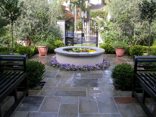
 

7 Materials for Outdoor Floors — and How to Use Them


Stone. Stone is enduring and elemental, taking many forms. Where a naturalistic style is most appropriate, irregular slabs of flagstone edged with dainty ground covers look right at home. In formal dining terraces, geometric shapes solidly mortared to a slab are a practical solution, assuring that the stones stay in place and provide a level surface. 

When it comes to selecting the right stone for your project, consider not only the color, but also its surface texture. Too smooth and it might present a slip hazard; too irregular and you'll have a hard time leveling a table (or walking in 6-inch stiletto heels — not a problem for me).

Stability and safety are paramount concerns, so be sure to set the stepping stones on a well-compacted base with some of their mass underground to keep them from tilting and moving around. Check that pathway stones are large enough and ergonomically spaced so you can land on them without having to delicately dance from one to the next.

The color of the stone should harmonize with the exterior of your home, other garden hardscaping and natural elements. You'll find a wide range, from nearly black to gray to white, and browns including rusty oxide-infused shades.

Brick. Brick is another durable flooring material that can express the aura of a classic garden. If the visible foundation of your house is brick, use the same brick as a walkway border to bind the house and the garden into a coherent composition. Or you can unleash your artsy, bohemian style by creating random patterns and infusing the design with random sprinklings of other materials, like stone or decorative tiles.

If you're the one responsible for rolling the trash cans from the side yard to the curb every Thursday evening, you'll be happy you passed on a pea gravel path and went with a continuous ribbon of mortared brick.

The color palette for brick requires additional design decisions; colors include a range of nearly black through gray, brown, red and some yellowish tints. Although individual bricks are rectangular, there are endless patterns to experiment with, including traditional running bond, herringbone, basket weave, radial spokes, gentle curves and whimsical layouts that look like someone pounded down one too many beers at lunch.


In formal situations brick is laid on a compacted bed of masonry sand or mortared onto a solid slab of concrete. This approach ensures that the brick will not subside or shift, a critical detail under tables and chairs. For paths the standard approach is to set the outer edges of brick in a solid concrete base, pave the inner surface with brick set on well-compacted mason’s sand and then brush more sand into the joints to lock them into place.

For shady, moist areas where moss can cause slip-and-fall accidents, be vigilant about choosing materials, like brick, that can withstand a strong blast from a hose or deep scrubbing with a coarse broom.

Caution: Where the ground freezes, loosely set brick can heave, making the path uneven and possibly dangerous. And steer clear of mature trees with surface roots.


Tile. Tile, like brick, offers a broad palette of styles, ranging from crisp, contemporary forms to old-world Mediterranean. Because tile is thin and unable to bear much weight on its own, it is always mortared to a solid foundation. Be careful to avoid slick surfaces, since they can become dangerously slippery when wet.


Concrete. Square foot for square foot, concrete is a smart long-term investment. It starts off in a semiliquid state, meaning it can assume any shape. If plain old sidewalk gray isn’t your style, concrete can be textured and colored to look like stone, seeded with pebbles, pocked with rock salt or stained with intense pigments to create bold designs. One problem with traditional concrete, though, is it's impermeable; it sheds water rather than allowing it to percolate into the soil where it can do some good.
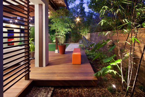
Decking. A contractor friend of mine calls wood decks “dry rot in slow motion.” He’s pretty spot-on. Traditional wood decks, regardless of how much waterproofing sealant you apply each year, will eventually succumb to nature’s forces (or termites). 

But if you’ve got a sloping property, need a level surface for outdoor entertaining and want to avoid the expense and disruption of building retaining walls, decking is the way to go. Since you’re not likely to add on to the deck once it’s built, now is the time to decide how it will be used and make space for all the furnishings you want.
 

To avoid the effects of weathering and decay, consider building with manufactured plastic lumber made from recycled bottles, plastic bags and wood scraps. It comes in standard lumber sizes, connects with screws and doesn’t rot, making it ideal for rooftop getaways. 


Loose materials.Although they might seem like a low-budget cop-out,loose materials like gravel, crushed rock, compacted shale and decomposed granite can be an inexpensive yet elegant choice, especially whenedged by a richer material, like stone or brick. Advantages include permeability, low cost and ease of installation.

However, these materials are more likely to be displaced, especially if water passes over them. And gritty, sandy materials are the last things you want to track onto your hardwood entryway. One of my favorite design treatments for upgrading crushed rock paths uses enriched thresholds and intersections of stone.


Plants. In addition to inert materials, there’s all the living stuff. Once again, your choice should be guided by the intended use: Active recreation, for example, calls for the evenly mowed surface of a tended lawn.

Another consideration is how "at home" a lawn is in your climate. Where rainfall is dependable and plentiful, you needn't be too concerned about using potable water for irrigation. And there are lots of organic approaches to lawn care, so you can avoid the old-school arsenal of chemical sprays and treatments that can be detrimental to beneficial insects, wildlife and groundwater. But in arid climates, more and more people are going lawnless to help conserve water as well as lower their dependence on fossil fuels for mowing and edging.


Meadows, with their tussled, just-got-out-of-bed appearance, are ideal for creating a rustic feeling — and can attract a diversity of beneficial insects and other cool things for kids to discover. You can walk through them or mow romantic, sinuous paths to explore. If you don’t need to wander through the space, any combination of ankle-high perennials and ground covers can provide color and an open expanse that will carry the eye across the garden.

Wednesday
Jul102013

Transition Time: How to Connect Tile and Hardwood Floors

Article By: John Whipple

Transitioning a bathroom's tile floor to the hardwood of another room is often given little forethought. However, not planning the transition can result in a final product that doesn't meet your expectations, or a floor assembly that's destined to fail. 

Most of the floor framing in North America is designed to meet a base industry standard. This standard (usually measured as a deflection rating) allows for materials like small ceramic tile, vinyl, carpet and hardwood to be used on floors. But these days most of my clients want large, natural stone tile. 

Many also want the tile to transition seamlessly from one room to the other. This can be done, but most homeowners don't know that their home has to be designed with extra strength and rigidity to carry this weight. 

Below you'll learn what to specify when planning a transition from tile flooring to hardwood. 

This bathroom is a great example of current trends in bathroom design: plenty of space, bright light, a great soaking tub and a walk-in barrier-free shower. 

Notice the flush transition from hardwood flooring to tile. Looking closer (click on the photo to enlarge it), you'll see that the tile is large (about 1 foot by 2 feet) and made of marble; both features require a stiffer floor than most homes have. 

Tip: If you're working with large-format tile or natural stone, specify that your rooms meet a stronger deflection rating: L/720, instead of the base-standard L/360. This number indicates how much flex a floor has before tile is installed — both the Tile Council of North America (TCNA) and the Terrazzo, Tile and Marble Association of Canada (TTMAC) require L/720 for heavy installations.


Most of today's floor tile is โ…œ inch to ¾ inch thick. Most hardwood flooring is ¾ inch thick. This means that when you put tile next to hardwood flooring, your tile choice will be critical for a flush transition. 

Simply tiling on top of a plywood subfloor is not an option — this practice is frowned upon and is not permitted by the TCNA or TTMAC. However, you can install a thin uncoupling mat (like Laticrete's Strata Mat or Schluter Systems' Ditra) to meet the tile industry's requirements. 

Tip: Installing a second layer of plywood over your subfloor and under your hardwood allows for more floor preparation options in the future. This is also a valid option if your home's floor joists were not designed for a stronger, heavier floor. However, this should be planned early on, since it affects how your stairs and stair risers are built.


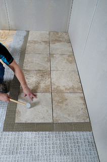
Here's an action shot of tile being installed over an uncoupling membrane from Laticrete, which prepares the plywood subfloor for tile. 

Tip: If your floor isn't strong enough to meet the right deflection rating, an uncoupling membrane won't help. Increasing the floor joist width or adding another layer of plywood is a better and safer option.


Here Tarkus Tile is prepping for a tile installation with a second layer of plywood and an uncoupling membrane. The orange material (Schluter Systems' Ditra) was installed with a quality modified thinset (mortar). Since this home's existing framing was not suited to hold the new tile selection, the installers beefed up the subfloor to make sure the installation would last for years to come. 

Tip: The choice between a flush installation from tile to hardwood and one that meets industry guidelines should not be a hard one. Always follow industry guidelines! They will probably be stricter than local building codes.


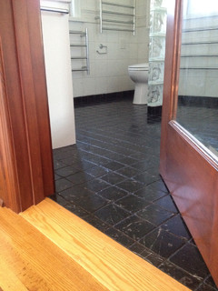
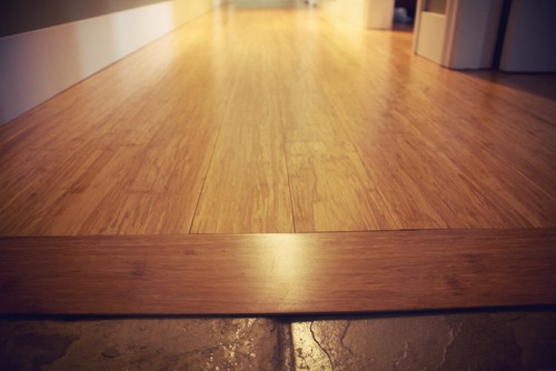
This custom oak transition helps adjust for the difference between the bathroom floor and the bedroom floor in this master suite. This is often called a reducing wood transition, because it works with two surfaces, reducing their height differences.

We centered the tile installation under the door, so when the door is closed you see only tile in the bathroom and oak in the bedroom. 

Tip: I find that these transitions look cleaner if the door jamb (the vertical part of the door frame) overlaps the tile a little bit. But this is hard to do if the tile hasn't been installed yet. If possible, install your bathroom door after the tile installation.


The simplest way to link floor tile and hardwood of different heights is with a transition strip. These strips can be finished to look like the floor or painted to stand out. 

Tip: Leave โ… inch to ¾ inch of space centered underneath the door for the bottom of the transition strip. If you affix a piece of scrap baseboard or plywood in the same size, it'll help keep this channel clean of thinset, making the transition strip much easier to install.
 

A custom transition can be milled by your flooring contractor for installation after the tile is complete. Notice where the wood transition meets the tile here — the wood is not cut to a feathered edge but kept to about โ…› inch thick. This makes the edge stronger. The reducing transition also overlaps the tile, which helps with movement, since wood and tile expand at different rates.


Kitchen designs, bathroom designs, and more ∨

When decorating or building a home, don't forget about the walls.
For small bathroom ideas, browse photos of space-saving bathroom cabinetry and clever hidden mirrored medicine cabinets.


Monday
Jul082013

Go for the Glow: Mother-of-Pearl Shines Around the Home

Article By: Ines Hanl

Mother-of-pearl has been used since ancient times to make people and their homes more beautiful, but today's manufacturing techniques have made this product even more accessible and economical. "Mother-of-pearl" is the common name for iridescent nacre, a blend of minerals secreted by oysters and other mollusks and deposited inside their shells; it coats and protects them from parasites and foreign objects. 

Now we can use this wonderful material in our homes in a wide range of products. Mother-of-pearl tiles, wallpaper and countertops can adorn a space with the same elegance that a pearl necklace adds to an outfit. It's not cheap (mother-of-pearl tile starts at about $30 per square foot), but it can be just the splurge you need to set your project apart from the crowd.
 

Mosaic tile. Available in a wide range of natural hues, mother-of-pearl tile and mosaic blends are made from the nacre on shells like capiz, black lip, brown lip, paua and violet oyster.


White mother-of-pearl appears iridescent naturally, but it can be artifically tinted to almost any (sometimes shocking) color.
 

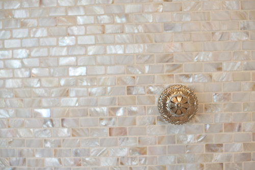
This is a beautiful example of mother-of-pearl on a kitchen backsplash. This shell tile is often thin, unless it's mounted to a thicker substrate, so if it's combined with another tile, it'll need to be built up to look flush.

If you're not sold on a shell product but love the iridescent look, look for manufacturers that produce iridescent glass mosaics. White iridescent glass can look quite similar to mother-of-pearl tiles.


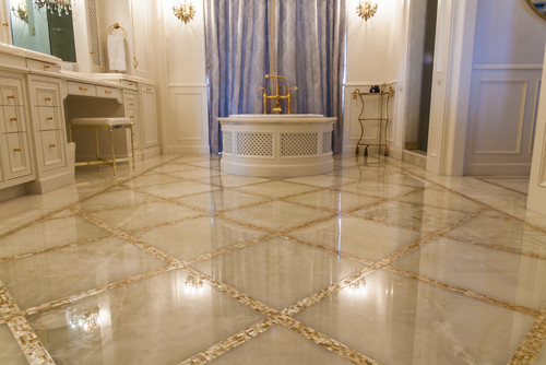
Flooring. What a elegant mix of natural stone and mother-of-pearl! This application is a great example of layering textures in a white-on-white application. Note how the simple act of creating a border around a well-proportioned floor tile strengthens the grid pattern.

Mother-of-pearl can be used for walls, floor surfaces (make sure to check with the manufacturer) and sometimes outdoor applications.


Accents. If you are craving the glow but don't have the budget for a full iridescent wall, use mother-of-pearl mosaic tile to add a bit of sparkle to an accent. Mirror frames, side tables and table lamps can all shine with mother-of-pearl tile.


Inlay. Mother of pearl is a very suitable product to be cut into shapes. The cut shapes, called tesserae, are often used as inlay on furniture and other decorative home accessories.


Sinks. Shown here as a semivessel model, a mother-of-pearl mosaic sink, like those fromLinkaSink, can be cleaned with mild household cleaner or soap and water. The grout can be cleaned with grout cleaner; it should be sealed once or twice a year for maintenance.


FurnishingsMother-of-pearl cabinetry faces utilize shell panels, rather than tile. These panels are laminated shell tiles and come in a variety of shell types, colors and sizes

Nusa Furniture often uses mother-of-pearl in combination with coconut on its furniture. The dark chocolate of the rough textured coconut and mother-of-pearl's creamy iridescence make for a delicious mix on this storage cabinet!


Wall coverings. Maya Romanoff, who specializes in luxurious wall products, offers a flexible tile that can be applied like a wallpaper. The tile is a thin capiz shell veneer applied to backing paper with a topcoat for easy maintenance. York Wallcoverings and Franco Ferrucci offer similar products.

Maya Romanoff's wallpaper starts at $45 per square foot (plus installation). Candice Olson's mother-of-pearl wallpaper starts at about $110 per double roll (about 60 feet of wallpaper).


Countertops. Icestoneuses mother-of-pearl as one ingredient in its countertop products. A cementitious base product mixed with recycled glass shards and mother-of-pearl creates beautiful color blends


Mother-of-pearl accents bring a wonderful glow to Icestone countertops, enlivening a space in a calm way. The use of small pieces of glass doesn't feel as aggressive as in some other products. 

From personal experience, I recommend using Icestone only in areas where there's no risk of staining the surface. I've used Icestone quite successfully in bathrooms and laundry areas.

Icestone countertops are comparable to mid- to high-end granite in cost. Allow for about $150 per square foot (including installation) in you.