twitter Facebook Google+

                 linkedin pinterest houzz  

Click for the BBB Business Review of this Countertops in Denver CO 

Google Review 

Sales & Promotions!

Architects, interior designers, and more ∨

Hire a decorator to find that just-right couch and coffee tables for your living room.
Find wall shelves, a customizable closet organizer and stylish furniture for home to whip your closet into shape.
Remodeling and Home Design

Qualify Us Now! ProView 

Cambria logoUp to $45,000 interest free for your project!Finance by Cambria

 convenient and easy.

  • No Money Down
  • Interest-free financing for up to one year without payments
  • Financing up to $45K for any project that includes Cambria (including cabinets, flooring, sinks, plumbing, install & more)
  • Secure paperless telephone application
  • Credit decision in less than 10 minutes


Entries in Design (22)

Monday
May062013

Kitchen Design: How to Avoid Standing Room Only


Photo Credit: Dennis Jourdan Photography via Remodeling Magazine

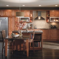
Room for Two: Alder cabinets, honed granite countertops and a tumbled marble backsplash give this kitchen a rustic feel.


The homeowners of this 1920s house (pictured above) had been planning a kitchen remodel for a long time. They went so far as to work on a design that would enclose the porch to expand the space, then got cold feet during the market downturn, and, worrying about the return on investment for an addition, put the project on hold.

By the time designer Diane Lawson, of Diane Lawson Designs in Nashville, TN; met the couple, they had revisited the project but had opted to stay within the existing footprint. However, they presented her with a long list of desires that included: good traffic flow for two cooks, separate cooking areas, an island, increased storage, and a rustic Italian design and details that would blend with the home's Italianate style. 

Though most homeowners today want to open up the kitchen to the rest of the house, Lawson says this couple bucked the trend, choosing to maintain the separation from the living and dining rooms.

Fitting in the long list of the client's wants required some compromise, including a peninsula rather than an island, but Lawson viewed the project as putting a puzzle together to set all the pieces neatly in to the outline. 


Photo Credit: Dennis Jourdan Photography via Remodeling Magazine

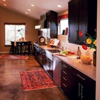
Window & Wall Upgrade: When the original windows were replaced with low-E units, insulation was also added to the exterior wall.


Puzzle Pieces

To help create a rustic Italian feel, the clients chose knotty alder cabinets. Lawson says that this species has increased in popularity during the last 10 years and that the wood - sometimes referred to as "poor man's cherry" because of it's similar grain and reddish tones - can cost 10% to 15% less than cherry.

Since not all manufacturers carry alder, Lawson opted for custom cabinetry. Going with a custom shop also had the advantage of enabling her to maximize storage and create a furniture look with cabinets that fit the age and style of the house. "[The choice] boils down to [the client's] wish list and what they are looking to achieve," Lawson explains. "And, of course, budget."

The clients wanted to use the same finish throughout the kitchen - a rare choice these days, Lawson says. Currently, most of her clients are opting for a contrasting finish for the island. 

Lawson had known remodeler Michael Menn, of Michale Menn Ltd., in Chicago, for almost 20 years and brought him on to help her with the extensive remodel.  The ceiling above the sink had a soffit. Menn removed it to accommodate Lawson's design, which took the cabinets to the ceiling to provide extra storage. 

One of Lawson's biggest design challenges was the traffic pattern for the family's two "heavy-duty chefs" and keeping them out of each other's way. The original freestanding island really affected the pattern, so Lawson moved the island to abut a wall. "While you don't have access on all four sides [of the island]," Lawson says, "it gave us more room in the busy aisle-way, which is the main entry into the kitchen and is where we needed as much space as possible" - especially when one of the cooks is standing at the island prep sink

The island has a small trash cabinet and a shelf for the client's heavy stand-mixer.


Photo Credit: Dennis Jourdan (photo) | Nicole Babcock (floorplan) via Remodeling Magazine


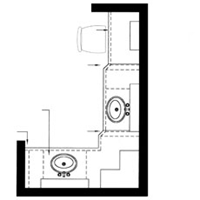
Into the fold: Removing the door and adding upper and lower cabinets makes this former pantry feel like part of the main kitchen.


Photo Credit: Dennis Jourdan (photo) | Nicole Babcock (floorpan) via Remodeling Magazine


Cook Nook: The second pantry has a microwave and an oven. The existing laundry chute remains - but it has been reframed to match the cabinetry.


Separate Yet Cohesive

The existing 360-square-foot kitchen included two under-utilized pantries. Lawson thought the 18-square-foot closet next to the stove alcove would work better as a butler's pantry, so Menn removed the door to make it part of the kitchen and replaced the wire-rack shelves with cabinets that match those in the main kitchen. The L-shaped run of cabinets has upper and lower cabinets and a countertop. An undercounter wine refrigerator is the only appliance. 

The other 24-square-foot closet is closer to the dining room. Lawson considered removing the walls to incorporate it into the dining space, but there were two obstacles to doing that: a laundry chute in the closet and a two-story chimney that runs adjacent to that pantry. "We were bound," Menn says, but the team also thought that retaining the quaint "little pockets" of space matched the style of the 90-year-old home. As they had done with the other closet, the crew removed the door. The existing closet had some shelves, an outlet, and a hanging bulb. The new space contains an oven, counter space, and upper shelves with a microwave. The wife likes to bake, and this area gives her a space to work in while her husband prepares food in the main kitchen area.


Photo Credit: Dennis Jourdan Photography via Remodeling Magazine

Brick or Treat

The original cooking alcove was outlined with faux brick. The clients liked the idea of a brick alcove and felt that it fit well with the new design's rustic feel. And, Lawson says, the material ties in with the brick porch outside the kitchen.

Menn and Lawson thought the alcove could be enhanced to make more of a statement, so Menn's team created a taller, softer arch at the top of the opening and installed real brick - cut ¾-inch thick - on the entire wall, as well as on the wall adjacent to the butler's pantry.

The alcove also has contermporary features, including a sleek stainless steel hood, a Wolf cooktop, and a stainless steel storage drawer custom-made by the cabinet shop. The hood is actually made for an above-island installation that the clients had considered for the addition version of the project. They liked the shape, so Menn installed it here. He made custom ductwork to meet local code and vented the hood through an exterior wall. Narrow base pull-out cabinets flank the stove and hold spices. 


(You're reading Standing Room Only originally posted on Remodeling)

Monday
Apr292013

Design 101: Common Kitchen Shapes That Blend Beauty and Function

We all want our kitchens to be both beautiful and functional. And while you may have an idea of how you want your new kitchen to look, balancing proportion and scale to achieve a harmonious whole is critical. However you'll also want to understand the factors that impact how it feels to be in the space. Here, we've gathered some information on kitchen shapes, optimizing functionality and how to ensure a layout works for you and your family.

Your Lifestyle and Your Home Will Influence Your Kitchen's Shape

Are you an aspiring cook? Do you like to entertain? Is counter space a premium? These are just some of the considerations that will determine which kitchen shape is right for you.

Photo Credit: Omega | MasterBrand Cabinets, Inc.

U-SHAPED

Popular with many cooks because of its efficiency, the U-shaped kitchen offers generous counter space and provides an efficient workflow by creating a compact work triangle. It can however make the cook feel apart from a group when entertaining, as most movement will be facing one of the three walls.


Photo Credit: Omega | MasterBrand Cabinets, Inc.

L-SHAPED

The L-shaped kitchen offers flexibility for both large and small homes. This shape utilizes only two kitchen walls, providing an open sensibility. The L-shape minimizes traffic through the kitchen and, typically, features larger expanses of countertops, allowing ease of preparation at mealtime.


Photo Credit: Omega | MasterBrand Cabinets, Inc.

L-SHAPED WITH AN ISLAND

An L-shaped kitchen with an island is ideal for entertaining. The ample counter space along the "L"of the kitchen becomes the primary work area, while the island allows guests or other family members to gather, to help prepare or just visit... AND to stay out of the way of the cook!


Photo Credit: Omega | MasterBrand Cabinets, Inc.

G-SHAPED

A modified "U" shape, the G shaped kitchen is very efficient. However, unless one or more of the walls are designed as half or "pony" walls, this kitchen shape can feel confining for today's cook. 


Photo Credit: Omega | MasterBrand Cabinets, Inc.

SINGLE WALL

This layout positions all of the appliances on a single wall, and would typically be found in a studio apartment or other very small space. 


Photo Credit: Omega | MasterBrand Cabinets, Inc.

GALLEY

Open on both ends, the Galley requires a minimum corridor width of 48" so that the cook can easily maneuver during meal preparation. Typically, appliances are near one another which is convenient, but due to the corridor shape of the kitchen, all of the household traffic will pass through the space. 


Efficiency Has a Shape: The Triangle

The basic work triangle is comprised of an imaginary line drawn between the kitchen's primary work areas:

  1. food storage (refrigerator)
  2. food preparation (stove)
  3. clean up (sink)

For maximum efficiency, the sum total of the triangle should be 26 linear feet, with the sink being the center point. 

What You Can Expect From Your Designer

In addition to offering guidance on door style, wood type and color selections; a professional kitchen designer will typically prepare three types of documents for your review:

  1. floor plan
  2. elevations of all the wall that receive cabinetry
  3. perspective view from one of more vantage points within the room

Availability of these documents to the consumer is usually contingent on a contractual agreement and/or down payment. 

Photo Credit: Omega | MasterBrand Cabinets, Inc.

FLOOR PLAN

A floor plan shows the wall layout from above, and an outline of all the components that will fill the space, such as base, wall and tall cabinetry. Sometimes lighting and electrical detailing are also shown on this plan.


Photo Credit: Omega | MasterBrand Cabinets, Inc.

ELEVATION

A "flat" drawing that shows each wall of cabinetry as if you were standing and facing it head on. The elevation view is good for seeing the detail of the cabinetry components that aren't visible in the floor plan view. It is also good for establishing heights of components within the room. 


Perspective

A perspective drawing is one that is "3D" or dimensional. It shows the room as it would be actually seen from the viewpoint of a person 5'-6" in height. Perspective drawings provide details such as areas that are increased or reduced in depth, a dimensional quality that elevation drawings don't offer. 

Testing the Fit

It is a good idea to layout the proposed kitchen in the actual space. If the space is empty, this is easily accomplished a couple of different ways. Refer to the completed floor plan utilizing a tape measure and masking tape to indicate where cabinets and appliances will be located. Newspaper can be folded to adjust its size and then moved around within the space - perfect for determining just how big that island should be! If there is an existing kitchen in place, you'll have to improvise a bit. Both tape and newspaper can be used to outline new cabinets or appliances, helping you visualize your new space. 

Tuesday
Apr232013

Wanted Dead or Alive: 10 Criminally Outdated Design Features

What worked in 1980 doesn't necessarily work now. Don't believe us? Look in your closet. Chances are, you've weeded out the parachute pants, leg warmers and shoulder pads. Similarly, interior design choices are cyclic. Even expensive, must-have features eventually become outdated and need to be replaced. 

Is your home stuck in a time warp? That's fine, if that's what you like. But if you're contemplating selling, you'll want to eliminate the generation gap between your house and potential buyers. Where to start? These 10 outdated features are among the biggest offenders.

#1 Colored Porcelain

Photo via Zillow BlogToilets should not be red or pink or black or blue or green. This should go without saying, but neither should your sink or bathtub. Think white. If not white, think bisque. Just say "no" to the bathroom rainbow.


#2 Mauve

This color was hot in the 1980s and 1990s. Dusty rose found its way into home via carpeting, furniture, drapery, bedding and wall color. What's the season's 'it' color? The folks at Pittsburgh Paints suggest a palette made of red berries, modest muted stone and solid, reliable brown. Of course, if you're intent on selling, neutrals are still the safest way to go.

#3 Wood Paneling

This once popular wall covering will send potential homebuyers running the other way (unless, perhaps, it's solid, well-cared-for wood in a traditional cabin in the woods). You can paint over the wood grain, but you'll be left with the telltale grooves of the paneled surface. You can skim the paneling with plaster, sand, prime, and paint to make it look like drywall. A more expensive, time consuming option is to remove the paneling and rebuild or repair the underlying walls. 

#4 Popcorn Ceilings

Photo via Zillow BlogAlso known as cottage cheese or acoustic ceilings, this spray-on or paint-on ceiling treatment primarily was used from the late 1950s into the 1980s. These bumpy, dust-loving ceilings can be softened with water and scraped off with a trowel or putty knife. It's a messy job and one you may want to leave to a pro since the earliest versions of these ceilings contained asbestos. Note: the only thing more outdated than a popcorn ceiling is a dropped, acoustic-tile ceiling that was installed to hide a popcorn ceiling.


#5 Fluorescent Lighting

Photo via Zillow BlogYes, we know that compact fluorescent light bulbs are energy efficient, and we know that new technology allows for warmer, softer, dimmable lighting. Those aren't the lights on our most-wanted list; the real offenders are those commercial-style tube lights that are great for office buildings and not-so-great on kitchen ceilings. Replace one of these stark fixtures, an you'll soon be seeing the light. 

#6 Gold-plate

When it comes to faucets and other plumbing fixtures, gold is the odd man out. Some designers predict that gold - in the form of brushed or matte faucets - may make a comeback, but today's buyers appear to be much more interested in brushed nickel or oil-rubbed bronze. Shiny builder-grade brass is simply not an aesthetic for the ages. 

#7 Faux Finishes

Photo via Zillow BlogSponge painted walls were hip in the 1990s. Now, they just look like walls that didn't get a good coat of paint - same for rag rolling and stippling. The one faux finish that seems to have stood the test of time is a Venetian plaster finish, but even this Old World look must be done well and in the right setting. Prime, paint and get rid of the faux.

#8 Wallpaper Borders

Wallpaper is making a comeback, wallpaper borders are not. If you've got a 6-to-12-inch wide borer hanging at the top or beltline of a room, take it down; it's simply not doing you any favors. Babies' rooms are the one place where borders are still stylish. Even then, you'd be wise to consider a removable wall decal instead of paste-on trim. 

#9 Bad Carpet

Photo via Zillow BlogWall-to-wall carpet that's worn or stained can make your home incredibly difficult to sell. Clean dirty carpets. If they can't be cleaned, replace them. Even if they are in great shape, buyers will run the other way when they see carpet in outdated colors or patterns (floral! plaid!). Worst of all: shag.

#10 Counterproductive Countertops

Buyers hate worn, cracked laminate countertops and backsplashes. They're also not crazy about ceramic-tile countertops with grimy grout or plastic cultured marble vanities. Today's most fashionable countertops are wearing granite, marble, limestone or soapstone. If natural stone doesn't fit into your budget, you can update with new, more affordable counters in concrete, tile or laminate.


(You are reading an article originally posted on Zillow Blog

Monday
Sep242012

The Four Things Home Buyers Really Want in Kitchen Cabinetry

A great kitchen design can dramatically increase your property value - if you want to attract prospective buyers, your kitchen  is the perfect place to invest money. The trick is to get it to appeal to the majority of people by spending your money on what most of them really want.

Kitchen cabinetry can do much to attract the right buyers. There are four key factors to consider:

  1. QualityPhoto: American Cabinet & Flooring
  2. Symmetry
  3. Color
  4. Layout

If you can get these key elements right with your cabinetry, you're bound to have a higher home value.

Quality

The number of cabinets you have is not as important as the quality of the cabinetry. The fewer cabinets you add to your kitchen renovation, the less expensive it will be. Choose quality over quantity.

DO: choose quality hinges and runners, including soft-close drawers and custom made cabinetry.

DON'T: go for large fillers and ill-fitted modular cabinetry.

Keep the cost down by keeping the cabinet count down. Design the kitchen layout to keep it light, bright and with an open plan, without using tons of cabinets. 

Note: Excessive internal organizers aren't essential if you are planning on reselling your home. They are wonderful in adding value to your personal use of the kitchen but are not always a wise choice if you are renovating purely to sell. Internal drawer and cabinet fit-outs are often expensive, and the extra money you spend on these accessories may not come back to you when you're selling your property.

Symmetry

The eye is naturally drawn to appreciate symmetry and repetition. When you're renovating to sell, keep your kitchen cabinetry simple and appealing. Elegance has a way of being understated, and simplicity is key when you are trying to appeal to the majority of buyers.

DO: keep the wall cabinetry sizes the same where possible. Drawers look nice when they are large and expansive - if you have multiple sets, keep them the same size, with the same proportion of drawers.

DON'T: add multiple cabinets in varying sizes, try to keep the look and feel consistent in the whole space.

Light, Bright Spaces

Many buyers want an open, light and airy space. A kitchen that is white makes the space feel bigger. White is also a universally appealing color and leaves a blank slate so buyers can re-envision the space.

DO: keep the space open, bright and light with white cabinetry. If you want some contrast, go for a darker bench top. Backsplahes should be kept fairly neutral too - try to introduce texture instead of color into the backsplash. The more neutral and elegant the space is, the more potential buyers you will attract.

DON'T: use darker-color cabinetry which can make the space feel closed. While adding a strong color may suit your taste, it may not be to everybody's liking. You want to attract as many potential buyers as possible, and while white may not be the most daring color for your cabinetry, it's the most popular. 

An Open Layout

Designing your kitchen to have a sensible and open layout is pivotal to increasing property value when you're renovating to sell. The trend is moving toward open-plan living and multifunctional spaces. 

DO: have a large open-plan space with a kitchen island if possible. Buyers often want to multi-task in the kitchen. They want to cook, have their kids do their homework and socialize in it.

DON'T: place your kitchen in a small and poky room, the kitchen is now often the hub of the house and buyers want to see a kitchen that is interactive and sociable.


Monday
Sep172012

Decorate With Intention: Nourish Your Creativity at Home

Photo: Going Home To RoostWhether you knit, sew, paint, write or craft, chances are that you find it challenging to squeeze in as much creative time as you would like. It is all too easy to allow our schedules to be filled to the brim with obligations to others, but the fact remains that when we take the time to do the things that feed our creative spirits, we feel better. When fall approaches, and the coziness of home beckons once again, it's the perfect time to take up your chosen craft (or try something new).

These 11 ideas and beautiful, inspiring spaces will help spark your creativity, get you out of any ruts and support your craft side.

No more excuses! Avoid distraction and make the most of limited time

Even if you can set aside only 10 or 15 minutes, if you make them count - and repeat daily - you will be amazed at what you can accomplish. While it's true that some projects require a few longer dedicated work times, if we are being honest, mostly "I have no time" is just another way to procrastinate.

If creating is important to you, you probably can find the time. Set yourself up for success by avoiding easy access to the Internet and turning off all of your devices during dedicated creative work times - and let those you live with know how important this this time is to you.

If you need a big, open space, make it happen

If what you really need is an expansive surface to spread out on and you don't have a dedicated place with one, don't let that stop you. It's perfectly all right to call dibs on the dining room or kitchen table between meals, provided you can clear your work to the side relatively easily. Keeping a cabinet or drawers nearby will make it easy to sweep things off the table in a hurry.

Feeling stuck? Take a time-out for exercise

The next time a creative block hits, try taking a brisk walk, settling into a few yoga poses or lifting weights - anything to get your blood pumping. Exercise gives your mind a rest from actively thinking about your creative problem while improving circulation (and likely your mood). The best ideas can bubble up spontaneously during these time-outs, pulling you out of your rut in a much shorter time than if you had been trying to force an idea to come. 

Find a corner to call your own

Whether it is a small table pulled up to a sunny window, a closet that can be curtained off from the rest of the space, a tiny unused nook or a cabinet with a work surface hidden inside, it is important to find somewhere that lets you fully commit to your creative practice. There will be times when you must leave your work in the middle of a project, and it is so helpful if you can leave some of your materials out rather than needing to clean up completely every time. Don't fret if the only space you can find is a bit out of the way - sometimes a desk with a spectacular view is not as conductive to good work as a tiny nook, where you can focus your energy on the task at hand.

Make sure you have easy access to your materials

If you need to hunt and dig every time you want to work on your craft project, chances are that it's not going to happen as often as you would like. It's not necessary to keep every last item on display, but putting frequently used tools in an easy-to-grab spot is key. Fill an open-top bin or basket with your materials and store it in the room where you like to work.

Let your entire space reflect your creative passions

There is something to be said for having an entire studio devoted to your art (of course), but for most of us, finding creative space within the rest of our home is just how it goes. But that doesn't mean you must confine your creativity to one zone - in fact, the more you can integrate mini creativity spots throughout your space, the more likely it is you'll be tempted to make something. Try displaying your guitar on a stand in the living room, keeping pretty fabrics or luscious yarns in open cubbies, and stashing a stack of fresh notebooks and nice pens near your favorite chair.

Know when you need privacy

This tip is especially pertinent for those living with kids or roommates. Even if you have a large space, if others are constantly interrupting to ask you questions or chat, you need to find somewhere more private. Taking over part of your own bedroom with a worktable and an inspiration board could be the ideal solution. If you want to be really tricky, you can even pretend you are still sleeping - and squeeze in a little creative time first thing in the morning before anyone knows you are up.

Mood matters: Your creative space should inspire you

While it is true you should minimize distractions during creative time, that doesn't necessarily mean you ought to work in a completely unadorned room, either. Tap into what fuels your creativity and bring more of that into your space. Consider a small stereo if you enjoy music while you work, textiles or vintage objects that spark your imagination, an inspiration board where you can collect your ideas, and book you love; even fun wallpaper or a vibrant wash of paint can enhance your mood and help juice your creative spirit.

Entice yourself with inspiring quotes

I am a big believer in the power of words, and an apt quote has helped me out of a creative rut many times. Keep a rotating selection of favorite quotes, says, song lyrics and lines of poetry on a chalkboard or pin board, or simply taped to your wall for a quick boost whenever you need it.

Know that moments of humor in your decor make creativity flow

Keep the mood light in your creative space with a cheeky, fun touch like a decorated or "dressed" sculpture, a cheapo vintage portrait that you have drawn a mustache on or any object that brings a smile to your face.

Be open to creativity in all areas of your life

Creativity permeates everything we do, from our conversations with friends to preparing dinner for our families. Approaching everyday tasks with a creative outlook makes our daily life richer and more satisfying.