twitter Facebook Google+

                 linkedin pinterest houzz  

Click for the BBB Business Review of this Countertops in Denver CO 

Google Review 

Sales & Promotions!

Architects, interior designers, and more ∨

Hire a decorator to find that just-right couch and coffee tables for your living room.
Find wall shelves, a customizable closet organizer and stylish furniture for home to whip your closet into shape.
Remodeling and Home Design

Qualify Us Now! ProView 

Cambria logoUp to $45,000 interest free for your project!Finance by Cambria

 convenient and easy.

  • No Money Down
  • Interest-free financing for up to one year without payments
  • Financing up to $45K for any project that includes Cambria (including cabinets, flooring, sinks, plumbing, install & more)
  • Secure paperless telephone application
  • Credit decision in less than 10 minutes


Entries in Kitchen (78)

Monday
Apr142014

Key Measurements to Help You Design Your Kitchen

Article by:

Whether you are moving into an existing kitchen, remodeling the one you have or building a new one, understanding a few key measurements and organizational guidelines can help your culinary life run more smoothly. 

Kitchens provide storage for your food and cookware, give you room for prep and cleanup, and of course also provide a place where you can cook and bake. When it’s thoughtfully arranged, these functions operate logically, making work in your kitchen a better experience. Here’s how to get the ideal setup.

Ideally, refrigeration and dry-goods storage should be located nearest to the kitchen’s entry point. The cooking area should be located toward the dining spaces, and the sink is best positioned between those two functions. This creates what’s called a work triangle. The best work triangle is less than 21 linear feet (6.4 meters). Work triangles that exceed 26 feet (7.9 meters) make moving from one function to another inefficient in most cases.

This cutaway plan illustrates arrangements and dimensions for a modest-size kitchen. Note that the preparation area is split between the island with the sink and the corner of the kitchen. The work triangle is compact. There will always be a few tradeoffs in any space. 

Let’s take a look at the three main functions of a kitchen:

1. Storage
2. Preparation
3. Cooking

Everyone has personal preferences for what works best, so consider this a guide and not a rulebook.


Storage. As noted, designers recommend putting refrigeration and dry-goods storage at the kitchen entry point. Putting your pantry on one side and a countertop that’s 15 to 24 inches (38 to 61 centimeters) on the other is a good idea. This will allow you to easily set down items that have been taken out of the freezer and refrigerator.

The pantry can hold dry goods plus brooms and supplies like paper towels. Use drawers in this area to hold plastic bags, foil and anything that can contain food to be stored. For the cabinets in this area, you will want to have mixing bowls, cake pans, measuring utensils and any other items that aid in assembling meals.

Preparation. Ideally, prep and cleaning space is best located around the sink. Within these areas will be everyday glasses and dishes, along with trash receptacles and the dishwasher. Allow 18 to 36 inches (45 to 92 centimeters) of countertop space on one or both sides of your sink.

Preparation areas are best kept clear of other items, since you will always be taking out bowls, plates and utensils there. Allow at least 36 inches (92 centimeters) of uncluttered countertop space for preparation in a small kitchen. Larger kitchens will have much more. This is one reason that islands are so popular. They provide broad and well-lit surfaces on which to perform the majority of kitchen tasks.

Cooking. The cooking centers should be arranged around the range, cooktop and wall ovens. Place pots, frying pans and baking sheets in the vicinity around your burners and ovens. It is a good idea to place small appliances such as toasters and coffeemakers in this area also, as it will leave your preparation areas unobstructed.

Allow 21 to 36 inches (53 to 92 centimeters) of countertop on either side of your cooktop. If possible, place wall ovens with a free countertop immediately next to them so that you can set down hot food immediately. Place seasonings, breadboards and potholders in nearby drawers and cupboards. Keep serveware toward the dining area.

Recommended Dimensions of Kitchen Elements

The dimensions of all the pieces in your kitchen are important to get right to make the best use of your space. A common refrigerator width is slightly less than 36 inches (92 centimeters). The problem is often the depth. In recent years some manufacturers have designed them to be much deeper than a 24-inch (61-centimeter) base cabinet. You can still buy shallower freestanding refrigerators, but you have to pay close attention to the dimensions listed in its specifications to be certain. The other option is built-in configurations, but they are significantly more expensive. 

Look for a depth of 30 inches (76 centimeters) or less, excluding handles, unless you can design your kitchen space to accept a deeper unit. Another thing to consider is the swing of the refrigerator door. Always examine the swing direction to see if it will meet an obstruction.


Here you can see how the height of the cabinets plays an important part in the configuration. Upper cabinets are normally positioned at 18 inches (46 centimeters) above the countertop and are 30 to 42 inches (76 to 107 centimeters) in height. Consider that your average maximum reach over and into an upper cabinet is 70 to 80 inches (178 to 203 centimeters) above the floor. Cabinets set at above 7 feet will likely need to be accessed with a step ladder. Cabinets above 8 feet are not practical for the majority of people; however, they may serve as storage for seasonal or decorative items, to be reached with step stools and ladders. 

The standard dimensions for base cabinets are 24 inches (61 centimeters) deep and 36 inches (92 centimeters) high. In general people are getting taller, so some homeowners are bumping up the counter height to 38 inches (97 centimeters).


Another important dimension to consider is the distance between cabinets. Entry points can be as little as 36 inches (92 centimeters) when there is a cabinet on only one side. Stay at least 42 inches (107 centimeters) from the face of a cabinet to the one on the other side; 48 inches (122 centimeters) is even better, but going beyond 60 inches (152 centimeters) is too wide in most cases. However, if it is a U-shaped kitchen, you could get away with up to 96 inches (244 centimeters).

Wednesday
Apr092014

What to Know About Budgeting for Your Home Remodel

Article by:

The budget conversation — it’s sometimes awkward, often slightly uncomfortable and usually comes with a bit of anxiety. Because of the nature of construction, things often cost more than what homeowners think. There are endless debates on why that is, but the result is that we designers often have conversations with clients that end with an awkward silence. The silence usually means that certain aspects of their project might be out of their reach. And truth be told, we really don’t like being the messenger in these conversations. We want our clients to be satisfied with the process and get what they really want. 

But the flip side of that conversation is that budget constraints can make a project better. Just hear me out. What we find is that financial considerations make our team and clients focus on what’s really important. That pressure helps edit down the myriad choices and allows a more coherent story to emerge. And it all comes back to sticking to that budget. Here’s how.

Establish Your Budget Early

We have been in situations where clients have not told us their budget until we have completed some of the initial phases of work. This, no surprise, can slow down the process. It’s like going to a personal trainer but not telling them how much weight you can lift, and so you spend time trying a few exercises to figure out what the proper weights are. 

There are situations where homeowners generally don’t know what a new custom home or addition will cost, but a key part of the process is considering how much you would be comfortable spending on the project. Obviously spending $50,000 will produce a dramatically different result than if you spent $500,000. And what you spend will be influenced by a wide variety of factors, including neighborhood, type of project and level of finishes.

Without knowing a budget range, we could get through the first few meetings with clients and then give them a rough ballpark figure, which is sometimes double or triple what they thought it would be.

Don’t try to second-guess your design team by holding your cards close to your chest. Help us work with you to get the most value for your hard-earned dollars. Most designers don’t look for opportunities to waste money just for the sake of it. Sure we all want a great project at the end of the process, but we also want to make sure our clients are happy. So establishing your budget early in the process will be helpful to your team, as it will give them one of the key ingredients that will go into making a design you can live with.

Ensure Your Budget Is Realistic

It’s easy to look at TV shows and get the wrong idea about what things cost. In most cases those budgets are not realistic for a bunch of reasons, most of which revolve around how suppliers and trades price their services to be included on the show. There is an old project management saying that goes, “Price, speed, quality — pick any two.” 

It’s not totally untrue, and it underscores that there are no easy trade-offs in a construction project. It would be problematic for me to suggest pricing in this article, as it varies substantially based on a number of factors, including location, number of trades in the area, level of finish, complexity of construction etc. 

The budget number that most clients care about is the “all-in” number. That includes everything they will write a check for including moving expenses, fees and construction. (More about that later.) 

Your design team can help you get a sense of what a realistic budget might be for your project; you can also ask friends who have done projects in the recent past, or check the Houzz Real Cost Finder

Pricing tip: Pricing can change substantially in certain areas over as little as a few years, so be sure that the projects were completed recently for the best idea of pricing.

After you create your budget, subtract 20 percent. Construction being what it is, there are always situations that arise that will increase the cost, and those are hard to foresee at the beginning of construction. It’s a very complicated process involving many people and a lot of communication, so there usually are things that happen that will eat into that 20 percent contingency. The contingency should not be used for upgrades to counters or splashy fixtures. 

On a recent project, our clients had to spend thousands of dollars to get their utilities hooked up again, as the electrical feed from the street was torn up by mistake. On top of that, since the utility’s own drawings said that the feed still existed, there was a three-month delay on top of the reconnection order so that the utility could update its drawings. Even though this these will never be seen, they were absolutely critical and had to be completed before construction could be completed. 

Keeping a 20 percent contingency allows our clients to end up spending what they thought they would spend initially, and they can sleep at night.

Understand What You’re Paying For

Hard costs, fees, furniture — what is in the contract? Your design team will also help you understand what is in those budget numbers. Hard costs include the costs of the construction materials and fixtures required to actually build the structure. Soft costs generally include fees for permits, consultants and designers.

It’s important to establish what your team is referring to in conversation to make sure everyone is on the same page about budget numbers. For example, construction is often expressed in dollars per square foot to give a rough guide during planning. Generally this does not include appliances or soft costs. So it’s important to know that if your contractor says your new house can be built for $750,000, there are soft costs likely not covered in that estimate. Work with your design team to understand the costs and how they relate to a schedule, and how there are items you might not have thought about, to get an overall sense of what is required.

What if You Run Out of Money?

We have had this conversation with clients on more than one occasion, and truly it’s not easy for either the clients or us. It’s frustrating to hear how something that you’ve been planning for is out of your reach. 

There may be opportunities to reduce costs by changing the scope of the project. For example, instead of fully constructing a basement bathroom in a new house, you might just rough in the plumbing so it could be finished at a later date. Or it could be possible to reduce the cost of fixtures and finishes such as flooring or faucets.

During a recent conversation with clients, we recommended that they wait before starting the project so they could gather more resources before proceeding. In the discussion we realized that it wouldn’t be possible to “de-scope” or redesign the project to fit their needs, so the best course of action was to delay. Was this difficult for all involved? Absolutely, but we felt strongly that starting a project that didn’t address their needs wouldn’t serve their overall best interests.

Whenever you are dealing with money, there is the potential for some uncomfortable conversations. But if you understand what you are dealing with early in the process, those conversations will be less stressful than if you’re standing in the middle of a half-completed project in the middle of winter wondering where all your hard-earned money has gone.

Monday
Mar312014

Top 10 Reasons to Remodel Your Kitchen

Article by: Ann Johnson

For many households the kitchen is the center of the home and the hub of activity. Remodeling the kitchen can be a major undertaking. It is not just the expense, but also the inconvenience to the household that gives many homeowners pause when considering such an undertaking. In spite of this, homeowners continue to find good reasons to proceed with a kitchen remodel. Reasons for remodeling vary, and your neighbor may not share your top reason for the project.

1. Deterioration

The kitchen might simply be falling apart. Cracked tiles, peeling countertops, broken or missing cabinet doors and outdated appliances don’t inspire gourmet cooking or family gatherings. The deteriorated kitchen has simply outlived its usefulness and needs a remodel.

2. Value

Homeowners often remodel their kitchens to increase the value or marketability of a property. A remodeled and attractive kitchen will appeal to prospective home buyers more than a boring and outdated one. The homeowner may or may not recoup the investment of the remodel; this will depend on a variety of factors, such as the degree of the remodel and current market prices.

3. Energy Savings

Energy savings might be the prime motivation for a kitchen remodel. Adding skylights brings in more sunshine, reducing the need for artificial light. Energy-efficient appliances and solar water heaters cut the utility bill and place less stress on the environment.

4. Modernity

The kitchen can be pristine yet outdated. If the kitchen says 1950s, but you want to live in the here and now, it is time to transform your retro kitchen environment into a room for the 21st century.

5. Lifestyle

The kitchen layout may have worked great for the previous homeowner, but not for you. Perhaps it lacks a breakfast bar, and your family wants to gather informally in the kitchen to enjoy coffee or grab a quick meal without going to the dining room table. Whatever the reason, one motivation for a kitchen remodel is to arrange the room to best suit the family’s needs.

6. Special Needs

It is sometimes necessary to remodel the kitchen to better accommodate the needs of disabled family members. For example, if one of the family is in a wheelchair or no longer able to reach high cupboards, a remodel can make the room more usable.

7. Financial Incentives

The prime motivation behind a remodel might simply be financial incentives, such as energy-saving rebates offered by government entities or vendors. Financial incentives include sales at home improvement centers, cash rebates for trading in outdated appliances, remodeling grants and low- or no-interest loans.

8. Change

Some homeowners simply want change. The current kitchen might be functional, updated and attractive, yet no longer appeal to the homeowner.

9. Home Improvement TV

Watching home improvement shows on cable television inspires many homeowners to remodel their kitchens. They may never have considered such a project until a home improvement program showed them the possibilities for their kitchen.

10. Gourmet Kitchen

For a homeowner who enjoys preparing fancy meals and considers himself a gourmet cook, the prime reason for a remodel is the desire to create a dream kitchen. A gourmet kitchen with fancier amenities than most accommodates the cook’s needs.

Friday
Feb282014

15 Ways to Wake Up Your Kitchen With Accessories


Remodeling, decorating, and more ∨

Before you throw your next party, browse a wide selection of barware, glassware and serveware.
Light up your living spaces with recessed lights, designer chandeliers or even a row of pendant lights.


Wednesday
Feb262014

What to Consider With an Extra-Long Kitchen Island

Article by:

Unlike its isolated geographic cousin in an ocean, an island in the kitchen serves as a central gathering space. As our kitchens have become more and more connected to our living spaces, they’ve changed from being solely utilitarian to being social gathering hubs. The island is often a central player in having a whole host of functions now, and the longer it is, the more function you can pack into it. 

Typical kitchen islands range between 7 and 10 feet; the long islands in this ideabook begin at 12 feet. The long island has definite advantages; however, it’s not without a few special planning challenges. Let’s review what you’ll need to know to chart the course to your own long island. 


Flexibility

The more our homes can accommodate the many functions of everyday life, the better the chance they’ll meet our long-term needs, because needs invariably change over time. Long islands serve this idea well by acting as flexible workstations. Today’s kitchens must accommodate serving, cooking, seating, gathering, display and even work tasks. 

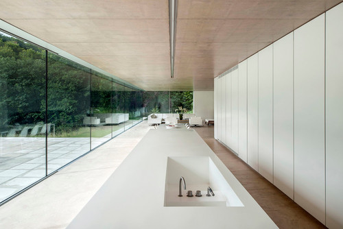
The underlying design idea for the modern extension seen here was deference to the landscape. The interior spaces are arranged to orient the occupants’ focus toward the exterior. This was done, in part, by minimizing interior obstructions to this view. And this long island seamlessly complements that vision. Its length accommodates gathering, storage and much of the function of the kitchen in one single move. 

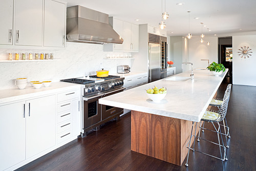
The architects have carried the clean, minimalist aesthetic to every last detail, taking care to recess even the faucet controls. By stripping this long object of any visual ornamentation, they’ve left multiple functions open to interpretation and whim.


Focus

One undeniable advantage of the long island is that it allows for a change in the traditional orientation of kitchen tasks. It does this by creating a workspace large enough to allow for all of the kitchen work — preparation, cooking and cleanup — to occur in and around the island, allowing the cooks to face their guests and family gathered in the kitchen.

This island’s design lends a laboratory vibe to the space. It’s freestanding and furniture-like, permitting dining for the entire family at one end, open and closed storage at the opposite end, and preparation, cooking and serving in between. It’s also proof that even a large island can feel light and open. Being proportional to the space is key here, and I love how this one functions as a communal worktable.


Function

The longer the island, the more roles it can play. In this kitchen the island is the clear focal point, and it houses much of its functional components. By extending the island, the architects were able to incorporate storage, a sink and multiple cooking appliances. By building in the long bank of storage, they eliminated the need for upper cabinetry; paired with the skylight above, this reinforces the open, loft-like feel of the space.
 

Long islands naturally come with broad expanses of counter space, something every kitchen can benefit from. Meeting both cooking and cleanup needs and dressed in hand-hewn walnut, this island was designed as a piece of bespoke furniture that measures 42 inches wide and 146 inches long.


Spatial Definition

Often our kitchens are cluttered with what we need to actually cook in the kitchen. While we’re eating, most of us aren’t interested in staring at the cooking mess we’ve left behind. 

Many modern spaces are interconnected and feel larger because of that openness. Walling off the kitchen to hide the clutter is not only impractical but unnecessarily confining. The architects here solved that by elongating the island to almost the entire width of the room and elevating the backsplash. 

Treating the island the same way as the wall of cabinetry at the rear of the kitchen clearly defines the kitchen as its own space, but still enables the cooks to be a part of the activity of the larger space. The backsplash here also functions as an appliance garage, with lift-up doors that conceal the appliances.


The thick divider can serve both sides of the kitchen. Facing the kitchen side above the counter and facing the dining area below the counter, it can function as storage cabinetry.

Spatial definition has been punctuated above this long island by an overhead plane clad in wood sized to match the island dimensions. This doubles as a place to locate task lighting for the counter.

Positioning the cleanup area of the kitchen closest to the dining space creates an efficient layout. And, while locating the sink across from the cooking zone in such a long kitchen may seem counterintuitive, it makes good design sense; it frees up more counter space. Because the cleanup area will be used after the cooking, placing these zones back to back isn’t the problem it may seem at first.


Seating and Dining

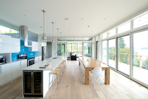
A popular choice for many islands is integrated seating. With a long island, the seating area can accommodate the entire family alongside guests. Diner-like in its configuration, this island comfortably seats eight or nine guests.

A good standard for counter seating is 2 linear feet per person. This will prevent elbow conflicts and be comfortable for most people. In smaller kitchens or spaces where a dining room isn’t possible, the long island can fill the role of a dining table. Here again this island’s proportion mirrors the proportion of the space.

Note the undercounter refrigerator at the end. This clever arrangement allows people to access beverages without having to cross into the kitchen and disrupt cooking tasks there. Long islands permit this kind of thoughtful kitchen zoning.


Clearances

It’s important that your kitchen island fit comfortably within the confines of your kitchen, and clearances are an essential consideration. A basic rule of thumb is to provide a minimum of 42 inches of working space around the island, even if you’ll be including seating. 

It is possible to push these recommended minimums. In this example the architects reduced the working space to 36 inches surrounding the island, maintaining a functional balance, given the narrow footprint of the row house.

Cabinetry and seating depths are also part of the size equation. Typical base cabinets are 24 inches deep; seating areas can be as shallow as 12 inches but are more comfortable at 18 inches. So for a two-sided island with seating, a minimum comfortable dimension would be 42 inches deep.


Materials

Choosing to match or contrast the island to the materials of the room is a critical decision. Choosing a fine hardwood will make it more furniture-like. Matching the surrounding cabinetry will clearly say it’s a part of the kitchen, while choosing an altogether different material will make it more of a table and something clearly distinct.

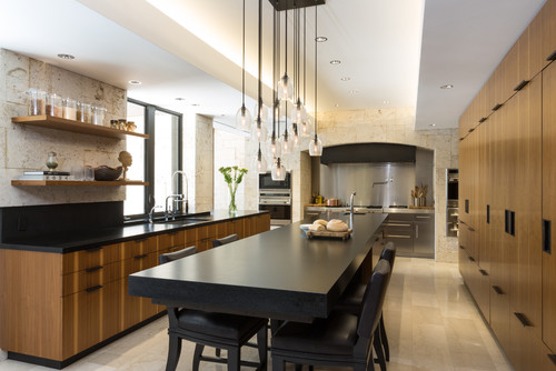
The island here contrasts the cabinetry but draws on a similar tonal palette. The black counter and hardware accents along with the pendant fixture tie this composition together without relying on one single material. It’s a more complex dialogue that adds richness to the kitchen. This island is 16 feet long with 40 inches of clearance around it and an amazing cantilevered seating area measuring 78 by 40 inches.


Just because they’re massive doesn’t mean long islands have to dominate a space. The focal point in this kitchen is the natural wood facing on the wall of cabinetry at the rear. 

In a walled kitchen such as this, a long island can be an obvious complementary design device. The cooking and storage wall requires counter space nearby, and the long island fits the bill with a horizontal surface for every inch of wall cabinet. Here again, note the cooking and cleanup zones.


Special Considerations

The benefits of a long island don’t come without a few pitfalls. Pay particular attention to:

Traffic Flow

Long islands mean long travel distances to get to the other side. It’s important to consider this when settling on an overall length and to understand how the circulation or flow of traffic will work. 

Storing items that need frequent loading and unloading from a dishwasher on the other side of an 18-foot island will mean lots of traveling back and forth. Establishing clear zones within the island is one way of mitigating this. So too is limiting the width of the island. This will mean loading the functional components of the kitchen on the kitchen side and keeping the seating areas on the opposite side or end.


Linear spaces pair well with long island configurations. Two obvious patterns of circulation exist here, and because of the narrow room dimension, the entire kitchen feels a part of the outdoors. This long island is the central spine of activity; with different functions pinwheeling off of it, it’s hard to tell where the kitchen ends and the living begins. In this way the long island becomes the Swiss Army knife of architectural space makers, humbly serving a multitude of functions.


Counter Seams

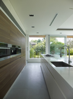
If your island extends beyond the typical 7 to 8 feet in length, you’ll face a more limited selection of seamless countertop materials. This island is 42 inches wide and 20 feet long. At these extreme dimensions, the architect certainly had to contend with seams.

Natural stone can be the most limiting material choice for long countertops, with the selection of slabs trailing off quickly when you reach 8 feet or longer. Manufactured surfaces (Corian, Richlite, Caesarstone etc.) can be had up to 10 feet in length and close to 5 feet in width. If it’s wood or stainless steel you’re after, your options are greater.


Seams aren’t as bad as you might think, though, as long you plan for them. This counter is 15 feet long and 4 feet wide, with a mitered edge giving it the appearance of a 4-inch-thick slab. See if you can identify the seams (there are two). 

Natural stone slabs can be book matched so the natural veining meets up at the seam, or a more even-toned slab can be selected to minimize the appearance of the seaming. It’s also possible to simply acknowledge that a seam exists, which highlights that it’s a natural material limited by industrial extraction and handling limitations. 

Manufactured counter surfaces can be welded together and are typically more uniformly colored, allowing seams to virtually disappear.