twitter Facebook Google+

                 linkedin pinterest houzz  

Click for the BBB Business Review of this Countertops in Denver CO 

Google Review 

Sales & Promotions!

Architects, interior designers, and more ∨

Hire a decorator to find that just-right couch and coffee tables for your living room.
Find wall shelves, a customizable closet organizer and stylish furniture for home to whip your closet into shape.
Remodeling and Home Design

Qualify Us Now! ProView 

Cambria logoUp to $45,000 interest free for your project!Finance by Cambria

 convenient and easy.

  • No Money Down
  • Interest-free financing for up to one year without payments
  • Financing up to $45K for any project that includes Cambria (including cabinets, flooring, sinks, plumbing, install & more)
  • Secure paperless telephone application
  • Credit decision in less than 10 minutes


Entries in Kitchen (78)

Monday
Jan272014

Get the Look of a Built-in Fridge for Less

Counter-depth refrigerators are popular appliances for new kitchens. Their appeal is that they save precious aisle space by sitting flush with the cabinets rather than sticking out. This makes the kitchen look smooth, custom and visually organized. These models can also be finished with matching cabinet doors for an even more cohesive look. 

The downside is that they are very expensive. They can cost two to three times more than a regular freestanding refrigerator, and must be wider to incorporate the same cubic-foot storage. If you want this look without the extra expense, design your kitchen and cabinets so that your regular-size refrigerator sits flush with your cabinets. 

Freestanding refrigerators come in many sizes and configurations. While typical base and tall cabinets are 24 inches deep, freestanding refrigerators can be 30 inches deep or deeper, with varying widths too. Therefore, you should select your refrigerator early in the planning process. 

To get that flush look, you can either recess a freestanding unit several inches into a wall or have your cabinets furred out several inches to meet the refrigerator.

In this kitchen, if you look carefully, you’ll see that the 24-inch-deep base cabinets that extend to the left are recessed behind the oven cabinets. The appliance portion of this wall, therefore, has been furred out. Note that the side cabinet panel on the right has been ordered in a larger size to accommodate the depth of the refrigerator, which is greater than 24 inches.


In this case the refrigerator door sticks out beyond the base cabinets. But because there are deep side panels and a deep cabinet overhead, the refrigerator looks incorporated into the cabinetry and built in. A deep cabinet above the refrigerator is a good place for tray storage or even a TV, as shown here.


Here is another kitchen where deeper cabinets accommodate the greater depth of a freestanding unit. This refrigerator is a bottom-freezer model.


Here the homeowners built a wider set of deep cabinets, which include some open shelves for display.


Another way to “build in” your freestanding refrigerator is to actually build it into the wall, rather than cabinets. If your kitchen plan will allow it, this is probably the easiest and most cost-effective way to get the look, because you can make the opening the exact width and depth you require. You also won’t have any cabinet modification costs. 

This is particularly nicely done. The very linear refrigerator fits neatly into the opening and is trimmed out with house molding. The display shelf above draws the eye up. With a wine refrigerator next to the main refrigerator in a small peninsula cabinet, this is a good area for dispensing drinks.


This kitchen utilizes a very effective way to incorporate a deep refrigerator: The cabinets are stepped, for a very custom look. From the corner to the left of the refrigerator, the cabinets are typical sizes: 12 inches deep on top; 24 inches deep on the bottom. Next comes the upper cabinets and the appliance garage unit, probably 15 to 18 inches deep. The deepest cabinet is around the refrigerator, with display cabinets above. 

On the end is a tall open cabinet that creates an interesting visual display as one enters the kitchen. Note that this cabinet is actually pulled back a few inches from the refrigerator depth, so it continues the stepped look and also makes that corner a little less intrusive.
 

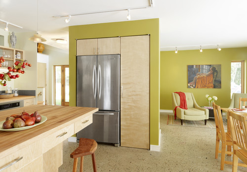
Cabinets and a refrigerator sandwiched within stud walls create a clean and contemporary look here. The cabinets were probably furred out within the walls. 

This refrigerator is the centerpiece of an open display area. This would be a very cost-effective way to house a refrigerator and small appliances while using a short wall. (This treatment even accommodates a radiator.)

Wednesday
Jan152014

10 Creative Ways to Give Your Kitchen a Boost

Article by:

After the flurry of holiday decorating and baking is over, the kitchen can seem a bit forlorn — but if one of your New Year’s resolutions was to eat healthier or cook more meals from scratch, it’s important that your kitchen supports and inspires you. These 10 doable project ideas are meant to revive your kitchen and make it an inspiring space that you can’t wait to spend time in. 

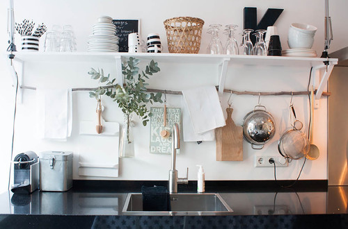
1. Use a found branch for hanging storage. If you have open shelving in your kitchen that rests on brackets, as shown here, extend their usefulness by sliding a thoroughly cleaned branch through the base of the brackets. Use simple S-hooks to hang small pots, spoons and other implements from the branch. You can even hang a small vase or a mason jar filled with flowers — just wrap the mouth with twine or wire to form a loop, and hang it from an S-hook. 

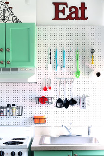
2. Try a pegboard in the kitchen, à la Julia Child.Julia was onto something when she designed the now-famous pegboard pot rack on the wall of her Cambridge, Massachusetts, kitchen. You can do the same by hanging basic pegboard on your kitchen wall and using S-hooks to hang cooking tools. Paint the pegboard to match your walls for a seamless look.


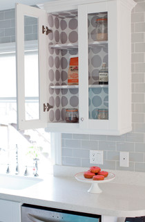
3. Paper the interior of a glass cupboard. This is the perfect place to use up any wallpaper scraps you may have lying around. If you don’t have wallpaper, pretty shelf paper or even quality gift wrap can be used instead.


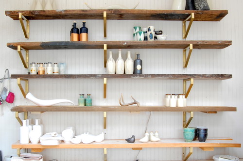
4. Glam up your shelving. Another easy way to spice up basic wall shelves is by coating the brackets with gold paint. Or, for a similar effect with less fuss, pick up a roll of copper tape at the hardware store and carefully apply it just to the edge of your shelves — this works best if your shelves are the same thickness as the tape, so measure first. 

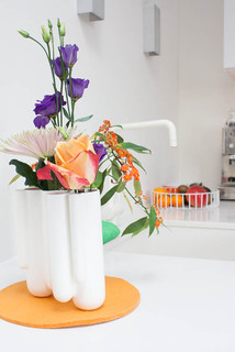
5. Bring in fresh blooms. You probably buy fresh flowers for other rooms in your home from time to time; why not snip a few for the kitchen? A vase with slots for individual blooms, like the one shown here, is ideal because it is so easy to fill.


6. Add a splash of unexpected color. Transform a plain step stool with a lick of vibrant color, paint the interior of your pantry, or line your drawers with polka dot paper. A bit of color or pattern where it’s least expected is especially welcome when it’s gray outdoors.


7. Give a plain basket a neon makeover. French market baskets are some of the most useful little accessories to keep around the house. Spruce one up with a simple painted-on star or heart in a neon hue and use it as a mini hamper for dirty dish towels and cloth napkins. For an even easier (and temporary) take, simply cut and stick on neon-colored tape.


8. Borrow baskets from the living room for produce storage and display. Have some lovely woven baskets just hanging around with nothing in them? Put them to work storing long-lasting produce like potatoes and onions, or colorful piles of lemons and limes.

9. Hang food magazines on a painted ladder. If you refer to your favorite food mags for recipes and menu ideas, keep them handy. A short ladder leaning against the wall is a perfect spot for stashing a rotating selection of your favorite foodie magazines — and in a pinch, even smaller cookbooks could get slung here, too.


10. Paint your breakfast-table chairs in a rainbow of pastels. Love pastels? I say, go for it. After all, why shouldn’t your breakfast nook be the cheeriest spot in the house? And if you don’t feel up to painting the entire chairs, even giving just the legs or seats a dip in pastel hues would make a big impact.


Thursday
Jan022014

Conquer Clutter With Drawers: 14 Inventive Solutions

Article by:

For many years drawers knew their place in the home. They were filled with a jumble of junk in the kitchen, stocked with sweaters and shirts in the bedroom, and crammed with pens and rubber bands in the office. But designers have begun to recognize the flexibility of this design staple. There’s nothing like an easy-to-access drawer to organize — or hide — the essentials of daily life. 

Consider these options to conquer the clutter in your home. 

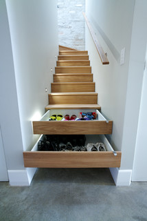
This narrow stairway features a truly ingenious storage solution: two of the risers are fitted with drawers to make a pile of shoes disappear in a flash.


Tired of tying up your kitchen outlets charging phones, tablets and laptops? Install a power strip in the back of a drawer and let your electronics recharge sight unseen. Just make sure the drawer is shorter than normal to allow room for the power strip’s cord in the back. 

Make edibles a design detail: Display your pasta or legumes in glass-fronted drawers. Brightly colored varieties (think red beans and spinach pasta) look best.


Instead of wrestling the ironing board out of the closet whenever you need to touch up a shirt, get one of these nifty folding versions that fit into — guess what? — a drawer.


Wine lasts longer and tastes better if it’s stored away from the light. This drawer, with its handy wooden cradles, keeps vino safe and close at hand. Don’t put the drawer near the oven, though, as heat is also a no-no. 

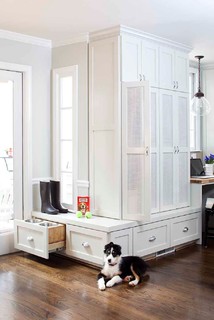
Even doggies appreciate their own dining area. Keep their bowls off the floor and out of the way with a pet-friendly drawer that slides out at mealtime.


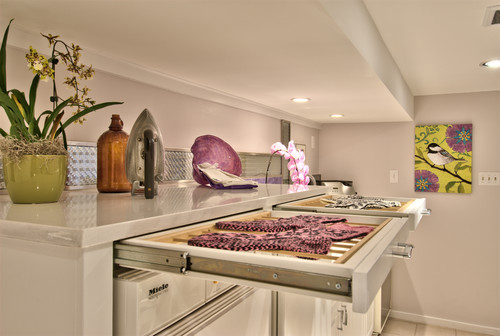
Forget drying delicates over a shower rod or the back of a chair. These skinny drawers are fitted with water-resistant racks that allow air to circulate, so your clothes will be ready to wear before you know it. 

Store clothes, sheets and blankets in drawers tucked under a platform bed. These beds work especially well in small rooms where there’s no space for a dresser. 

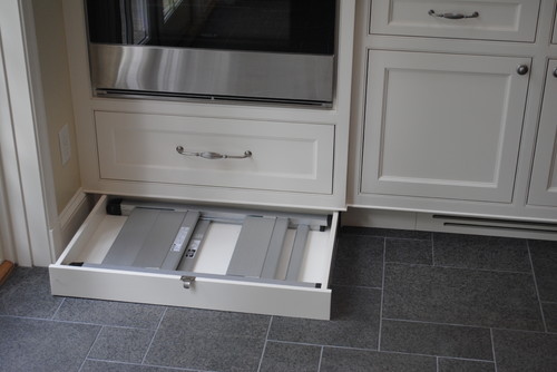
To eke out storage in every last corner of your kitchen, utilize the space under the cabinets with kick drawers. (They’re tucked in behind the cabinet’s toe kick.) This one hides a folding step stool to reach those high shelves, but you could also use this space to hold trays or cookie sheets. 

Clean up your entryway and keep track of outerwear by hiding it in discreet drawers. The ones here are faced with beadboard that matches the wainscoting.


Instead of there being a traditional ladder to access the top bunks in this kids’ room, a cleverly designed stack of drawers acts as a staircase. 

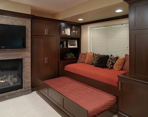
Need extra space for guests? Add a bed in a drawer that disappears under a window seat when it’s not needed. 

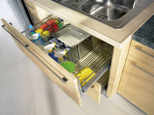
The pipes under a kitchen sink have always made it difficult to organize cleaning supplies. This drawer, with its U-shaped wire basket, is designed to fit around the piping, so you can easily access spray bottles, sponges and scrub brushes. 

This airy kitchen nook not only provides comfy benches for seating, but the drawers underneath can hide kitchen equipment.

Wednesday
Nov202013

7 Strategies for a Well-Designed Kitchen

Article by:

What's the most important room in your house? For me it's the kitchen. I love to eat, cook and spend time with family, and the kitchen is where I can do it all. With today's busy schedules, mealtimes are often the only times families have to spend with one another. So how can you have the perfect kitchen for your lifestyle, stay within your budget and maximize resale value? 

One of the most important steps in any project is starting with a great design. It's not just about looks, it's more about function and adding value to your life. More than any other room in the house, a kitchen has to be well thought out, carefully configured and designed to accommodate multiple functions. You probably spend more time in your kitchen than any other room, and that's exactly why it's so important to start with a great design. Consider these seven ways to get there. 

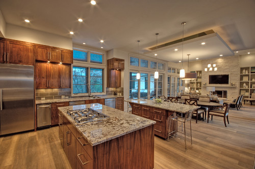
1. Avoid isolation. For many of today's families, the kitchen is the heart of the home and should be a place where people can gather, entertain and relax — not just cook. That's why an open plan, like in this kitchen, works so well. 

The open plan isn't your only option, but it isn't going anywhere yet. Consider your family's needs carefully before choosing a kitchen plan, and know that if resale is an option for you, most buyers these days are looking for an open kitchen. 
 

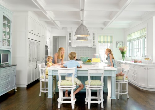
2. Plan a functional layout. If you like to cook and enjoy making meals for family and friends, there is nothing more frustrating than a kitchen that doesn’t function well. Most designs today follow the basic kitchen work triangle of the sink, refrigerator and range to maximize functionality. But take your own needs into account too. Plenty of counter space for prep, especially next to appliances, like in this kitchen, can make your cooking routine go much more smoothly. 

3. Choose a good location. If you plan to make your kitchen the heart of your home, choose a location that connects it with all the other major circulation points. Having your kitchen anchor your home's great room or provide access to the garage through a mudroom or laundry room is a great way to achieve this.


4. Include ample storage. There are so many accessories and appliances available for modern kitchens, it's easy to feel overwhelmed and forget about storage. Don't underestimate how much storage you'll need for food, flatware and all the little gadgets you're planning to stock up on. 


5. Add an island if there's room. Let's face it, people love to hang out in the kitchen — especially when there's something cooking that smells delicious. For families a kitchen island can help make the kitchen a space where everyone can gather and spend time. Space and kitchen layout will impact your island's efficiency, so it's not for everyone. But it's absolutely worth considering. 

6. Plan outdoor access. Again, this will depend on your home's layout and spatial considerations, but it's always great to place your kitchen adjacent to the outdoors. This will give you plenty of natural light (and an enviable kitchen sink window), and can also increase your entertaining space with an outdoor patio or dining area. 

7. Have fun. Above all else, your kitchen should be about you. Don't be afraid to incorporate personality into your design and material choices. Start simple, but don't be afraid to choose what you like best. No one else's opinion really matters in the long run. 

The truth is, great kitchen design is less about looks and more about how it works. Great design translates to a house that functions better, costs less to build, is more efficient to run and maintain, and gets you more for less.

A great meal doesn’t have to cost any more than a regular one. It needs to start with a great recipe, have quality ingredients and be carried out with confidence and execution in the kitchen. The same thing could be said about your next kitchen design. Make sure it’s a great one!


Monday
Nov182013

Countertop + Backsplash: Making the Perfect Match

Article By:

Which do you select first — kitchen counter or backsplash? How do you coordinate colors? Is it OK to mix patterns? The seemingly unlimited countertop and backsplash choices can feel overwhelming.

I've had homeowners approach me after weeks or months of looking at and collecting samples of materials that they love separately but just don't love together. Some settle on a combination that looks good together, but they don't actually like either material on its own. 

Here are 10 examples of stunning and successful countertop and backsplash combinations to help you plan your own mix of kitchen finishes, along with tips to ease your selection process. 

Approach 1: Select the Countertop First

If you feel overwhelmed by the countertop and backsplash options, try focusing on countertop selection first. Your countertop is the workhorse in your kitchen and can constitute a good chunk of your budget, so you'll want to get it right. Your budget and the way you use your kitchen will narrow things down. Plus, there are generally fewer color and pattern options for countertop materials, whereas backsplash options are practically unlimited. Countertops will also be installed before the backsplash, so you definitely need to decide on them first if construction has already begun.

Browse the Houzz photo database for countertop materials that appeal to you and the compare pros and cons in the Houzz guides to countertops. If you want to see something in person, check out what's available at your local stone yard, kitchen and bathroom design showrooms, and home improvement stores.

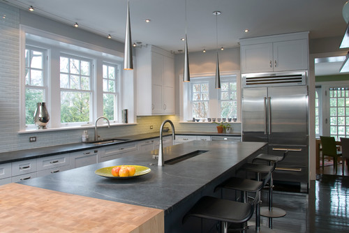
Shown: Soapstone and butcher block counter; linear glass tile mosaic backsplash
 

Once you've homed in on your countertop of choice (congratulations!), you have immediately narrowed the field of options for the backsplash. Trust me, this makes your life easier. 

Now, you don't necessarily need to exactly match the color or pattern of your countertop to that of your backsplash, especially if you go for an unusual hue or a countertop material with a lot of movement in it. In these cases a simple and neutral-hued backsplash is a good choice, so that the countertop takes center stage and does not fight with the backsplash for attention.

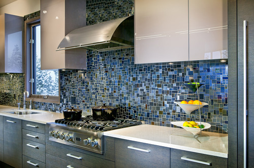
Shown: Orange quartz counter (get the look withOne Quartz from Daltile); Oceanside Glasstile'sTessera mosaic blend in Veil backsplash


If you want to go bold with both your countertop and backsplash, bring a sample of your chosen countertop material with you as you shop for backsplash tile. You will be able to instantly limit your backsplash options to those that work with your countertop material. If you are struggling with finding the right backsplash to work with your countertop selection, consider hiring a pro, even if it's for just a few hours, to help you nail the selections. Or enlist the help of a color- or design-savvy friend.

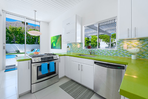
Shown: Green quartz counter (get the look with Silestone); mosaic glass tile backsplash
 

Approach 2: Select the Backsplash First

Of course, if you happen to find a backsplash you absolutely love before you've even looked at countertops, I say go for it. Making this selection will absolutely help you narrow down the options for the countertop. If you go for a statement-making backsplash such as the one here, find a quiet, subtler countertop material so it doesn't fight with the backsplash.

Shown: Pietra del Cardoso stone counter; Stone & Pewter Accents mosaic glass tile backsplash


I prefer that either the countertop or the backsplash be the star of the show, with the other material playing a supporting role. This stunning backsplash has lots of color and movement and, in my opinion, should not have to compete with an equally attention-grabbing countertop.

Shown: Caesarstone counter; glass mosaic Waterworks backsplash
 

That's not to say you shouldn't consider a mix of colors and patterns for both your countertop and backsplash. But if both of your materials feature multiple hues and have different patterns, aggregates or movement, stick to one overriding color palette for both materials. This will give the materials a nice cohesiveness, so they don't fight with each other.

Shown: Bianco Romano granite counter; stained glass mosaic tile backsplash
 

Approach 3: Use the Same Material for Both Counter and Backsplash

Love your countertop selection and want to keep this process simple? Consider running your countertop material up onto the wall as the backsplash. This is an especially smart option if you are required to purchase entire slabs of your chosen countertop material and you happen to have enough material left over to use the remainder as the backsplash.

Shown: Get the look with a Pietra del Cardoso stone counter and backsplash.
 

You can also use the same or similar countertop material for your backsplash but break it up by selecting a tile format for your backsplash rather than a slab. This can be a budget-friendlier option than purchasing extra slabs to create a backsplash.

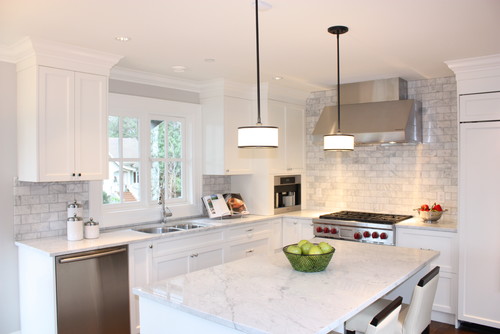
Shown: Get the look with a Carrara marble counter or, for a more durable option, check out Misty Carrera from Caesarstone; Carrara marble subway tile backsplash
 

Another cost-effective approach is to run your countertop 4 to 6 inches up the wall as a short splash. It will give you a nice finished edge where the countertop meets the wall, and it will also provide protection to the part of the wall most likely to get wet or dirty. Just be sure to check your local building code requirements regarding the minimum height of noncombustible materials on the wall area above the range or cooktop.

Shown: Uba Tuba granite counter; colbalt-blue Daltile subway tile backsplash
 

Approach 4: Hire an Expert

Some homeowners just have a difficult time visualizing their finished kitchen, which is why material selection can prove so challenging. And all too often you are asked to make too many decisions in too short a time period. If you know you are prone to analysis paralysis, do yourself a favor and give yourself enough time to weigh your options, but with a firm deadline to make the decision. Engage the assistance of a friend whose taste you admire, or hire a design professional to help guide you or bless your selections.

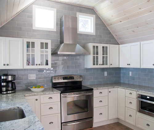
Shown: Gray and white granite counter; oversize ceramic tile backsplash