twitter Facebook Google+

                 linkedin pinterest houzz  

Click for the BBB Business Review of this Countertops in Denver CO 

Google Review 

Sales & Promotions!

Architects, interior designers, and more ∨

Hire a decorator to find that just-right couch and coffee tables for your living room.
Find wall shelves, a customizable closet organizer and stylish furniture for home to whip your closet into shape.
Remodeling and Home Design

Qualify Us Now! ProView 

Cambria logoUp to $45,000 interest free for your project!Finance by Cambria

 convenient and easy.

  • No Money Down
  • Interest-free financing for up to one year without payments
  • Financing up to $45K for any project that includes Cambria (including cabinets, flooring, sinks, plumbing, install & more)
  • Secure paperless telephone application
  • Credit decision in less than 10 minutes


Tuesday
Apr232013

Wanted Dead or Alive: 10 Criminally Outdated Design Features

What worked in 1980 doesn't necessarily work now. Don't believe us? Look in your closet. Chances are, you've weeded out the parachute pants, leg warmers and shoulder pads. Similarly, interior design choices are cyclic. Even expensive, must-have features eventually become outdated and need to be replaced. 

Is your home stuck in a time warp? That's fine, if that's what you like. But if you're contemplating selling, you'll want to eliminate the generation gap between your house and potential buyers. Where to start? These 10 outdated features are among the biggest offenders.

#1 Colored Porcelain

Photo via Zillow BlogToilets should not be red or pink or black or blue or green. This should go without saying, but neither should your sink or bathtub. Think white. If not white, think bisque. Just say "no" to the bathroom rainbow.


#2 Mauve

This color was hot in the 1980s and 1990s. Dusty rose found its way into home via carpeting, furniture, drapery, bedding and wall color. What's the season's 'it' color? The folks at Pittsburgh Paints suggest a palette made of red berries, modest muted stone and solid, reliable brown. Of course, if you're intent on selling, neutrals are still the safest way to go.

#3 Wood Paneling

This once popular wall covering will send potential homebuyers running the other way (unless, perhaps, it's solid, well-cared-for wood in a traditional cabin in the woods). You can paint over the wood grain, but you'll be left with the telltale grooves of the paneled surface. You can skim the paneling with plaster, sand, prime, and paint to make it look like drywall. A more expensive, time consuming option is to remove the paneling and rebuild or repair the underlying walls. 

#4 Popcorn Ceilings

Photo via Zillow BlogAlso known as cottage cheese or acoustic ceilings, this spray-on or paint-on ceiling treatment primarily was used from the late 1950s into the 1980s. These bumpy, dust-loving ceilings can be softened with water and scraped off with a trowel or putty knife. It's a messy job and one you may want to leave to a pro since the earliest versions of these ceilings contained asbestos. Note: the only thing more outdated than a popcorn ceiling is a dropped, acoustic-tile ceiling that was installed to hide a popcorn ceiling.


#5 Fluorescent Lighting

Photo via Zillow BlogYes, we know that compact fluorescent light bulbs are energy efficient, and we know that new technology allows for warmer, softer, dimmable lighting. Those aren't the lights on our most-wanted list; the real offenders are those commercial-style tube lights that are great for office buildings and not-so-great on kitchen ceilings. Replace one of these stark fixtures, an you'll soon be seeing the light. 

#6 Gold-plate

When it comes to faucets and other plumbing fixtures, gold is the odd man out. Some designers predict that gold - in the form of brushed or matte faucets - may make a comeback, but today's buyers appear to be much more interested in brushed nickel or oil-rubbed bronze. Shiny builder-grade brass is simply not an aesthetic for the ages. 

#7 Faux Finishes

Photo via Zillow BlogSponge painted walls were hip in the 1990s. Now, they just look like walls that didn't get a good coat of paint - same for rag rolling and stippling. The one faux finish that seems to have stood the test of time is a Venetian plaster finish, but even this Old World look must be done well and in the right setting. Prime, paint and get rid of the faux.

#8 Wallpaper Borders

Wallpaper is making a comeback, wallpaper borders are not. If you've got a 6-to-12-inch wide borer hanging at the top or beltline of a room, take it down; it's simply not doing you any favors. Babies' rooms are the one place where borders are still stylish. Even then, you'd be wise to consider a removable wall decal instead of paste-on trim. 

#9 Bad Carpet

Photo via Zillow BlogWall-to-wall carpet that's worn or stained can make your home incredibly difficult to sell. Clean dirty carpets. If they can't be cleaned, replace them. Even if they are in great shape, buyers will run the other way when they see carpet in outdated colors or patterns (floral! plaid!). Worst of all: shag.

#10 Counterproductive Countertops

Buyers hate worn, cracked laminate countertops and backsplashes. They're also not crazy about ceramic-tile countertops with grimy grout or plastic cultured marble vanities. Today's most fashionable countertops are wearing granite, marble, limestone or soapstone. If natural stone doesn't fit into your budget, you can update with new, more affordable counters in concrete, tile or laminate.


(You are reading an article originally posted on Zillow Blog

Monday
Apr222013

Sensational Space-Saving Kitchens

Photo Credit: Bruce Buck via This Old House

Galley Kitchens


For maximum efficiency when short on space, this layout excels. Its two parallel counters make all points of the work triangle equally accessible. Important things to keep in mind during your design are; aisle space, light and storage.

In this kitchen (pictured), concealing the fridge and dishwasher behind cabinetry panels gives the small space a tidy look. Light-colored cabinets, open shelving, and a large pass-through window make the galley open and airy.


Photo Credit: Joshua McHugh via This Old House

Shake It Up


Defined by simple lines, natural and handcrafted materials, and a muted palette, this Shaker-style kitchen (pictured) is smart and functional. The large wall-hung plate rack makes attractive dishware a visual focus, and offers quick access when setting the table. Small apothecary drawers alongside the range make use of often wasted space, while base cabinets are fitted with pull-out shelves and full-extension drawers to maximize storage. The island is perfect for meals, with a cast-concrete counter and a triple-pendant lamp overhead.


Photo Credit: Joshua McHugh via This Old House

Universal Appeal


Designed for a older couple, this kitchen (pictured) tucks away great tricks for a comfortable lifestyle. The lighting scheme removes the risk of over lighting or glare by using undercabinet fluorescent strips and large milk-glass pendant globes. Easy-to-pull handles are used on the refrigerator and dishwasher, the latter of which is a drawer, eliminating the need to bend down to load and unload. The kitchen sink is equipped with a single lever and integrated sprayer hose, and the rangetop's continuous grill allows for easy movement of pots and pans without any lifting.


Photo Credit: Deborah Whitlaw Llewellyn via This Old House

Form Meets Function


Beauty and function live simultaneously in this small kitchen (pictured). The stylish concrete countertops are complete with a knife block and a built-in drain board. Adding bigger windows and getting rid of the surrounding upper cabinets opened up the space. Cabinets line the adjacent wall.


Photo Credit: Michael Luppino via This Old House

Family Affair


The professional range in this galley kitchen (pictured) serves as the focal point of the design. The configuration offers plenty of counter space, as well as lots of room for cabinets. A pass-through serves as a breakfast bar and looks out onto an intimate corner banquette for family dinners.


Photo Credit: Ann Spurling via This Old House

Fine Dining


A cozy gathering spot, this kitchen (pictured) is equipped with all the necessities of a professional chef's workspace. Two ranges, a large utility sink with an industrial-size pot washer, a pair of butcher-block islands on wheels, and wall-to-wall cabinets make prepping, cooking, and serving food easy as pie.


Photo Credit: Pascal Blancon via This Old House

Old-Fashioned Feel


The U-shaped layout of this kitchen (pictured) offers an efficient work triangle for its owners, a couple with a penchant for cooking. Wine cubbies above the window make use of often-overlooked space. Antique-white painted cabinets, dark green granite countertops, and original oak floors help stainless steel appliances blend into the 1874 farmhouse.


Photo Credit: Eric Plasecki via This Old House

Small Wonder


Taking down a wall and replacing it with a breakfast bar opened up this 11-by-12-foot space (pictured). Additional counter space for prep was added with a second peninsula, which also anchors the work triangle. An existing tin ceiling and a brick chimney were uncovered, coordinating well with the antique pine base cabinets that were salvaged from the owner's grandmother's house. 


Photo Credit: Michael Luppino via This Old House

Gorgeous Galley


This galley kitchen (pictured) is efficient in its narrow footprint, with ample built-in storage and counter space. A pass-through window opens the room up to an adjacent dining area, while providing a two-seater breakfast bar. Glass-front cabinets with lighted interiors offer a visual focal point.


Photo Credit: Peter Vitale via This Old House

Santa Fe Style

This modest kitchen (pictured) is ideal for its setting in the historic district of Santa Fe, New Mexico. Black slate covers the countertops, backsplash, and floor. While custom cherry cabinets flank a s stainless steel range. The custom-made island serves as a centerpiece to the design.


Photo Credit: Alexandra Rowley

Rearranging Things


Chef Michael Lomonaco's plan for his 7-by-10 foot Manhattan galley kitchen (pictured) was simple: use every available space efficiently, without changing the basic layout. So he moved the sink faucet into the corner and the microwave to over the range - the only configuration changes he made - freeing up counter space for food prep. 


Photo Credit: Pascal Blancon via This Old House

Packing it In


With five kids and a passion for cooking, this homeowner was determined to transform her pea-sized kitchen (pictured) into a comfortable working space. The solution? Packing every corner with smart storage solutions. This particular nook houses lots of cabinet space, a coffee maker, wine cooler, wine rack, bar sink, child-height microwave, and a kids' snack corner. 


Friday
Apr192013

Five Features That Today's Homebuyers Want Most

Homebuyers have become more practical since the housing market crisis - they don't want cavernous entryways but they do want plenty of storage space. They want to be close to their jobs and integrated into their communities. And they want to keep their energy costs low. In today's market, McMansion in the exburbs may be a tough sell. Price is still primary, but if you're thinking of buying or selling a home, you should learn how buyers' preferences have changed since the last time you were in the market. Here are the five features today's homebuyers want most. 

Photo via Wikimedia Commons

#1 Proximity to Work

During the last housing boom, people were willing to move deeper and deeper into suburban sprawl to find a home they could afford. That trend is reversing, especially among the first-time homebuyers. "At 30%, proximity to work was the most frequently cited reason for choosing a specific neighborhood," said Dave Crowe, chief economist with the National Association of Home Builders. As you house hunt, pay attention to commute times. The Housing + Transportation Affordability Tool helps you measure a home's true cost based on its location.

#2 Energy Efficiency

One of the hallmarks of McMansions from the boom era is the double-height entryway. But it's going away, in part because people realize how expensive the corresponding double-height foyer is to heat and cool. That's indicative of the demand for energy-efficient homes. Nine out of 10 buyers in the 2011 American Housing Survey said they'd rather purchase a home with energy-efficient features that lower utility bills than a home without such features that costs two to three percent less. And in the NAHB's Home Trends & Buyer Preferences survey, Energy Star appliances were the most desired feature, picked by 94% of respondents. 

#3 Lots and Lots of Storage

Forget the whirlpool tub and six-burner stove. A linen closet, walk-in pantry, and other helpful organizers are the new selling points. This change reflects the more realistic mindset of today's homebuyers. These savvy house hunters are thinking honestly about how they really live, day in and day out, rather than falling for some fantasy version f what life might be. In that scenario, having somewhere to stow towels, sheets, and bulk items from the warehouse club is high on their wish list. 

#4 Quality of Space, Not Quantity

Smart homebuyers understand that a well-designed 2,000-square-foot home will live larger than a poorly planned one with 3,000 square feet or more. Look for open, yet defined floor plans that foster a connection between rooms while still providing privacy as needed. If you have kids, you don't want to have to go outside or into the garage to have a private conversation. Rooms should be easy to furnish as well. For example, in the master bedroom there should be one wall that's big enough to anchor a king-size bed, preferably away from the door to the bathroom.

#5 Connection Outdoors and to the Community Beyond

A front porch is another feature desired most by today's homebuyer. That tells you a couple things. First, it says people want to spend time outdoors. But they also want to engage with neighbors and the community at large by hanging out in the front of their house. Backyard patios and decks are also desirable for private meals and parties. But the increased interest in front porches is significant. A block filled with homes with active front porches is going to feel very different from one where all you see driving down the street is a line of garage doors. 


(You are reading an article originally posted on Consumer Reports.org)

Thursday
Apr182013

The Best Colors for Your Spring Redesign

You probably already know that certain colors make you feel certain ways. For instance, you might adore purple and absolutely hate yellow, or you might be attracted to every shade of green under the sun. But did you know that colors truly can affect how we think and feel? Before you reach for that paint swatch and make a commitment to a certain color in your home, make sure you know what each color might mean for your mood, appetite and even your metabolism. 

The color you choose to brush on your walls can have a major effect on your everyday life. You want to create something that not only reflects the way you love to feel, but also conveys what you believe in and dream about. So without further ado, here are some of the most popular colors and what they really mean.

Red

Photo Credit: Eclectic Dinig Room by Boston Interior Designer (m) + charles beach INTERIORS

Everything from deep red to cherry fire-engine red can be appealing, but keep in mind that red is know to boost appetite. This makes it a perfect option for the dining room or kitchen. In fact think about some of the biggest fast food-restaurants - what color is their signage? Most of them have at least a touch of red. But avoid putting red in your office, because it has also been shown to cut down on the effectiveness of studying. 

Blue

Photo Credit: Modern Home Office by Chicago Photographer Cynthia Lynn PhotographyFeeling blue? Then you might be very productive! Blue is known for curbing appetite and keeping production levels high, so put it in your office. It is also great for calmness and serenity, as well as being a favorite color for men, so blue accents in the man cave might be an excellent idea.

Green

Photo Credit: Traditional Hall by Weston Architect Oak Hill ArchitetThis color mimics nature, so is it any wonder that it brings to mind good health and tranquility? Turn to green for your bedroom, reading room or anywhere else that you want to relax. Green is also an excellent color for those who have a strong affinity for nature, for obvious reasons.

Yellow

Photo Credit: Traditional Living Room by Wooster General Contractor Weaver Custom HomesThis cheerful, warm color is a popular one for nurseries, but unfortunately, it has been shown to make babies cry. Keep the peace by keeping yellow in your kitchen, mudroom or sunroom. Yellow can give you more energy and even boost your metabolism.

White

Photo Credit: Traditional Entry by Los Angeles Artist & Artisan Blue Tangerine ArtIf you want to create the illusion of space, white is the way to go. This innocent, pure color creates the perfect backdrop for any kind of decor and keeps the room airy at the same time. Pair white with a big mirror for big impact.

Brown

Photo Credit: Traditional Home Office by Charlotte Interior Designer Carolina Design Associates, LLCThose who choose brown are practical, careful people. Put this in your office, living room or use it as an accent color. However, be sure to spice it up with a containing color; brown can also mean "boring" if you use too much of it.

Other Colors to Consider

What about colors that are a bit off the beaten path? Experts have plenty to say about that, too.

  • Pink is a feminine color that makes people feel safe and happy.
  • Purple brings to mind royalty and wealth; in fact, many kings throughout history have worn purple robes, the sign of power.
  • Orange gets attention and conveys excitement and enthusiasm, so use it in a room where busy people are, such as the playroom for the kids.

Finally, keep in mind that black conveys exactly what you probably think; death, mourning and darkness. Black can make a great accent or furniture color, but you might want to steer clear from putting it on your walls, as it can also make a room look smaller.


Now that you know, what color will you choose for your springtime design?


(You are reading an article originally posted on Build Direct Blog.)

Tuesday
Apr092013

TopShow News | April 2013


TopShop News | April 2013


American Cabinet & Flooring, Inc.

SPRING SALE!


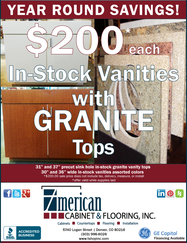
$100 GRANITE Vanity Tops

Spring Sale! In-stock GRANITE Vanity Tops for ***$100.00 each*** (offer does not include tax, deliver, measure or install | valid while supplies last through April 30, 2013)


That's right! Quality in-stock 31" and 37" granite vanity tops with a precut sink hole are on sale for the super low price of $100 each with a variety of colors to choose from!
(*price does not include sales tax, measure, installation, or delivery)
 
Come and see us today and take advantage of this amazing offer while supplies lasts through April 30, 2013!
 
Earth Day 2013 is Monday, April 22nd.
Easy Green: 23 Ways to Reduce Waste at Home

by Laura Gaskill | Houzz Contributor
We all know that growing landfill mass and, sadly, even trash floating out at sea are real issues, but it can be hard to know where to start if you want to make a difference. Thankfully, it's actually quite easy to cut way down on your household trash by making tiny changes in your shopping habits and daily routines. If you would like to reduce the amount of trash your household creates but are not quite sure how to do it, these 23 tips can help. They are all easy to implement and can add up to a reduction in waste that makes a difference. 
 
Living Room and Entertaining

     1. Switch to digital downloads of movies and music if you haven't yet.

     2. Ask for and give consumable or homemade gifts. Think event tickets, dinner reservations and edible treats.

     3. Stop junk mail and paper bills, and cancel subscriptions that you don't read.

Bedroom and Wardrobe

     4. Be picky. By choosing to buy only what you love and know you will wear, you can slim your wardrobe and love it more.

     5. Shop vintage.

     6. Bring cloth shopping bags of your own... even to the mall.

     7. Mend and tailor instead of toss. Take a cue from our grandparent's generation and work with what you have.

Kitchen

     8. Buy soap in bulk and decant it into reusable containers.

     9. Keep lots of cloth towels on hand instead of paper.

    10. As long as it is relatively clean, you can reuse aluminum foil several times.

    11. Give old clothes and linens a second life - cut them up and reuse them as cleaning rags.

Buying Groceries

    12. Shop farmer's markets, produce stands and natural food markets - you will find the freshest and most local food that's minimally packaged.

    13. Avoid buying single-serving packages. Pick the larger containers instead.

    14. Keep plenty of reusable bags around. If you have trouble remembering to bring bags, try keeping stashes of them in your car, by the front door, in your office and anywhere else they might come in handy.

Dining

    15. Use real dishes and cloth napkins every day.

    16. Try an alternative to plastic wrap. Place a plate on top of a bowl to store leftovers in the fridge or purchase reusable dish covers.

Pets

    17. Our pets don't ask for much, but that doesn't stop us from wanting to buy them all sorts of things. Keep things simple and stick with a few favorite toys and accessories.

    18. Buy your most frequently used pet supplies in bulk to cut down packaging.

Bathroom

    19. Simplify your beauty routine - fewer products means less waste.

    20. Use microfiber cloths instead of paper towels for cleaning.

    21. Buy the biggest packages of toilet paper you can find to reduce packaging.

Downtime

    22. Make friends with your public library. If you haven't explored your local library lately, consider giving it another look and borrow a book, movie or music CD instead of buying.

    23. Rethink leisure time. Relax in your backyard, cook dinner for friends, walk in nature, go for a bike ride, have a picnic or read a book - from the library!

You are reading an article originally posted on houzz.com

Beautiful cabinets, countertops & flooring with attractive financing options available!


Fast. Smart. Simple.

  • Quick credit decisions
  • Simple and fast application process
  • Low minimum monthly payments
American Cabinet & Flooring financing options available

See a Sales Associate for complete program details and to apply today!
In-stock Merillat Cabinet Collection at American Cabinet & Flooring, Inc
Attractive. Economical. Simple.
Our in-stock Merillat Cabinet Collection features a clean, modern style with a traditional overlay door and a flat center panel design providing a straightforward choice that creates exceptional looks. All at a price point that makes this collection practical and extremely simple.

Click here to print or download our Merillat Cabinet Collection
How did we do? Please submit a review on your experience with American Cabinet & Flooring, Inc.

How are we doing?

We value feedback from our customers and strive to always provide the best in quality products and service; it's important to us to know how we are doing. 

Did we exceed your expectations? 

Is there something we could be doing better? 

Let us know by clicking on any of the links below and write a review on your experience(s) with American Cabinet & Flooring
American Cabinet & Flooring, Inc. is proud to be a BBB accredited business with an A+ rating