twitter Facebook Google+

                 linkedin pinterest houzz  

Click for the BBB Business Review of this Countertops in Denver CO 

Google Review 

Sales & Promotions!

Architects, interior designers, and more ∨

Hire a decorator to find that just-right couch and coffee tables for your living room.
Find wall shelves, a customizable closet organizer and stylish furniture for home to whip your closet into shape.
Remodeling and Home Design

Qualify Us Now! ProView 

Cambria logoUp to $45,000 interest free for your project!Finance by Cambria

 convenient and easy.

  • No Money Down
  • Interest-free financing for up to one year without payments
  • Financing up to $45K for any project that includes Cambria (including cabinets, flooring, sinks, plumbing, install & more)
  • Secure paperless telephone application
  • Credit decision in less than 10 minutes


Tuesday
Apr302013

12 Ways to Make Your Home Feel New Again

Treat your furniture, walls, floors and countertops to some TLC, to give them a just-bought look for a fraction of the cost!

Photo Credit: The Marshall Kitchen | American Cabinet & Flooring, Inc.

Shopping is the easy part for some - the thrill of the chase, the flutter of excitement at bringing a new treasure home, choosing a new paint color or materials for a remodel. But what happens to those glorious finds and finishes months or years later? Before you give in to the urge to shop for new stuff, consider some home maintenance to show off what you have in the best possible light. You may find that after giving what you already have a little extra TLC, your craving for new stuff fades. You never know; you may even find yourself falling for your home and decor all over again.

#1 - Maintain Upholstery

Regular maintenance can go a long way toward keeping upholstery looking as good as new for as long as possible. Vacuum the fabric and rotate cushions each time you clean the living room, and clean spills and mend small tears right away.

Even if a stain has been there for a long time, it can still often be removed with stain removal or hydrogen peroxide; treat it repeatedly until it fades. Just be sure to test new cleaning products on a less-visible area of fabric first.

#2 - Remove Scuff Marks and Touch Up Paint

Small things like scuff marks from shoes and bags, tiny dings and chipped corners can make a space feel worn out. Spend a day scrubbing, patching and touching up paint, and you'll notice a world of difference.

#3 - Make Furniture Gleam

If you can't remember the last time you polished your wood furniture, doing so will probably make you wonder why you don't do it all the time - the difference is amazing.

The type of finish on your furniture will determine what you use to polish it. Midcentury teak pieces are often finished with oil alone, so simply rubbing in a bit more teak oil from time to time will suffice. Finished wood pieces may respond well to a furniture paste or wax - read the directions thoroughly before trying any new product. 

#4 - Remove Stains from Marble

This porous surface is prone to staining, so it's important to wipe up spills immediately. Of course, there are time that just doesn't happen. No matter how or when it happened, there still may be hope for restoring the beauty of your marble. Check the chart available from the Marble Institute of America for methods of removing all sorts of stains. If you still can't get it out, call a pro - improving the counters you have is still cheaper than getting new ones. 

#5 - Care for Wood Counters

Remove scratches and stains on your wood countertops by gently sanding the area; then rub in a food-grade mineral oil with a soft rag. To prevent future damage, always use trivets under hot items, wipe up spills quickly and cut items on cutting boards, not on the counter.

#6 - Refresh Old Wood Floors

Even if you don't want to have your wood floors refinished, there are still ways to make them look their best. What you use to refresh your floors will depend on the type of finish your wood floors have.

Floors with a natural oil-rubbed finish can be shined up with wood oil. Really old, worn floors may do well with a wax. Floors finished with polyurethane can be cleaned with a solution of white vinegar and water. Just avoid getting the floors really wet by applying the solution with a barely damp mop and wiping dry with a towel immediately after. Excess water on wood floors of any type can potentially cause damage.

#7 - Refluff Area Rugs

Fluffy rugs like flokatis and sheepskins look amazing when you first bring them home, but... less amazing after several months of wear and tear. Most small natural flokati and sheepskin rugs can be hand washed (or even machine washed on delicate) in mild soap and then air dried.

Between washings, simply shake out and then brush your rug with a dog brush. Just be sure to read the cleaning instructions before deciding on a method.

#8 - Deep Clean Wall-to-Wall Carpeting

Regular vacuuming and spot cleaning will get you only so far. Every once in a while, it pays to rent, borrow or buy a steam cleaner to give your carpeting a deep clean. To help the floor dry as quickly and completely as possible, wait for a dry day ant set up a dehumidifier in the room afterward.

#9 - Condition Leather

Leather furniture can actually look better with age, provided that it is properly cared for. Use a leather conditioner a few times each year to keep the leather from drying out and cracking.

Keep it looking fresh by vacuuming and then buffing with a dry microfiber cloth as needed. Wipe up spills as soon as they happen, using a dry cloth to soak up any liquid. 

#10 - Brighten Whites

Slipcovers, pillow covers, curtains, towels and more can all use a good refreshing from time to time. If you don't want to use chlorine bleach on your whites, try an oxygen - or hydrogen peroxide-based nonchlorine bleach instead. 

#11 - Touch Up Appliances

Years of use can create all sorts of stains and scratches on the once-pristine finish of your washer and dryer. If new appliances are not in the cards, consider painting yours with a product designed for the task, like the Appliance Enamel paint from Rust-Oleum. You can also use appliance paint on wornout finishes to the dishwasher. Do not use it on surfaces that get hot, like stovetops. 

#12 - Stock Up for Proper Maintenance

Beyond your usual cleaning tools, if there are any special items that would make it easier to care for your home and belongings, go ahead and make the investment. If you have lots of carpeting, for instance, a good steam cleaner could be a worthy addition. Leather conditioner, wood oil, furniture polish - having the little things you need at hand can help you keep your home looking its best. 


Monday
Apr292013

Design 101: Common Kitchen Shapes That Blend Beauty and Function

We all want our kitchens to be both beautiful and functional. And while you may have an idea of how you want your new kitchen to look, balancing proportion and scale to achieve a harmonious whole is critical. However you'll also want to understand the factors that impact how it feels to be in the space. Here, we've gathered some information on kitchen shapes, optimizing functionality and how to ensure a layout works for you and your family.

Your Lifestyle and Your Home Will Influence Your Kitchen's Shape

Are you an aspiring cook? Do you like to entertain? Is counter space a premium? These are just some of the considerations that will determine which kitchen shape is right for you.

Photo Credit: Omega | MasterBrand Cabinets, Inc.

U-SHAPED

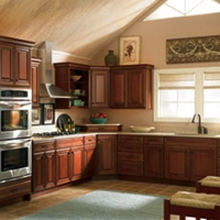
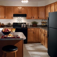
Popular with many cooks because of its efficiency, the U-shaped kitchen offers generous counter space and provides an efficient workflow by creating a compact work triangle. It can however make the cook feel apart from a group when entertaining, as most movement will be facing one of the three walls.


Photo Credit: Omega | MasterBrand Cabinets, Inc.

L-SHAPED

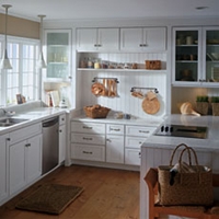
The L-shaped kitchen offers flexibility for both large and small homes. This shape utilizes only two kitchen walls, providing an open sensibility. The L-shape minimizes traffic through the kitchen and, typically, features larger expanses of countertops, allowing ease of preparation at mealtime.


Photo Credit: Omega | MasterBrand Cabinets, Inc.

L-SHAPED WITH AN ISLAND

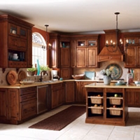
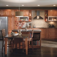
An L-shaped kitchen with an island is ideal for entertaining. The ample counter space along the "L"of the kitchen becomes the primary work area, while the island allows guests or other family members to gather, to help prepare or just visit... AND to stay out of the way of the cook!


Photo Credit: Omega | MasterBrand Cabinets, Inc.

G-SHAPED

A modified "U" shape, the G shaped kitchen is very efficient. However, unless one or more of the walls are designed as half or "pony" walls, this kitchen shape can feel confining for today's cook. 


Photo Credit: Omega | MasterBrand Cabinets, Inc.

SINGLE WALL

This layout positions all of the appliances on a single wall, and would typically be found in a studio apartment or other very small space. 


Photo Credit: Omega | MasterBrand Cabinets, Inc.

GALLEY

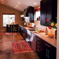
Open on both ends, the Galley requires a minimum corridor width of 48" so that the cook can easily maneuver during meal preparation. Typically, appliances are near one another which is convenient, but due to the corridor shape of the kitchen, all of the household traffic will pass through the space. 


Efficiency Has a Shape: The Triangle

The basic work triangle is comprised of an imaginary line drawn between the kitchen's primary work areas:

  1. food storage (refrigerator)
  2. food preparation (stove)
  3. clean up (sink)

For maximum efficiency, the sum total of the triangle should be 26 linear feet, with the sink being the center point. 

What You Can Expect From Your Designer

In addition to offering guidance on door style, wood type and color selections; a professional kitchen designer will typically prepare three types of documents for your review:

  1. floor plan
  2. elevations of all the wall that receive cabinetry
  3. perspective view from one of more vantage points within the room

Availability of these documents to the consumer is usually contingent on a contractual agreement and/or down payment. 

Photo Credit: Omega | MasterBrand Cabinets, Inc.

FLOOR PLAN

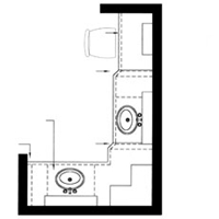
A floor plan shows the wall layout from above, and an outline of all the components that will fill the space, such as base, wall and tall cabinetry. Sometimes lighting and electrical detailing are also shown on this plan.


Photo Credit: Omega | MasterBrand Cabinets, Inc.

ELEVATION

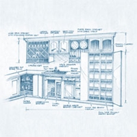
A "flat" drawing that shows each wall of cabinetry as if you were standing and facing it head on. The elevation view is good for seeing the detail of the cabinetry components that aren't visible in the floor plan view. It is also good for establishing heights of components within the room. 


Perspective

A perspective drawing is one that is "3D" or dimensional. It shows the room as it would be actually seen from the viewpoint of a person 5'-6" in height. Perspective drawings provide details such as areas that are increased or reduced in depth, a dimensional quality that elevation drawings don't offer. 

Testing the Fit

It is a good idea to layout the proposed kitchen in the actual space. If the space is empty, this is easily accomplished a couple of different ways. Refer to the completed floor plan utilizing a tape measure and masking tape to indicate where cabinets and appliances will be located. Newspaper can be folded to adjust its size and then moved around within the space - perfect for determining just how big that island should be! If there is an existing kitchen in place, you'll have to improvise a bit. Both tape and newspaper can be used to outline new cabinets or appliances, helping you visualize your new space. 

Friday
Apr262013

Create a New Look with DIY Wall Art

Tired of looking at those same old walls? You could spice things up with a mirror here and there, perhaps some nice framed art or even a new coat of paint with a faux finish that transforms flat walls with opulent designs. Or you could go an even more unique route and create unique wall art that is sure to become a conversation piece. 


Photo Credit: Spaces Design by New York Paint & Wall Coverings | Janna Makaeva, Cutting Edge Stencils

Transform a Room with Stencils

Stencils are a great way to create art on your walls without hanging up yet another picture. Stenciling has been used for centuries as a way to make walls look more personal, and it's very simple. All you need are some appealing stencils, the right kind of paint, a steady hand and patience.

Start out with a wall that has been painted your desired color. For the best results, the paint you choose for your stencil should contrast enough to stand out, even in dim lighting. For instance, a black wall with a white stencil can look great, and so can a gray wall with a yellow stencil. The options are endless!


Photo Credit: Spaces Design by New York Paint & Wall Coverings | Janna Makaeva, Cutting Edge Stencils

Depending upon the space and complexity, there are many ways to use your stencils. Attach the stencil to the all with a painter's tape. You can then trace around the stencil openings with a pencil and choose to paint later, or you can dab the paint directly on the stencil. Tracing is usually a preferred method, because it allows you to correct mistakes, such as a stencil that doesn't quite fit appropriately the first time you try it. 

Take your time with stenciling the walls - this is a project meant to draw attention, so you want it to draw attention for all the right reasons and none of the wrong ones!

Collections Make a Big Impression

If stencils seem like too much work, collections can make your wall art easier. If you have particular items you love to collect, your wall art can reflect that part of your personal style. For instance, if you love the outdoors, collect a variety of leaves and put them in inexpensive yet handsome frames. Then attach the frames to the wall in an eye-catching display.


Photo Credit: Eclectic Bedroom design by New York Architect Incorporated

Don't like frames? Put collections directly on the wall! Hang your pictures in various sizes with colorful pins, cover your wall with a giant map that includes flags to mark your travels, or tack your child's drawings up on a wall to create a modern-art installation in your own home.

Go Freestyle!

If none of these orderly things appeal to you, branch out into something whimsical and random. Quotes pinned on a wall in freehand not only look great, but give you the satisfaction of seeing your own handwriting on the wall. Let your kids have a "graffiti" day - give them paints and a few ideas, then set them to work. Budding artists absolutely love to do this in their own rooms. It makes their space extra-special.


Photo Credit: Contemporary Kids design by Minneapolis Architect Jaque Bethke for PURE Design Environments, Inc.

If you want the freestyle look but you're not ready to commit to something too random, create freestyle stencils and use those to etch what you want on your walls. Simply cut out the stencils, tape a small level to them and use that to help ensure that the freestyle designs or writing stay perfectly straight on the walls. 

Whether you choose to paint something whimsical with cans of spray paint or opt for something much more sedate, your wall decorations can become a focal point of the room, a great conversation piece, and a constant example of a satisfying job well done. Best of all, these creative walls can make your space even more personal, giving you a deeper connection to your home.


(*You are reading an article originally posted on Build Direct Blog)

Thursday
Apr252013

Benefits of Container Gardening

There are personal and environmental benefits to gardening in containers. First, it's a good way for beginners to start small. A pot with a few plants in it is less intimidating than designing and executing a garden of any size. Instead of figuring the best place for a garden, digging up the lawn and planning heights, food production and bloom time of flowers, you can fill a pot with soil, plant some ornamentals and food, water it in and be done!

Photo Credit: Eclectic Patio by Dallas Media and Blogs Sarah Greenman

You have control over the size of your garden, and there are fewer decisions to make. There is less maintenance for a container garden, too. I spend hours weeding, dead-heading flowers, checking for bugs, harvesting and dragging hoses from here to there (I know - the garden writer without an irrigation system! Blasphemy!). When containers are clustered in one spot, all your supplies and chores are also in one spot. 

Container Gardening | Take Notes

Growing only a few plants also lets you study them. If you make notes about their performances, you can expand your gardening knowledge each year, and you may eventually be inclined to dig up some lawn for a bigger garden with more varieties. On the other hand, you may never get the gardening bug, and containers may suit your needs to garden minimally!

If you only have a small outdoor living area, containers are perfect for having a bit of greenery in your life. It's a bonus to get food, herbs and cut flowers from your deck or balcony. Containers can even be part of the design, so a small collection can be a tastefully designed art project. 

Photo Credit: Modern Patio by New York Architect Resolution: 4 Architecture

Portability of Container Gardens

Being portable, containers can also be moved around. They can be brought in for the winter or placed for a special event. 

As for the environment, it's important we grow our own food, especially in urban areas. As Monsanto creeps into our gardens more and more each day, we need to retain our independence by growing our own food, saving seed and sharing with out community. Even one pot with one tomato plant in it is a way to fight back. Anyone with a smidgeon of space can grow a little bit of food. If you've never grown your own food before, you'll be hooked on the freshness and flavor!

Saving Water

Containers also save water. Instead of a sprinkler showering a garden and its surrounds, you can put the right amount exactly where it needs to go. The same stands for fertilizers (organic, of course). Instead of broadcasting them over spaces where there are no plants, you can give a container planting exactly what it needs. 

Self watering containers gauge when plants need water then delivers it to them. Alternatively, you can set up a drip system to cover a series of pots that are close together. That is the most resource efficient way to water. And you don't have to think about it. Put your system on a timer, and you won't have to think about it. That's great for the gardener without a lot of time to spend fussing over a garden. 

The best containers are recycled or upcycled. See the author's 'container garden' Pinterest board for recycling and irrigation ideads!

Photo Credit: Traditional Outdoor Planters by Other Metro Wayfair

One for Every Porch or Balcony

Container gardens makes a lot of sense, from the need or desire to grow food in a small area to accommodating disabled and elderly people to saving resources with efficient water systems. Soon we will see a small garden on every porch or balcony!

(*You are reading an article originally posted to Build Direct Blog)

Wednesday
Apr242013

Three Emerging Global Design Themes

How will fashion, architecture, materials and culture influence the future of design? The Formica Group design team shares its unique perspective in the new 2013 Trend Vision Report. The report outlines three major themes: PURITY, NUTOPIA and CLASH - and highlights the related trends. Here's an excerpt ...

THEME 1 | PURITY

PURITY is an über-modern style that ties together technology with the soft and feminine. Biomorphic shapes are digitized and bring about a new aesthetic language. Light-infused, filtered colors complement clean and pure textures. White is central along with translucent of pale pastels that blend seamlessly with intense dark bases of spruce, sweet violet and mocha and vibrant neon accents of coral, hot pink, absinthe and turquoise. Synthetics are authentic and elegantly shiny surfaces create futuristic interiors. 

Photo Credit: Formica Blog | Share the Love

Photo Credit: Formica Blog | Share the Love

Purity Key Terms: serenity | feminine | soft tech | futuristic | translucency | biomorphic shapes | simplicity | light | the white story | prismatic | color gradients

THEME 2 | NUTOPIA

NUTOPIA emerges from the chaos of the new world and the resulting desire to maintain balance and serenity by going off-grid mentally and physically. Good quality products will be key; luxurious materials must endure. Craftsmanship, artisanal processes and blended materials will be important, as will environments in warm colors, prints and styling. 

Urban farming and gardening are key inspirations for a host of new environmental greens and earth tones. There is a certain nostalgic feel with sun-bleached colors and ash roses. Mustard seed evolves, championed by brighter shades of melon. Lowlights of prune, navy and olive provide contrast and newness. Wood, preferably reclaimed, is the essential material.

Photo Credit: Formica Blog | Share the LovePhoto Credit: Formica Blog | Share the Love

NUTOPIA KEY TERMS: slow - artisanal processes | the hand-made | complex crafts meet simplified aesthetics | preserving local knowledge and traditions | get rid of excess stuff | primitive - archaic aesthetic | a touch of vintage | upcycling | urban farming | deceleration | living off-grid | slow food | preserving the heritage

THEME 3 | CLASH

CLASH is the most provocative of the three trends. It deals with growing urbanization, participation by the people and frustration with politics, education, housing or jobs. Reflecting today's harsh realities, communities will be formed by cultural magpies that pick and choose from the multi-cultural societies in which they live.

A new generation is seduced by rebel aesthetics. The base palette for CLASH is grays (think concrete and asphalt, oxidized or corrugated metal), accompanied by very vibrant colors and patterns from the spectrum palette to intensive orange and yellow. Yellows and mints are essential for the coming year. Blue stays prominent, especially in fashion. Geranium and hunter green are important to manipulate harmonies. While the palette shown is quite pretty, CLASH is all about disharmonious combination.

Photo Credit: Formica Blog | Share the LovePhoto Credit: Formica Blog | Share the Love

CLASH KEY TERMS: industrial aesthetic | color blocking and shocking | urban decay | upcycling | street art | style clash | contrast - opposites | geometric - loud graphic pattern | metal | corten steel | burnt wood | concrete | yarn bomb


(*You are reading an article originally posted to Formica Groups's Blog "Share the Love")