twitter Facebook Google+

                 linkedin pinterest houzz  

Click for the BBB Business Review of this Countertops in Denver CO 

Google Review 

Sales & Promotions!

Architects, interior designers, and more ∨

Hire a decorator to find that just-right couch and coffee tables for your living room.
Find wall shelves, a customizable closet organizer and stylish furniture for home to whip your closet into shape.
Remodeling and Home Design

Qualify Us Now! ProView 

Cambria logoUp to $45,000 interest free for your project!Finance by Cambria

 convenient and easy.

  • No Money Down
  • Interest-free financing for up to one year without payments
  • Financing up to $45K for any project that includes Cambria (including cabinets, flooring, sinks, plumbing, install & more)
  • Secure paperless telephone application
  • Credit decision in less than 10 minutes


Entries in Cabinets (30)

Monday
Jun242013

Your Guide to Choosing Kitchen Cabinets

Article by: Vanessa Brunner

The right kitchen cabinetry can make or break your kitchen's functionality and style — not to mention your budget. No pressure, right? Don't stress yet — Houzz's kitchen cabinet guides can walk you through the process, from start to finish. Resource guides covering everything from Shaker to flat panel, from corbels to aprons, from glass knobs to recessed pulls, are all listed here in easy-to-access fashion.


Door Styles

Shaker, flat or inset? Your cabinet door style is important — it may be your biggest kitchen expense, after all — but choosing it doesn't have to be stressful. See which of these popular cabinet doors fit with your home's style. 

Get the guide: Popular Cabinet Door Styles for Kitchens of All Kinds


Who says cabinets have to be wood? Put your best dishes on display and open up your kitchen to light and space with glass cabinets. 

Get the guide: 8 Beautiful Ways to Work Glass Into Your Kitchen Cabinets

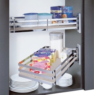
Go beyond the standard swinging door in your new kitchen. Flip-up doors, pocket doors and corner drawers can make your cabinets more functional and your life easier. 

Get the guide: 8 Cabinet Door and Drawer Types for an Exceptional Kitchen


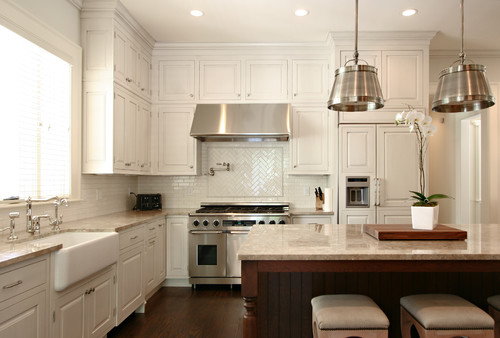
If you'd rather stick with something more traditional for your cabinets, then the timeless Shaker style is a sure bet. Learn how to make this look work with different counter, hardware and backsplash materials. 


Add a more traditional furniture style to your kitchen storage with a countertop hutch. Glass fronts make these the perfect place to put pretty dishes on display. 


Open shelving feels as much at home in modern kitchens as it does in traditional ones. See how to make this simple, clean storage style work in your home. 

Using ecofriendly materials isn't rare anymore — it's easy to choose kitchen cabinetry that contributes to a healthy home and family, as long as you know what to look for. 


Can't decide between two different styles? Mix and match — two different cabinet styles can make an even bigger impact. 

Hardware Styles

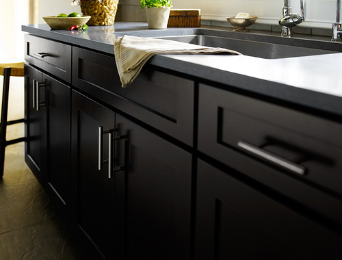
Of course, once you have your cabinets chosen, you have a whole other task ahead of you: choosing hardware. Even if you've got simple Shaker cabinets like these, your choice of drawer pulls and knobs makes a big difference in your finished look. 


Flat-panel cabinets tend to work best in modern kitchens; make sure you choose hardware to match. Clean, simple and contemporary pulls work well with this cabinetry style. 

Raised-panel cabinetry tends to suit traditional kitchens. Look for classic, old-world fixtures to fit this beautiful style. 

Colors and Finishes

Colorful kitchen cabinetry has made a big comeback. Try pretty palettes to give your kitchen flair.


Try playing with two different colors on your kitchen cabinetry. Scared to go too bold? Contrast a single bright color with neutral finishes. 

If you want to get color the DIY way, read our related ideabook first. Painting your kitchen cabinets can be difficult, but these pro tips will help. 

Get the guide: From the Pros: How to Paint Kitchen Cabinets


Stains are a great way to get color on your kitchen cabinetry without covering up the wood's beauty. From greens to blues to browns, stain colors can really enhance your new kitchen. 


Curious about color but worried about the maintenance? A distressed finish can cover all the bases, offering a warm, bright look that can actually embrace wear and tear. 

Sometimes a kitchen remodel doesn't require a new fridge or oven — but how do you pick a cabinet color to go with your existing appliances? Check out our cabinet color guide for cabinets with dark appliances. 

Get the guide: Cabinet Colors for Dark Appliances


Molding and Details

Adding molding is an easy way to make any type of cabinetry look custom. Whether you want to add crown molding to your existing kitchen or edge molding to new cabinets, this guide can help you envision the final result. 

Decorative supports, aprons, corbels and toe kicks — these features might not come standard on most cabinetry, but they can make a huge visual impact. 

Learn how frosted, textured and seeded glass is made, and whether or not it can work with your kitchen cabinets. 

Get the guide: Choose Your Kitchen Cabinet Glass


Whether you're building a new kitchen or retrofitting an existing one, it's important to keep universal design in mind. Clever accessories will make your kitchen comfortable and accessible for everyone who uses it. 


Kitchen ideas, bathroom ideas, and more ∨

Browse living room ideas, from a sectional sofa couch to chandelier lights and floorlamps, for your next interior design project.
Find a wall shelf, customizable closet organization and stylish furnishings to whip your closet into shape.


Monday
Jun102013

Cleaning Up in the Laundry Room

ARTICLE BY ANITA SHAW

Downstairs, lurking somewhere in a dark corner of an unfinished basement, is a cramped area housing the washer and dryer. It’s an image most people can relate to as, at one time or another, we have stood in a “laundry room” like this.

Well, that image can be banished from memory, as today’s laundry rooms are not only bright and airy, they are places where people actually enjoy spending time. They are incorporating many amenities from other areas of the home and acting as gathering spaces for a variety of activities. And, the desire for these spaces to incorporate high-end design and functionality is definitely on the rise.

“I consider laundry spaces to be almost on the level with kitchens and baths,” states Tina Kuhlmann, principal designer, Primrose Design Interiors in San Diego, CA. “People are in and out of there all of the time. It’s a really integral part of the kitchen and the family.”

While storage is a necessity in the laundry room, Lee Taylor, showroom manager for Taralla Kitchen and Bath in the Bronx, NY, notes, “the look of the cabinets and countertops are sometimes more important. These rooms have become an extension of the kitchens and living spaces.”

Photo: Kelly Keul Duer and Virginia Vipperman | Designer: Cameo Kitchens

Laundry necessities

The approach to designing today’s laundry rooms is much the same as with other rooms, according to designers. It’s critical to understand how clients not only wash and dry their clothes, but also use the surrounding space.

Families tend to do laundry in different ways, so it is important to know their habits, stresses Mike Macklin, designer, Cameo Kitchens in Falls Church, VA. “If the family brings their laundry down in baskets and promptly takes the basket back to their rooms, open shelving is a practical way to go. But, if the laundry tends to pile up, storage behind doors may be a better idea.”

“I put a lot of things behind doors because I know people are messy,” stresses Kuhlmann. “Very few of us live like the catalogs look.”

Of course, a surface to act as a folding area is critical, and one size does not fit all. “When I’m dealing with empty nesters, they often ask for a place to fold that is nice and at back level, so there isn’t a lot of bending over,” comments Kuhlmann.

“Many of our customers opt to use washers and dryers that fit under the counter,” notes Macklin. “This provides a counter space more than long enough to fold and organize clean laundry.”

An oversized sink is an important element, according to several designers. “I always include a laundry sink with a pull-down faucet,” states Kuhlmann. “The pull-down faucet is really nice because you can get in there and spray those stains out or pretreat.”

It can also be used to wash delicates and, once those delicates are washed, areas for hanging become very important.

“Sometimes I’ll do a tall hanging cabinet for delicates because people don’t always want to dry them in a dryer, and they don’t really want to look at them, either,” reports Kuhlmann. She has created cabinets to hang delicates that function like a closet. She includes open-weave bronze or copper on the door, sometimes backed by fabric, to allow for air circulation for drying.

“Drying racks and drip areas are a big deal,” adds Lynley Serratt, CKD, CBD, Allied ASID, director of sales and marketing, Palmer Todd in San Antonio, TX. She reports that her firm has done pull-out drying racks in the space between the top of the front-load washer and dryer and the cabinet above.

Photo: John Lennon Photography | Designer: Tina KuhlmanAnd, while ironing may be akin to drudgery, ironing boards are important to the room’s design. However, tucked away and out of sight is the preference for this household item. Kuhlmann likes to put the ironing board behind a finished door panel so that it looks like it’s part of the cabinetry.

Laundry plus

In addition to the items people expect to find in the laundry room, there are several surprise amenities that are finding their way into the design. Charging stations for the family’s multitude of electronic devices have found a home here, as have beverage refrigerators and flat-screen televisions.

Of course, innovative storage is a must, especially in rooms that serve multiple purposes.

“Organized space for coats, hats, backpacks and sports equipment is essential [when this area is combined with a mud room], and bench seating can be an effective means of hiding these necessities,” reports Macklin.

“These rooms are used by all members of the house on a daily basis for staying organized, and for keeping the clutter out of the rest of the house,” she reports.

“I tend to like drawers in the laundry room that aren’t as deep – maybe three or four of them. That way, you don’t lose things in the bottom,” remarks Kuhlmann. If a larger drawer works better for the space aesthetically, she will often add a hidden drawer within the larger one that can roll fully to the back of the drawer.

Lighting – both natural and installed – is key to the space for both function and spirit. Since time will be spent in a laundry room that serves multiple purposes, windows that bring in daylight are essential to the overall design. And, according to Kuhlmann, good undercabinet lighting is important, especially for matching dark socks!

People also like to personalize the space with add-on features. “You can explore your personality a bit more in this room because, typically, it’s just one family member running the show, unlike a kitchen or bath where you have to compromise,” explains Jenny Rausch, CKD, president, Karr Bick Kitchen and Bath in Brentwood, MO.

Photo: Denash Photography | Designer: Jenny Rausch

She has created laundry rooms with glass tile, marble tops and crystal chandeliers. “If you love an expensive backsplash tile, the good news is that, in a laundry room, you probably won’t need that much of it,” she stresses.

Kuhlmann agrees. “A tile backsplash is a significant amount more money, but you can have a lot of fun with it. It gives the difference between looking at a dry wall surface and that punch of design.”

Kuhlmann also likes putting solid surface countertops in the laundry room when she can. “Nobody wants to be scrubbing tile grout,” she comments.

Rausch stresses that the laundry room can be just as profitable as a kitchen because the same materials are used in both spaces. “Lighting, cabinets and tile carry high margins, and all can be done to the max in these dream laundries,” she comments.

“It’s important to pay attention to all of the details,” continues Rausch. “It’s not just a laundry room – it can be a sanctuary.”

While the idea of laundry room as sanctuary may not have caught on as of yet, the laundry room as mud room, gift wrapping center or craft space certainly has.

Wrapping areas are very popular in the laundry room, according to Kuhlmann, and she will incorporate storage for rolls of ribbon and wrap, scissors, tape and the like.

Kuhlmann has done laundry room dog washes, too. “I’ll install a shower pan and a handshower low on the wall for when your pet comes into the mud room and has muddy feet,” she explains.

“We expect more requests for laundry room renovation in the future, as customers seek to maximize every inch of their home,” concurs Macklin. “The laundry room will be more of a home center and an important component of the home’s design.”

“Call it what you will, the laundry room has become this wonderful multi-use space that’s not just about laundry anymore. It’s almost like a secondary multi-purpose room adjacent to the kitchen, and if we educate our clients in that general direction, they’re going to want it that much more,” states Kuhlmann.

(You are reading an article originally posted on ForResidentialPros.com)

Monday
May132013

13 Big Ideas for Small Bathrooms

Photo: via TOHA few things all old house lovers are familiar with: drafty windows, less-than-perfect plumbing, squeaky floors - and small bathrooms. While new home baths have nearly doubled in size over the past 30 years, old home bathrooms average about 5- by 8-feet.

Not to worry, though: you can combat the claustrophobia by scaling down to physically save space. (Pedestal sink, anyone?) And, with the right colors and lighting, you can create the illusion of a roomy bath

Here, we dig into the National Kitchen & Bath Association (NKBA) Design Competition archives to deliver great ideas from Certified Kitchen Designers that you can use in your next remodel. 


Photo: via TOH | Designer: Debbie R. Gualco, California

#1 Rich, Asian-Inspired Design

This homeowner wanted to bring her home out of the 1980s with contemporary Asian design, so the powder room vanity was inspired by a Japanese kaidantansu (stepped chest), which contributes fluidity of design in the cramped quarters. The use of rich and dark colors makes the walls of the small space recede.


Photo: via TOH | Designer: Erica S. Westeroth, Ontario

#2 Day at the Beach

These homeowners opened up their space by getting rid of two small closets and adding task and ambient lighting to help create the illusion of a larger room. Little width remained after incorporating the tub and toilet, so a shallow cabinet was incorporated. Our favorite detail? The playful "dry riverbed" of stones in the floor


Photo: via TOH | Designer: Gary Hentges, Illionis

#3 His-and-Her Bath

The use of continuing horizontal lines, a large, frameless mirror, and well-placed task lighting helps to create the illusion of a larger space. The marble-clad dividing wall lends modesty to the toilet area, while creating a recessed storage opportunity. A must in every small bath, the shower has a curbless entry to eliminate demarcation of the limited footprint. 


Photo: via TOH | Designer: Gary Henteges, Illionis

#4 Small and Simple

These homeowners wanted to "keep it simple and do it well." This cherry and limestone bath replaced a tiny, cluttered space meant for guest use. The curved-front vanity maximizes usable space with two deep drawers on double extension drawer slides.


Photo: via TOH | Designer: Holly Rickert, New Jersey

#5 Zen Escape

The size of this room called attention to an eyesore: an off-center, aluminum-framed window. A floor-to-ceiling Shoji screen took care of that by concealing the flaw, while letting light through. A 7-foot framed mirror, hung horizontally, spans the entire length of the room and reflects the ladder towel rack, which adds storage without taking up floor space. 


Photo: via TOH | Designer: Keri Davis, Oregon

#6 Small Spa Retreat

This bathroom was constrained by bedrooms on either side, so it wasn't possible to increase square footage. To make the space feel roomier, white marble tile and several mirrored surfaces wrap the room. Floor-to-ceiling cabinets add height, while a glass shower wall eliminates the visual barrier of a shower curtain or doors. Rich wood tones add warmth and create balance. 


Photo: via TOH | Designer: Leslie Ann Cohen, California

#7 Hacienda-Style Bath

This guest bath features a custom miniature sideboard topped with a rich red travertine counter and copper vessel sink. Rich shower draperies and handmade tiles add to the charm of this space, showing that patterns used selectively as accents will not overwhelm a small room.


Photo: via TOH | Designer: Lori Carroll, Arizona

#8 Tone and Texture

It's not uncommon to create attention-commanding focal points in compact spaces. This powder room vanity is crafted with smooth, flaxen veneer and is topped with a cast bronze basin and patina counter. Recessed lighting around the large mirror illuminates any reflection.


Photo: via TOH | Designer: Leslie Thompson, Florida

#9 Modern Makeover

This vanity continues the lesson of creating a bold focal point in a small space. The upper walls of this ultra-feminine retreat are upholstered in padded silk, but the stainless steel backsplash adds a rugged accent.


Photo: via TOH | Designer: Margie Little

#10 Compact Commode

This teeny, tiny full bath features a wall hung toilet; the tank is hidden inside the 2x6 stud wall, allowing for 9 inches of extra space in the center of the room. Clear glass shower doors eliminate visual barriers and a skylight floods the space with natural light.


Photo: via TOH | Designer: MaryLou Kalmus

#11 Glass Grandeur

A curved glass countertop provides a sense of spaciousness, while hand-applied 1-inch Bizazza glass tiles mimic the swooping curves of the fixtures. The high ceiling features a deep amethyst color wash to visually lower the height of the room, which felt "like a tunnel" to the homeowers.


Photo: via TOH | Designer: Sheila K. Tilander, Washington

#12 Retro Redo

This homeowner wanted a nostalgic style with a contemporary twist. Trumpet-shaped sconces flank an oval mirror that conceals a medicine cabinet. A frameless shower door extends the visual expanse of the space, while allowing unobstructed views of oversized subway and amber glass tilework. 


Photo: via TOH | Designer: Tiffany De Tomasi, California

#13 Eastern Oasis

A freestanding vanity with elongated fixtures, a custom bamboo mirror, and ladder towel rack create the illusion of vertical space in this small guest bath. A soft color palette accented with dark woods, balances the space. Artistic relief panels add visual interest without completely walling off light. 


(You are reading an article originally posted on This Old House)

Monday
May062013

Kitchen Design: How to Avoid Standing Room Only


Photo Credit: Dennis Jourdan Photography via Remodeling Magazine

Room for Two: Alder cabinets, honed granite countertops and a tumbled marble backsplash give this kitchen a rustic feel.


The homeowners of this 1920s house (pictured above) had been planning a kitchen remodel for a long time. They went so far as to work on a design that would enclose the porch to expand the space, then got cold feet during the market downturn, and, worrying about the return on investment for an addition, put the project on hold.

By the time designer Diane Lawson, of Diane Lawson Designs in Nashville, TN; met the couple, they had revisited the project but had opted to stay within the existing footprint. However, they presented her with a long list of desires that included: good traffic flow for two cooks, separate cooking areas, an island, increased storage, and a rustic Italian design and details that would blend with the home's Italianate style. 

Though most homeowners today want to open up the kitchen to the rest of the house, Lawson says this couple bucked the trend, choosing to maintain the separation from the living and dining rooms.

Fitting in the long list of the client's wants required some compromise, including a peninsula rather than an island, but Lawson viewed the project as putting a puzzle together to set all the pieces neatly in to the outline. 


Photo Credit: Dennis Jourdan Photography via Remodeling Magazine

Window & Wall Upgrade: When the original windows were replaced with low-E units, insulation was also added to the exterior wall.


Puzzle Pieces

To help create a rustic Italian feel, the clients chose knotty alder cabinets. Lawson says that this species has increased in popularity during the last 10 years and that the wood - sometimes referred to as "poor man's cherry" because of it's similar grain and reddish tones - can cost 10% to 15% less than cherry.

Since not all manufacturers carry alder, Lawson opted for custom cabinetry. Going with a custom shop also had the advantage of enabling her to maximize storage and create a furniture look with cabinets that fit the age and style of the house. "[The choice] boils down to [the client's] wish list and what they are looking to achieve," Lawson explains. "And, of course, budget."

The clients wanted to use the same finish throughout the kitchen - a rare choice these days, Lawson says. Currently, most of her clients are opting for a contrasting finish for the island. 

Lawson had known remodeler Michael Menn, of Michale Menn Ltd., in Chicago, for almost 20 years and brought him on to help her with the extensive remodel.  The ceiling above the sink had a soffit. Menn removed it to accommodate Lawson's design, which took the cabinets to the ceiling to provide extra storage. 

One of Lawson's biggest design challenges was the traffic pattern for the family's two "heavy-duty chefs" and keeping them out of each other's way. The original freestanding island really affected the pattern, so Lawson moved the island to abut a wall. "While you don't have access on all four sides [of the island]," Lawson says, "it gave us more room in the busy aisle-way, which is the main entry into the kitchen and is where we needed as much space as possible" - especially when one of the cooks is standing at the island prep sink

The island has a small trash cabinet and a shelf for the client's heavy stand-mixer.


Photo Credit: Dennis Jourdan (photo) | Nicole Babcock (floorplan) via Remodeling Magazine


Into the fold: Removing the door and adding upper and lower cabinets makes this former pantry feel like part of the main kitchen.


Photo Credit: Dennis Jourdan (photo) | Nicole Babcock (floorpan) via Remodeling Magazine


Cook Nook: The second pantry has a microwave and an oven. The existing laundry chute remains - but it has been reframed to match the cabinetry.


Separate Yet Cohesive

The existing 360-square-foot kitchen included two under-utilized pantries. Lawson thought the 18-square-foot closet next to the stove alcove would work better as a butler's pantry, so Menn removed the door to make it part of the kitchen and replaced the wire-rack shelves with cabinets that match those in the main kitchen. The L-shaped run of cabinets has upper and lower cabinets and a countertop. An undercounter wine refrigerator is the only appliance. 

The other 24-square-foot closet is closer to the dining room. Lawson considered removing the walls to incorporate it into the dining space, but there were two obstacles to doing that: a laundry chute in the closet and a two-story chimney that runs adjacent to that pantry. "We were bound," Menn says, but the team also thought that retaining the quaint "little pockets" of space matched the style of the 90-year-old home. As they had done with the other closet, the crew removed the door. The existing closet had some shelves, an outlet, and a hanging bulb. The new space contains an oven, counter space, and upper shelves with a microwave. The wife likes to bake, and this area gives her a space to work in while her husband prepares food in the main kitchen area.


Photo Credit: Dennis Jourdan Photography via Remodeling Magazine

Brick or Treat

The original cooking alcove was outlined with faux brick. The clients liked the idea of a brick alcove and felt that it fit well with the new design's rustic feel. And, Lawson says, the material ties in with the brick porch outside the kitchen.

Menn and Lawson thought the alcove could be enhanced to make more of a statement, so Menn's team created a taller, softer arch at the top of the opening and installed real brick - cut ¾-inch thick - on the entire wall, as well as on the wall adjacent to the butler's pantry.

The alcove also has contermporary features, including a sleek stainless steel hood, a Wolf cooktop, and a stainless steel storage drawer custom-made by the cabinet shop. The hood is actually made for an above-island installation that the clients had considered for the addition version of the project. They liked the shape, so Menn installed it here. He made custom ductwork to meet local code and vented the hood through an exterior wall. Narrow base pull-out cabinets flank the stove and hold spices. 


(You're reading Standing Room Only originally posted on Remodeling)

Monday
Apr222013

Sensational Space-Saving Kitchens

Photo Credit: Bruce Buck via This Old House

Galley Kitchens


For maximum efficiency when short on space, this layout excels. Its two parallel counters make all points of the work triangle equally accessible. Important things to keep in mind during your design are; aisle space, light and storage.

In this kitchen (pictured), concealing the fridge and dishwasher behind cabinetry panels gives the small space a tidy look. Light-colored cabinets, open shelving, and a large pass-through window make the galley open and airy.


Photo Credit: Joshua McHugh via This Old House

Shake It Up


Defined by simple lines, natural and handcrafted materials, and a muted palette, this Shaker-style kitchen (pictured) is smart and functional. The large wall-hung plate rack makes attractive dishware a visual focus, and offers quick access when setting the table. Small apothecary drawers alongside the range make use of often wasted space, while base cabinets are fitted with pull-out shelves and full-extension drawers to maximize storage. The island is perfect for meals, with a cast-concrete counter and a triple-pendant lamp overhead.


Photo Credit: Joshua McHugh via This Old House

Universal Appeal


Designed for a older couple, this kitchen (pictured) tucks away great tricks for a comfortable lifestyle. The lighting scheme removes the risk of over lighting or glare by using undercabinet fluorescent strips and large milk-glass pendant globes. Easy-to-pull handles are used on the refrigerator and dishwasher, the latter of which is a drawer, eliminating the need to bend down to load and unload. The kitchen sink is equipped with a single lever and integrated sprayer hose, and the rangetop's continuous grill allows for easy movement of pots and pans without any lifting.


Photo Credit: Deborah Whitlaw Llewellyn via This Old House

Form Meets Function


Beauty and function live simultaneously in this small kitchen (pictured). The stylish concrete countertops are complete with a knife block and a built-in drain board. Adding bigger windows and getting rid of the surrounding upper cabinets opened up the space. Cabinets line the adjacent wall.


Photo Credit: Michael Luppino via This Old House

Family Affair


The professional range in this galley kitchen (pictured) serves as the focal point of the design. The configuration offers plenty of counter space, as well as lots of room for cabinets. A pass-through serves as a breakfast bar and looks out onto an intimate corner banquette for family dinners.


Photo Credit: Ann Spurling via This Old House

Fine Dining


A cozy gathering spot, this kitchen (pictured) is equipped with all the necessities of a professional chef's workspace. Two ranges, a large utility sink with an industrial-size pot washer, a pair of butcher-block islands on wheels, and wall-to-wall cabinets make prepping, cooking, and serving food easy as pie.


Photo Credit: Pascal Blancon via This Old House

Old-Fashioned Feel


The U-shaped layout of this kitchen (pictured) offers an efficient work triangle for its owners, a couple with a penchant for cooking. Wine cubbies above the window make use of often-overlooked space. Antique-white painted cabinets, dark green granite countertops, and original oak floors help stainless steel appliances blend into the 1874 farmhouse.


Photo Credit: Eric Plasecki via This Old House

Small Wonder


Taking down a wall and replacing it with a breakfast bar opened up this 11-by-12-foot space (pictured). Additional counter space for prep was added with a second peninsula, which also anchors the work triangle. An existing tin ceiling and a brick chimney were uncovered, coordinating well with the antique pine base cabinets that were salvaged from the owner's grandmother's house. 


Photo Credit: Michael Luppino via This Old House

Gorgeous Galley


This galley kitchen (pictured) is efficient in its narrow footprint, with ample built-in storage and counter space. A pass-through window opens the room up to an adjacent dining area, while providing a two-seater breakfast bar. Glass-front cabinets with lighted interiors offer a visual focal point.


Photo Credit: Peter Vitale via This Old House

Santa Fe Style

This modest kitchen (pictured) is ideal for its setting in the historic district of Santa Fe, New Mexico. Black slate covers the countertops, backsplash, and floor. While custom cherry cabinets flank a s stainless steel range. The custom-made island serves as a centerpiece to the design.


Photo Credit: Alexandra Rowley

Rearranging Things


Chef Michael Lomonaco's plan for his 7-by-10 foot Manhattan galley kitchen (pictured) was simple: use every available space efficiently, without changing the basic layout. So he moved the sink faucet into the corner and the microwave to over the range - the only configuration changes he made - freeing up counter space for food prep. 


Photo Credit: Pascal Blancon via This Old House

Packing it In


With five kids and a passion for cooking, this homeowner was determined to transform her pea-sized kitchen (pictured) into a comfortable working space. The solution? Packing every corner with smart storage solutions. This particular nook houses lots of cabinet space, a coffee maker, wine cooler, wine rack, bar sink, child-height microwave, and a kids' snack corner.