twitter Facebook Google+

                 linkedin pinterest houzz  

Click for the BBB Business Review of this Countertops in Denver CO 

Google Review 

Sales & Promotions!

Architects, interior designers, and more ∨

Hire a decorator to find that just-right couch and coffee tables for your living room.
Find wall shelves, a customizable closet organizer and stylish furniture for home to whip your closet into shape.
Remodeling and Home Design

Qualify Us Now! ProView 

Cambria logoUp to $45,000 interest free for your project!Finance by Cambria

 convenient and easy.

  • No Money Down
  • Interest-free financing for up to one year without payments
  • Financing up to $45K for any project that includes Cambria (including cabinets, flooring, sinks, plumbing, install & more)
  • Secure paperless telephone application
  • Credit decision in less than 10 minutes


Tuesday
Feb042014

Construction Timelines: What to Know Before You Build

Article by:

One of the first questions we get when talking to clients about a new custom home or remodel is, “How much will it cost?” This is usually quickly followed by the second question, “How long will it take?” The answer to both is, “It depends.” 

While we don’t want to be evasive, there are many variables that have to be factored in before we can adequately assess the time and cost of a project. One thing that most homeowners don’t see initially is that for a properly planned and designed project, the design and construction phases can last roughly the same amount of time.

As I’ve written about previously, the design process can take up to six to eight months for a new custom build (including determining the client’s needs, designing to those needs and deciding how to best to build the project). And it could take longer if there are complications such as other approvals or if someone objects to your project. This time is not spent just daydreaming and staring out the window — your team is working to understand the design and construction to smooth out potential issues in your timeline. 

Be realistic. It’s often difficult for homeowners to know what’s realistic for each phase of the construction process. For instance, one week to construct a kitchen is not realistic due to the number of services and trades involved — installers, plumbers, tile contractors. It would be foolhardy to think that everything could be done to satisfaction in such a short time. 

What’s also confusing is that timelines for suburban developments can be wildly different from a single luxury custom home. We have had clients ask us why a custom home costs more per square foot and takes longer that a tract home. The reason is that developers have crews that move from house to house and are dedicated to that development. This means that for all intents and purposes, they finish their work on one house and move on to the next. 

On a custom house, your framers might be a week late showing up (because their last job ran late), and then the next trade in line is thrown off as well. You can see how this can cause a domino effect on your project. Most contractors can’t wait around until the exact time they are needed on a site — they have to keep their crews busy, or they don’t get paid. So they tend to overbook rather than underbook to make sure they have enough work to keep them busy.
 

Often one trade cannot begin work until another is finished. There is time associated with mobilization and demobilization of each trade, and often one of the trades cannot be onsite the exact day or even within a week of when you need it. So often there is downtime that needs to be accounted for. When planning, it is important not to try to plan schedules too tightly, as they rarely work out that way.

Understand the timeline and the implications of what is written. Do you know what demolition entails? The mess? The noise? Words on a spreadsheet can seem awfully abstract when you are looking at them in your living room, but they can mean a whole different thing when one wall of your kitchen is blown out in the middle of a March storm. It might mean that you want to consider moving out while some of the more disruptive work is completed. Your design team should be helping determine this as part of their work. If you don’t understand what specific items mean, clarify them with your team. 

Also, plan for construction to take place when it will best for the project and affect your family the least. One of our clients learned the hard way after he insisted on starting a project just as winter set in. The contractors were only able to pour the footings, and then a cold snap set in, which held up the project for six weeks. The lesson here is to understand what potential delays could crop up that could derail your project timeline.
 

What is in the timeline? Your timeline should be specific enough to include a level of detail that helps you and your team understand the logical flow of activities, so you can follow the logical steps that should happen in sequence. It is typical to require the contractor, as part of the contract, to prepare a comprehensive schedule for all work and phases from start to finish and present it at the beginning of the project. This schedule is then reviewed at a start-up meeting, at which the client, architect, contractor and major consultants who might have a stake are present. 

Get a sense of what could affect the timeline. There’s a rule of thumb for construction used by contractors and designers: “It will always take longer than you think.” There are a number of factors that conspire against the pristine order of a freshly minted timeline document: complexity, weather, number of construction workers, permits and inspections, back orders and delays for materials, equipment or fixtures. Make sure you or your team members are aware of products that have a long lead time. These could include materials, equipment or products that are not warehoused locally, such as custom-fabricated furniture, light fixtures or imported tile. 

There are also municipal approvals to consider. A municipal building inspector has to come to the site during construction to check that what is being built corresponds with the drawings. It is the contractor who coordinates these inspections, and who needs to plan for them so work doesn’t stop while everyone waits for an inspection to happen. 

If the inspector feels there is a gap between what has been documented in the drawings and what is being built, he or she can request more information from the team. This is to understand that the changes from what is documented in the drawings will still satisfy the building code. Or worse, the inspector can place a stop-work order, which effectively shuts down the project. And that can put your timeline on life support. But with proper project oversight from your design team, your project should be able to move along smoothly.
 

Final details. For some reason the final details on a project often take a lot longer that you might think. The reasons are that they often require very precise work that takes time to get right. Things like installing trim or custom millwork can wreak havoc on a schedule. 

On a recent project, we specified a custom millwork piece for all the bathrooms. The challenge was that it required coordinating three separate trades: the millworker who built the cabinets, the countertop contractor who fabricated the quartz and the stainless steel fabricator who made the custom sink. While the owner is thrilled with how it looks, it did take some time to get everyone involved on the same page. 

One thing to keep in mind is that at the end of the project, most of the budget has been spent and many of the tradespeople have made the majority of their money. This is where holdbacks come in. A holdback keeps a certain percentage of the contract amount set aside until a set number of days after completion. Tradespeople want to see their work completed and will finish up what needs to be done. But in some cases, it is important to not only judge the amount of work done when a contractor applies to be paid but also how much work is left, and can the remaining funds motivate them to finish. It is not unheard of for a designer to return a contractor’s application for payment and insist that certain details are done first before the requested amount is paid out.
 

Just as there is not one piece of art that everyone agrees is perfect, there is no construction timeline that fits all projects. But by working with your team, you can understand the components that go into your timeline. And that can help avoid timeline trauma during construction.

Monday
Feb032014

February Checklist for a Smooth-Running Home

Article by:

February means the thick of snow and cold across most of the country — but that doesn’t mean we can’t dream of spring. Spruce up your home this month by giving your bedroom a feng shui makeover in honor of Valentine’s Day, plus take stock of cleaning supplies, keep road salt out of the house and refresh walls with paint (and maybe some new art, too). These 10 to-dos can help you keep your home in top shape, even if the weather outside is still frightful. 

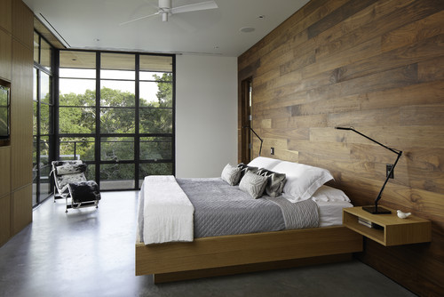
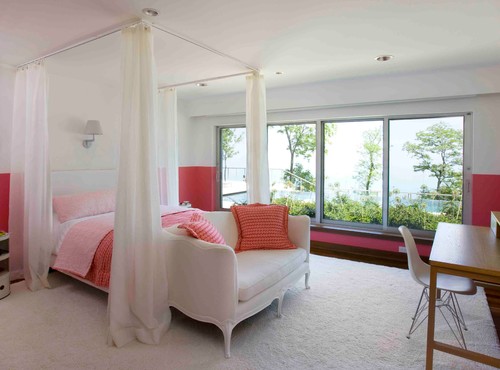
1. Tune up the bedroom with feng shui. With Valentine’s Day this month, it seems like a good time to spruce up the bedroom. If you are in the market for new bedding, consider shades of pink and red to encourage romance. Rotating your mattress regularly will help prevent it from developing hills and valleys, which in feng shui can be seen as separating partners in the bed. While you’re moving mattresses around, have a peek underneath the bed — what’s hiding down there? In feng shui a clean area beneath the bed is best for relationships, so be sure to vacuum up dust bunnies and deal with hidden clutter. 

2. Fluff pillows and duvets. Duvets and pillows looking flat? That’s because over time, air is pressed out of them, and the filling (whether down or synthetic) can shift and clump.

Some synthetic-filled pillows and duvets can be machine washed (check the labels for instructions), and even down-filled items can be fluffed up in a dryer on a no-heat setting. Toss a few tennis balls into the dryer with your duvet to help it regain maximum fluffiness.


3. Clean up road salt from entrances. If the winters are chilly where you live, you know how grimy road salt and melted snow can leave your floors, especially in high-traffic areas. After giving these areas a thorough cleaning, stow your supplies nearby so it’s easy to sweep floors regularly.

4. Clean seat cushion covers. Like floors, entryway seat cushions can take a beating at this time of year. Take off removable covers and launder them; spot clean upholstery.
 

5. Tidy and restock cleaning supplies. Get prepped for spring cleaning by sorting out your cleaning supplies. Toss products you tried that didn’t work and fill in gaps with fresh cleaning supplies and tools. Look over your dish towels, mop heads and microfiber cleaning rags, and replace them as needed. 

6. Rotate art and touch up walls. Give your home a winter wake-up call by swapping out a few pieces of artwork, patching dings in the walls and touching up paint. 

Make rearranging your collection easier in the future by installing a few narrow shelves around the house, like the one shown here.


7. Recycle e-waste. Old tech devices, CFL bulbs, ink and toner cartridges, and batteries contain dangerous toxins and cannot be tossed in with your other garbage or recycling. Store up your e-waste in one place and take it to a recycling center that accepts these items. Some office supply stores, like Staples, have free e-waste recycling programs — just drop everything off at your local store, and you’re done. 

8. Change furnace filters. A clean furnace filter will help your heating system work more efficiently and trap more dust and allergens. Most high-efficiency filters should be changed every three months — but it helps to inspect them every month, just to be sure.

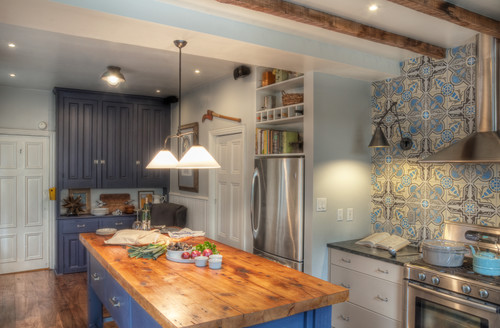
9. Spruce up your favorite reading nook. This is a good time to get cozy with a book. Spruce up your reading corner with a warm throw, a soft rug and a comfy ottoman to put your feet on. And if you find yourself stuck in the house on a snowy afternoon, why not spend it organizing your books?


10. Book a summer rental … and consider renting your home out, too. Seem a little early to be thinking about summer vacations? Not if you want to book a cottage — highly coveted locations arebooked months in advance. 

And if you want to offset the costs of your trip this year, consider listing your home as a rental or look into doing a house swap to stay somewhere for free.

Wednesday
Jan292014

11 Ways to Update Your Kitchen Without a Sledgehammer

OK, so you have a perfectly good kitchen. The layout works; the cabinetry is solid; but it just needs a little uplift. There are plenty of relatively minor changes you can make that don’t involve restructuring your life and house. Here are a few.

1. Repaint your cabinets. A fresh coat of paint can transform a kitchen from dark and dingy to light and airy. If you are a few years away from that big kitchen reno, this is a great time to have some fun with color.


2. Upgrade your countertop. Upgrading a dated countertop will give new life to your entire kitchen and add value.  

3. Install a new backsplash. If your cabinetry and countertop work nicely but your room lacks pizzazz, a new backsplash can add lots of personality and really dress up a kitchen. A bit of texture, sparkle or gloss will give simple cabinetry a lot of presence. 

4. Make a statement. New jewelry always picks up my mood. It can do wonders for your kitchen too. New hardware can dress up plain cabinets, while standout lighting fixtures can add a surprising wow factor.  

5. Change your faucet. A detachable hose with a hand spray comes in handy for so much more than just giving a bath to the cat. I prefer a faucet with a flexible braided water-supply hose. It looks better than a plain black rubber hose and will last longer.


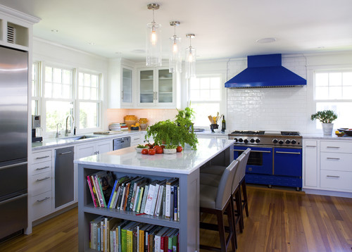
6. Expand your horizons. Need more surface area? Don’t think you need to start from scratch. If you have an island, you can introduce a different material on an added eating counter either below or above the counter.

The standard counter height is 36 inches. A nice option, like you see here, is to add an extension at table height (30 inches is typical). The great thing about adding a table-height extension is that regular kitchen and dining chairs will pull up to the counter comfortably. If you prefer a higher surface, you could go with bar height (40 to 42 inches). 


7. Consider refacing. New cabinet fronts and doors can dress up the cabinetry boxes if the layout already works and they are solid. 

8. Rethink the uppers. Open shelving offers an opportunity to display collections or just keep frequently used items accessible. Wine comes to mind, but that’s just me. 

9. Add some cozy touches. A runner is a great addition to a galley kitchen. I don’t know why we are disciplined to treat our kitchen like it has a different set of rules when it comes to decor. I’m all for adding a table lamp for an unexpected element in a kitchen. 

10. Add a floating island. If a new bank of cabinetry is beyond the budget, try a ready-made freestanding piece to add extra storage and a surface for working and eating surface.

Add a new top to a freestanding piece of furniture and extend the edge for an eating counter. The minimum overhang would be 10 to 12 inches, but there are a few considerations when extending the top. Take care not to shift the balance of weight so much that the piece is unstable (people love to rest their elbows, adding weight to the surface). Also you may need to add brackets to support the overhang.


11. Add a showstopper. A simple kitchen with simple cabinetry is downplayed by a showpiece range. Playing up one feature is a great way to detract from less interesting elements.

Monday
Jan272014

Get the Look of a Built-in Fridge for Less

Counter-depth refrigerators are popular appliances for new kitchens. Their appeal is that they save precious aisle space by sitting flush with the cabinets rather than sticking out. This makes the kitchen look smooth, custom and visually organized. These models can also be finished with matching cabinet doors for an even more cohesive look. 

The downside is that they are very expensive. They can cost two to three times more than a regular freestanding refrigerator, and must be wider to incorporate the same cubic-foot storage. If you want this look without the extra expense, design your kitchen and cabinets so that your regular-size refrigerator sits flush with your cabinets. 

Freestanding refrigerators come in many sizes and configurations. While typical base and tall cabinets are 24 inches deep, freestanding refrigerators can be 30 inches deep or deeper, with varying widths too. Therefore, you should select your refrigerator early in the planning process. 

To get that flush look, you can either recess a freestanding unit several inches into a wall or have your cabinets furred out several inches to meet the refrigerator.

In this kitchen, if you look carefully, you’ll see that the 24-inch-deep base cabinets that extend to the left are recessed behind the oven cabinets. The appliance portion of this wall, therefore, has been furred out. Note that the side cabinet panel on the right has been ordered in a larger size to accommodate the depth of the refrigerator, which is greater than 24 inches.


In this case the refrigerator door sticks out beyond the base cabinets. But because there are deep side panels and a deep cabinet overhead, the refrigerator looks incorporated into the cabinetry and built in. A deep cabinet above the refrigerator is a good place for tray storage or even a TV, as shown here.


Here is another kitchen where deeper cabinets accommodate the greater depth of a freestanding unit. This refrigerator is a bottom-freezer model.


Here the homeowners built a wider set of deep cabinets, which include some open shelves for display.


Another way to “build in” your freestanding refrigerator is to actually build it into the wall, rather than cabinets. If your kitchen plan will allow it, this is probably the easiest and most cost-effective way to get the look, because you can make the opening the exact width and depth you require. You also won’t have any cabinet modification costs. 

This is particularly nicely done. The very linear refrigerator fits neatly into the opening and is trimmed out with house molding. The display shelf above draws the eye up. With a wine refrigerator next to the main refrigerator in a small peninsula cabinet, this is a good area for dispensing drinks.


This kitchen utilizes a very effective way to incorporate a deep refrigerator: The cabinets are stepped, for a very custom look. From the corner to the left of the refrigerator, the cabinets are typical sizes: 12 inches deep on top; 24 inches deep on the bottom. Next comes the upper cabinets and the appliance garage unit, probably 15 to 18 inches deep. The deepest cabinet is around the refrigerator, with display cabinets above. 

On the end is a tall open cabinet that creates an interesting visual display as one enters the kitchen. Note that this cabinet is actually pulled back a few inches from the refrigerator depth, so it continues the stepped look and also makes that corner a little less intrusive.
 

Cabinets and a refrigerator sandwiched within stud walls create a clean and contemporary look here. The cabinets were probably furred out within the walls. 

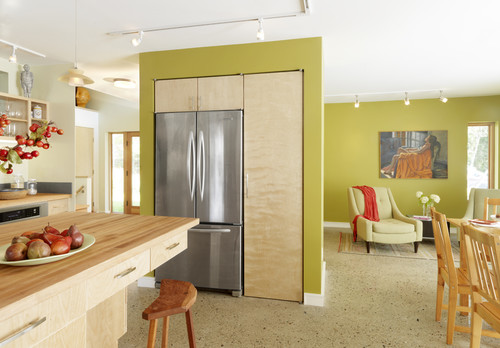
This refrigerator is the centerpiece of an open display area. This would be a very cost-effective way to house a refrigerator and small appliances while using a short wall. (This treatment even accommodates a radiator.)

Wednesday
Jan222014

9 Big Space-Saving Ideas for Tiny Bathrooms

Article by:

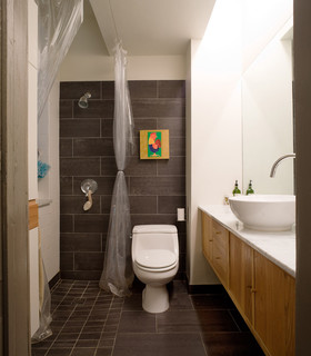
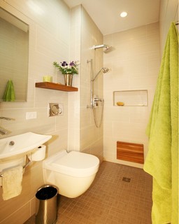
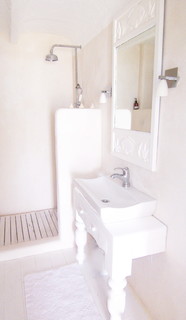
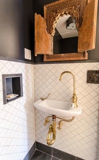
Really small bathrooms can be incredibly challenging to design. When there is hardly room for a toilet and sink, let alone a shower (a tub being totally out of the question), the usual fixtures and room layout simply will not do. These nine ideas go beyond simply making your bathroom look bigger and actually free up more space. 

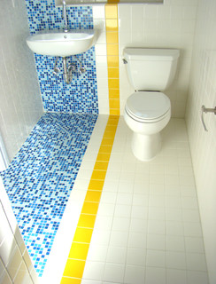
1. European-style wet bath. A wet bath is exactly what it sounds like: a bathroom where everything can (and does) get wet. This style of bath is quite common in Europe, where you will often see a tiny bathroom with the showerhead directly over the toilet, a small sink on the side and a drain in the middle of the floor. By forgoing a shower surround, you can really maximize square footage in a small space.


Wet bath a little too wet for you? Add a shower curtain on a ceiling track. If you plan the layout so the shower nozzle doesn’t spray directly across the toilet, you’ll have the option of dividing the space with a shower curtain.


2. Wall-mounted toilet. This wet bath has another feature widely used in Europe — a petite wall-mounted toilet. This style of toilet might look a little flimsy, but it’s actually quite strong when properly installed. Not having the center pedestal and upper tank to contend with makes this a major space saver.


3. Compact shower stall. A mini shower stall with a partial wall is another good option, somewhere between a traditional shower and a wet bath. The openness makes the room feel larger, but the partial wall offers some sense of division.

4. Flat mirror plus narrow sink. A regular mirror instead of a medicine cabinet has two benefits: its slim profile visually expands the space, and it allows for a narrower sink profile than a fat medicine cabinet sticking out above.


5. Teardrop-shaped sink. Curves feel more welcoming than sharp angles in a tight space, and this unique teardrop-shaped sink is both a space saver and a focal point. The curved shower wall in this wet bath echoes the lines of the sink, creating a smooth and seamless look.


6. Water fountain–style sink. With a smaller scale than most sinks out there, a single-basin, single-handle, gooseneck faucet sink can fit into even the tightest spots. And it looks pretty swell doing it.


7. Sliding door. The designers of this space-conscious houseboat chose a sliding door to save room. The swing of a traditional door can eat up a lot of floor space; go with a pocket door or sliding barn door instead and save that precious square footage for other things.


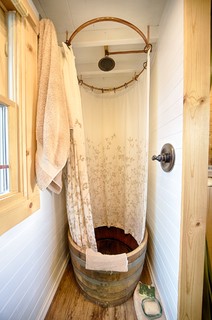
8. Shower in a barrel. Rustic, charming and certainly not for everyone, this may be the most creative reuse of a wine barrel we’ve ever seen. The homeowners must wipe out the interior of the barrel after each shower to keep the unsealed wood in good shape, but it’s worth the effort for its scale and unique good looks.


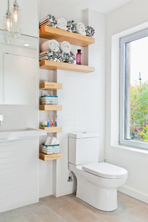
9. Custom-fit shelves. Hard to find storage space? Look closely and you may find a few nooks to tuck shelves into. Even 6-inch-wide shelves can be enough storage for toiletries, washcloths and extra soap. Don’t forget to look up, too — a high shelf or two can be a lifesaver if you need a place for extra towels.