twitter Facebook Google+

                 linkedin pinterest houzz  

Click for the BBB Business Review of this Countertops in Denver CO 

Google Review 

Sales & Promotions!

Architects, interior designers, and more ∨

Hire a decorator to find that just-right couch and coffee tables for your living room.
Find wall shelves, a customizable closet organizer and stylish furniture for home to whip your closet into shape.
Remodeling and Home Design

Qualify Us Now! ProView 

Cambria logoUp to $45,000 interest free for your project!Finance by Cambria

 convenient and easy.

  • No Money Down
  • Interest-free financing for up to one year without payments
  • Financing up to $45K for any project that includes Cambria (including cabinets, flooring, sinks, plumbing, install & more)
  • Secure paperless telephone application
  • Credit decision in less than 10 minutes


Monday
Jan202014

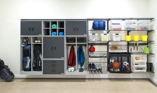
How to Make Your Garage a Storage Powerhouse

Article by:

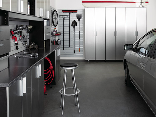
Garages often turn into repositories for everything from sports equipment to holiday decorations. But with planning you can turn your garage into a harmonious space with room to actually — wait for it — park the car. 

Why: “The garage is definitely the most underutilized space in the house,” says Amanda Le Blanc, a professional organizer (she owns The Amandas in Birmingham, Alabama) and spokesperson for Organized Living. “I prefer the garage to the attic for storage, because a garage actually has less temperature fluctuation.” 

How: Ginny Scott, chief design officer at California Closets, says to start by determining what you need to store. “You need to think of your goal first. Do you want to store overflow from the pantry? Do you want to make a Costco closet? Do you need a workspace like a potting or tool bench? Maybe you need a place to stash sports equipment. Once you have determined what you want to do, that will inform the kinds of shelving, cabinets or lockers you need,” she says. 

Le Blanc says knowing yourself will help you figure out what kind of storage you need. “It’s all about how you function in a space,” she says. “An organization system won’t change the type of person you are.” 

She says that although a garage lined with storage lockers and cabinets has a clean look — an important factor for garages that open at the front of the house and are visible to the neighbors — if you are of the “out of sight, out of mind” school, closed storage is not for you. “If you are that type of person, then go for open shelves and labeled bins,” she says.
 

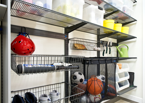
Le Blanc says for kids’ items and sports equipment, open shelving is almost always the answer. “I tell parents to forget about lids with kids,” she says. “If there’s a barrier, it seems to keep them from putting things away.”

Whether you are installing shelves that are open or in cabinets, Scott suggests choosing adjustable units for the garage. “It’s more important here than elsewhere,” she says. “We may not change the way we use our pantry much, but what we use in the garage varies from year to year and season to season.”


Scott adds that it’s also important to choose storage units that are made from durable materials; items stored in the garage are often heavy, so you want shelves that won’t buckle or bend. She also says in the tighter confines of the garage, you are more likely to bump, brush or spill things on your storage system, so an easy-clean material such as a high-grade laminate is often best. 

Cost: It depends on material selection. “The good news is that garage storage is often less expensive than regular closets, because we usually use simple materials and hardware, and we usually don’t use glass inserts,” says Scott.

She says an 8-foot run of open shelving in a garage could cost $1,000 to $2,000 (rough estimate). A row of storage lockers of the same length might cost $2,000 to $3,000. 

Project length: From consultation to installation, this kind of project could take three to five weeks, Scott says.

Permit: “Unless we are doing something structural or adding electricity, no permit is generally needed,” says Scott.

Wednesday
Jan152014

10 Creative Ways to Give Your Kitchen a Boost

Article by:

After the flurry of holiday decorating and baking is over, the kitchen can seem a bit forlorn — but if one of your New Year’s resolutions was to eat healthier or cook more meals from scratch, it’s important that your kitchen supports and inspires you. These 10 doable project ideas are meant to revive your kitchen and make it an inspiring space that you can’t wait to spend time in. 

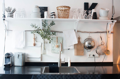
1. Use a found branch for hanging storage. If you have open shelving in your kitchen that rests on brackets, as shown here, extend their usefulness by sliding a thoroughly cleaned branch through the base of the brackets. Use simple S-hooks to hang small pots, spoons and other implements from the branch. You can even hang a small vase or a mason jar filled with flowers — just wrap the mouth with twine or wire to form a loop, and hang it from an S-hook. 

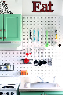
2. Try a pegboard in the kitchen, à la Julia Child.Julia was onto something when she designed the now-famous pegboard pot rack on the wall of her Cambridge, Massachusetts, kitchen. You can do the same by hanging basic pegboard on your kitchen wall and using S-hooks to hang cooking tools. Paint the pegboard to match your walls for a seamless look.


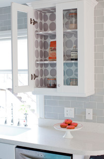
3. Paper the interior of a glass cupboard. This is the perfect place to use up any wallpaper scraps you may have lying around. If you don’t have wallpaper, pretty shelf paper or even quality gift wrap can be used instead.


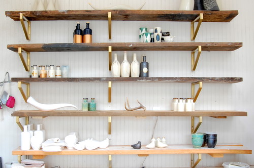
4. Glam up your shelving. Another easy way to spice up basic wall shelves is by coating the brackets with gold paint. Or, for a similar effect with less fuss, pick up a roll of copper tape at the hardware store and carefully apply it just to the edge of your shelves — this works best if your shelves are the same thickness as the tape, so measure first. 

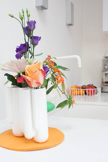
5. Bring in fresh blooms. You probably buy fresh flowers for other rooms in your home from time to time; why not snip a few for the kitchen? A vase with slots for individual blooms, like the one shown here, is ideal because it is so easy to fill.


6. Add a splash of unexpected color. Transform a plain step stool with a lick of vibrant color, paint the interior of your pantry, or line your drawers with polka dot paper. A bit of color or pattern where it’s least expected is especially welcome when it’s gray outdoors.


7. Give a plain basket a neon makeover. French market baskets are some of the most useful little accessories to keep around the house. Spruce one up with a simple painted-on star or heart in a neon hue and use it as a mini hamper for dirty dish towels and cloth napkins. For an even easier (and temporary) take, simply cut and stick on neon-colored tape.


8. Borrow baskets from the living room for produce storage and display. Have some lovely woven baskets just hanging around with nothing in them? Put them to work storing long-lasting produce like potatoes and onions, or colorful piles of lemons and limes.

9. Hang food magazines on a painted ladder. If you refer to your favorite food mags for recipes and menu ideas, keep them handy. A short ladder leaning against the wall is a perfect spot for stashing a rotating selection of your favorite foodie magazines — and in a pinch, even smaller cookbooks could get slung here, too.


10. Paint your breakfast-table chairs in a rainbow of pastels. Love pastels? I say, go for it. After all, why shouldn’t your breakfast nook be the cheeriest spot in the house? And if you don’t feel up to painting the entire chairs, even giving just the legs or seats a dip in pastel hues would make a big impact.


Monday
Jan132014

Bathroom Remodel Insight: A Houzz Survey Reveals Homeowners’ Plans

Article by:

Older and younger generations often have widely differing viewpoints. But who knew bathrooms could be so divisive? In a recent Houzz survey, we asked homeowners planning a bathroom remodel or already in the process of one about their needs and desires. Of the 7,645 people who responded, young and old homeowners tended to fall into two clear groups. 

Homeowners 65 and older are more likely to skip adding a bathtub than those under 35. This could be for any number of reasons, but it’s likely that younger homeowners may have or expect to have children, who would be more likely to use a tub. Plus, those 65 and older likely choose showers because they’re more accessible for aging in place.

Bathtubs have traditionally boosted resale value (which 31 percent of the respondents said was the driving factor for their bathroom remodel), but older people may be planning to hang on to their homes longer, so resale isn’t as much of an issue.


For those adding tubs, freestanding models top the list, with 33 percent of respondents preferring them over drop-ins, undermounts and other styles. 


Young and old are also split on how they like their showers. If you’re under 45, you’re more likely to choose a rain shower and multiple showerheads. If you’re over 55, you likely prefer hand showers and sliding bars.


Meanwhile, there are two camps when it comes to, er, No. 2. The survey found an even split when it comes to toilet exposure: 52 percent of people want an open toilet versus one behind a closed door. Younger homeowners (25 to 34 years old) prefer tankless or wall-mounted models over the traditional two-piece ones. 

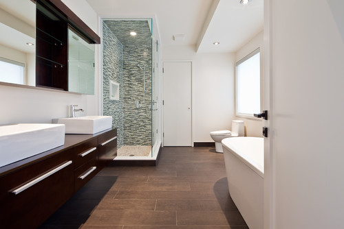
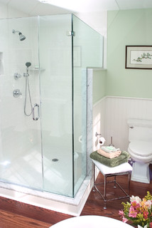
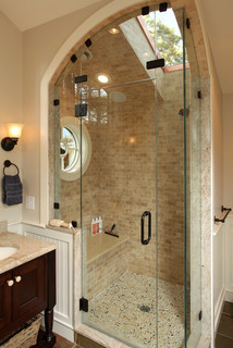
Upgrading features and fixtures was the main reason cited for remodeling a bathroom (49 percent). Frameless glass is one of the more popular choices. About 79 percent of people will choose all-glass enclosures for their main shower, and 54 percent will chose frameless glass.


Lighting is important too, whether it’s bringing in the natural sunshine with skylights or adding more LED lights. New windows top the list too, with 48 percent of respondents saying they plan to add a window and 41 percent a lighted vanity mirror. And if that’s not enough, 7 percent say they’ll add a showerhead with LED lights.


Also, 42 percent of all respondents are planning to add a shower seat. I think it was Winston Churchill who said, “Why stand when you can sit?”


White cabinets are the preferred color choice, with 32 percent of homeowners saying they’ll choose this ultimate neutral hue.


Brushed nickel (26 percent) and polished chrome (24 percent) are the front-runners for faucet finishes.

Wednesday
Jan082014

How to Remodel Your Fireplace

Article by:

The fireplace is often the most commanding element in any room it’s in. Size and abundance of material are often factors, but as renovation specialist Ron Parko points out, our eyes are naturally drawn to the darkest object in a room anyway. Oftentimes, that’s the firebox when it’s unlit. 

Naturally you want this element, and everything that surrounds it, to complement the rest of your home. In many older homes where large brick fireplaces prevail, this can pose a challenge. What do you do? Cover it, paint it, rip it out? Here’s what to consider. 

Project: Remodeling a fireplace wall.

Why: Replacing a fireplace wall is mostly an aesthetic choice, but besides pleasing you now, an updated fireplace can also can add resale value. 

Who to hire: Someone with plenty of experience remodeling fireplaces is recommended if the job is more than just drywalling or plastering. Someone like Rita Henry, will consult with clients through email and provide renderings and design plans so they can hire a local general contractor to do the actual work. 

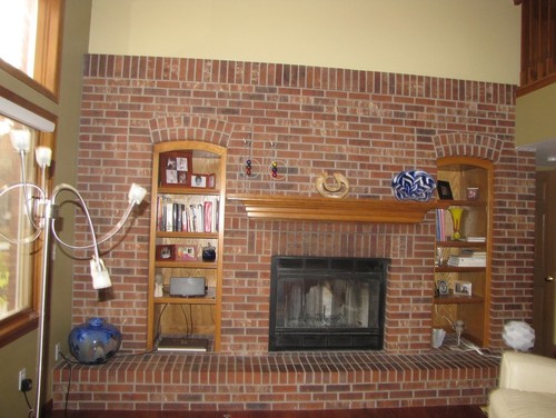
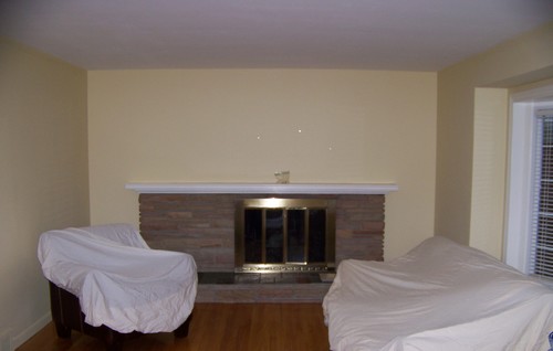
Brick fireplaces are the most popular to replace. Henry says a quick and easy solution is to simply wrap the brick in either tile or wood, leaving the exposed brick for the firebox. “It’s a more updated look that’s one of the least expensive,” she says. And that way the brick will remain beneath the new material in case a future home buyer prefers brick. 

For the brick fireplace shown here, she wrapped the whole thing in tile. 

AFTER: The stone tile runs wall to wall, creating a dramatic look. It completely changed the tone of the living room in this Denver home

You could also choose to drywall or plaster over the brick, creating a blank canvas that you can then do pretty much anything you want with.
 

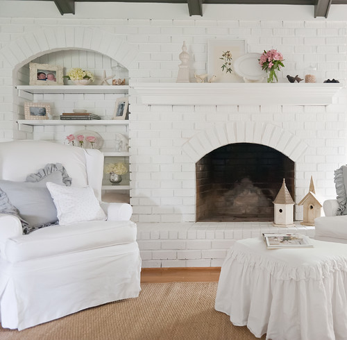
Painting is also an option. While Henry doesn’t prefer the look of painted brick, it’s a relatively inexpensive update that can easily be changed. 

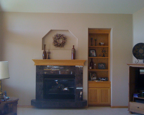
For this project Henry ripped out all the existing elements, flattened the niche and cleaned up the wall. 

AFTER: A new mantel and built-ins transformed the space. Henry says an upgrade on this scale could be done for around $3,000.

Length of project: A standard drywall installation with mantel and surround can be completed in two days. A custom mantel or more extensive ductwork or electrical installation can take five or six weeks.
 

For this 1950s fireplace, renovation specialist Ron Parko’s client wanted to add bookcases and extend the hearth to each wall.  

AFTER: Because the fireplace is off center, Parko tried to mask it while also extending it out. Raising the elevation made it dominant, while photos and accessories help distract the eye from the imbalance. 

Cost: Drywalling over a brick fireplace could run about $1,500. Parko says a 6-foot-wide floor-to-ceiling paint-grade oak or poplar fireplace with a tiled hearth could run around $2,000. Wrapping an entire fireplace wall in stone and adding a custom mantel could run around $9,000. The most expensive remodel Parko did was for $12,000, which included bookcases, hidden drawers and a mantel leg that concealed a shotgun. 

Permit needed: Only if you’re altering the firebox, adding a wood burner or converting to gas.

Best time of year to do this project: This is a year-round project, but if you’re considering adding hardwood to a room or doing anything to the walls, including painting, it’s best to do the fireplace first. 

Monday
Jan062014

7 Tips for Designing Your Bedroom

Article by:

Have you ever been in a room that just feels right? Nine times out of 10, it's because it has a simple design that functions well. But creating a simple design is harder than it looks — particularly in bedrooms. 

Why? Because every bedroom absolutely has to have a bed in it. And beds are big and ungainly, and dictate the placement of every other object in the room. But if you're lucky enough to be planning a bedroom from scratch or remodeling an existing bedroom, you can control the other elements and create a space that's both practical andpretty. 

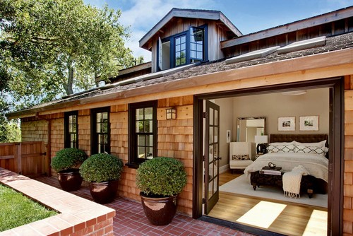
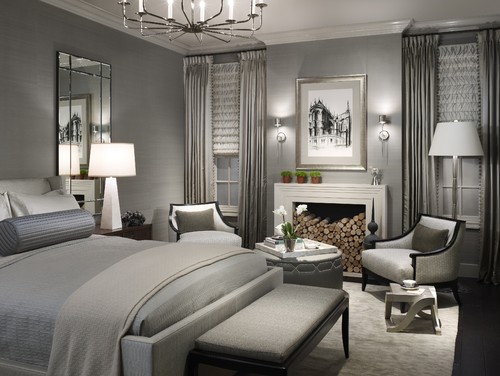
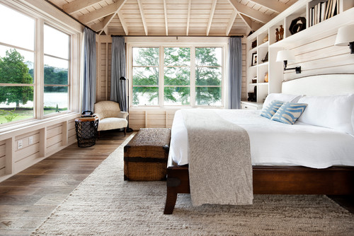
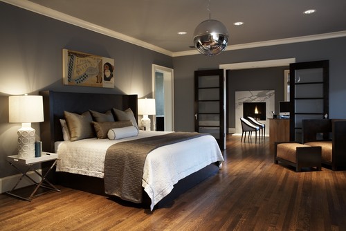
The bedrooms shown here manage that feat with panache. Even if you don't have a great view, access to the outdoors or plenty of space to work with, the principles they embody and the simplicity they show can inspire your own bedroom design project. 

Because the bedroom is one of the simplest rooms in the house, it's often overlooked. One of the first steps to a great bedroom design is having an efficient and well-designed floor plan that gives you everything you want — no matter how much space you start with. 

Here are seven tips to help you get the most out of your bedroom. 

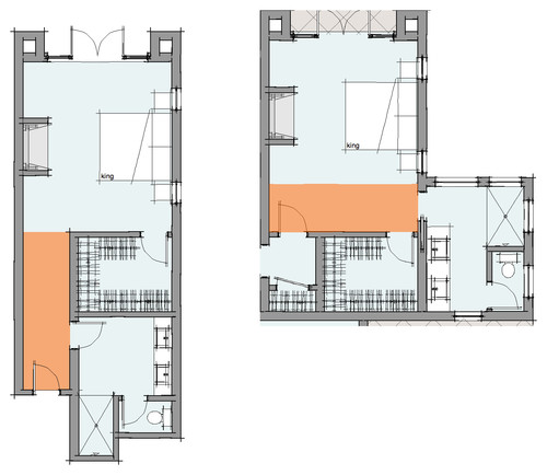
1. Simple circulation. Try to keep your circulation on one side of the room. Hotels do a great job of this. There's a reason 90 percent of hotels have the same floor plan: because it's simple and it works. 

Circulation plans become a little more challenging with en suite rooms (bedrooms with bathrooms attached) or bedrooms that have doors to the outside.


To save on space, pay attention to where you locate the bathroom and closet in your bedroom. Rooms that have bathroom or closet access before the sleeping area require a longer hall (see the left-hand plan). If you organize the circulation so the bathroom and closet are accessed through the sleeping area (right-hand plan), you don't need a separate hall, and you can add the circulation space into the room to make it feel larger, too. 

2. Focus on the view. A bedroom always feels nicer when the first thing you experience is a pleasant view out the window — as opposed to a view looking straight at the bed. If you're designing a new bedroom or reworking an old one, try to come up with a layout that focuses on the vista — whether it's something as stunning as a lake or as simple as your backyard. 

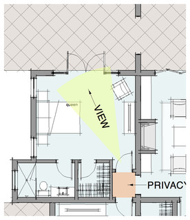
3. Keep privacy in mind. It's always nice when you can leave the bedroom door open without forsaking all of your privacy. The small foyer in this example provides separation from the family room. I always try to avoid designing a layout in which you look directly into the bedroom from a more public space, like a great room, kitchen or family room.


4. Connect with the outdoors. While this might not be feasible in all climates, connecting a room with the outdoors is a great way to make the space feel larger and admit more natural light. If your bedroom is on the ground floor (or is on the second story and has an adjacent terrace), adding a set of French doors can instantly increase visual space.  

5. Consider the furniture layout. Your bedroom's architecture should take your furniture into account. Bedroom floor plans usually have a bed wall — but what about dressers, nightstands, TVs, chairs and a desk? Work with your architect or designer to make sure there is enough space beside the bed for nightstands and ample circulation so you can access three sides of the mattress. 

6. Increase light and ventilation. Locating your bedroom at the corner of your home can give you windows on two or more adjacent walls. This gives you the added benefit of cross ventilation and a softer natural light. 

7. Take your time. Great design takes a while and usually requires refining before you come up with the perfect plan for your lifestyle. Don't rush through the design — it's worth taking a little extra time up front to make sure you have a more efficient and functional plan in the end. 

The truth is, great design doesn't necessarily mean a space that's overly complex and expensive to build. A space that functions better, costs less to build, is more efficient to run and is easier to maintain can be an outstanding example of great design.