twitter Facebook Google+

                 linkedin pinterest houzz  

Click for the BBB Business Review of this Countertops in Denver CO 

Google Review 

Sales & Promotions!

Architects, interior designers, and more ∨

Hire a decorator to find that just-right couch and coffee tables for your living room.
Find wall shelves, a customizable closet organizer and stylish furniture for home to whip your closet into shape.
Remodeling and Home Design

Qualify Us Now! ProView 

Cambria logoUp to $45,000 interest free for your project!Finance by Cambria

 convenient and easy.

  • No Money Down
  • Interest-free financing for up to one year without payments
  • Financing up to $45K for any project that includes Cambria (including cabinets, flooring, sinks, plumbing, install & more)
  • Secure paperless telephone application
  • Credit decision in less than 10 minutes


Friday
Jan032014

January Checklist for a Smooth-Running Home

Article by:

January brings fresh starts and renewed hopes for the year ahead. Of course, with the excitement of the holidays done and months of winter stretching out before us, January can also be a bit of a downer — especially for those in cold climates. Make the most of the first month of 2014 by taking time to say goodbye to the old year (and the holiday decorations), give your home the TLC it needs to see it through winter storms, and dream up plans for the months ahead. Here are 10 to-dos to get your year off to a good start. 

1. Keep your home fresh and cozy postholidays. Once the glow of the holidays has passed and you shift back into your usual routines, the house can suddenly feel a bit empty. Fight the winter blahs by giving your home a good cleaning (those pine needles end up in the strangest places) and boosting comfort with extra candles, cozy throws, hot drinks and good music. 

2. Store holiday decorations properly. Yes, it’s sort of a pain, but taking the extra time to sort your Christmas lights, ornaments and decor now will save you loads of frustration next year — you owe it to your future self! Wrap each strand of lights around a stiff piece of cardboard to prevent tangling. (Remember to test them first.) Very delicate ornaments should be individually wrapped in tissue paper and stored in shallow boxes. Sturdier ornaments can be lightly wrapped and stacked in a box with cardboard dividers. 

3. Organize warranties and manuals. Get any new gadgets or appliances over the past year? Take a few moments to flip through that stack of old manuals and warranties, tossing out paperwork for stuff you no longer own — and remember to send in forms to activate new warranties as needed. Store everything together in one binder or document box. 

4. Install flood alarms. If you’ve had problems with flooding, you know how awful even a minor flood can be. Installing individual sensors in likely leak spots (behind the washing machine, toilet and drainpipes) can alert you before leaks become a disaster.


5. Keep hard surfaces sanitized. Cold and flu season is fully upon us. Do what you can to keep illness at bay by regularly sanitizing often-handled surfaces. Tables and counters are obvious spots, but don’t miss sneakier areas like doorknobs, faucets, phones and tech devices. 

6. Get inspired and set goals for the year. Want to get more organized this year or save up for a renovation? Then sit down on a blustery afternoon with a hot drink and your Houzz app or a pile of inspiring home magazines and start plotting and planning! Once you’ve settled on a few goals, try writing specific to-dos and deadlines on your calendar to keep your eyes on the prize.


7. Protect pipes from freezing. If you haven’t yet and still can, insulate any exposed outdoor pipes to prevent freezing. If you plan to be away from home during a freezing spell, have a friend or neighbor stop by to turn on your water to a trickle. Find out where your home’s water shut-off valve is, if you don’t know already, so you can quickly shut off water if a pipe does burst.

8. Inspect your house after winter storms. 
Get ahead of problems by carefully looking over your home’s exterior after each storm. Especially keep an eye out for any tree limbs that have come down and any damage to your roof or siding.
 

9. Provide for feathered friends. Wild birds in cold climates can use extra support. You can help by providing a safe place to land and fill up on fresh birdseed. Bigger birds like cardinals and jays prefer larger, dark seeds — look for a seed mix that caters to the kind of birds you see in your yard. Fresh (unfrozen) water can be difficult for wild birds to find in winter, so consider regularly providing a dish of fresh water, or a heated waterer. 

10. Out with the old, in with the new. Got some new goodies for Christmas? Instead of packing them into overstuffed closets and drawers, take a few extra minutes to seek out something similar to let go of. New set of sheets? Pick out an older set to give away. New pair of boots? Dig in your closet for a worn-out pair to toss.

Thursday
Jan022014

Conquer Clutter With Drawers: 14 Inventive Solutions

Article by:

For many years drawers knew their place in the home. They were filled with a jumble of junk in the kitchen, stocked with sweaters and shirts in the bedroom, and crammed with pens and rubber bands in the office. But designers have begun to recognize the flexibility of this design staple. There’s nothing like an easy-to-access drawer to organize — or hide — the essentials of daily life. 

Consider these options to conquer the clutter in your home. 

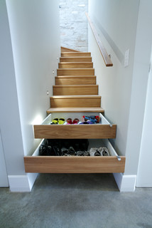
This narrow stairway features a truly ingenious storage solution: two of the risers are fitted with drawers to make a pile of shoes disappear in a flash.


Tired of tying up your kitchen outlets charging phones, tablets and laptops? Install a power strip in the back of a drawer and let your electronics recharge sight unseen. Just make sure the drawer is shorter than normal to allow room for the power strip’s cord in the back. 

Make edibles a design detail: Display your pasta or legumes in glass-fronted drawers. Brightly colored varieties (think red beans and spinach pasta) look best.


Instead of wrestling the ironing board out of the closet whenever you need to touch up a shirt, get one of these nifty folding versions that fit into — guess what? — a drawer.


Wine lasts longer and tastes better if it’s stored away from the light. This drawer, with its handy wooden cradles, keeps vino safe and close at hand. Don’t put the drawer near the oven, though, as heat is also a no-no. 

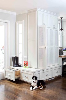
Even doggies appreciate their own dining area. Keep their bowls off the floor and out of the way with a pet-friendly drawer that slides out at mealtime.


Forget drying delicates over a shower rod or the back of a chair. These skinny drawers are fitted with water-resistant racks that allow air to circulate, so your clothes will be ready to wear before you know it. 

Store clothes, sheets and blankets in drawers tucked under a platform bed. These beds work especially well in small rooms where there’s no space for a dresser. 

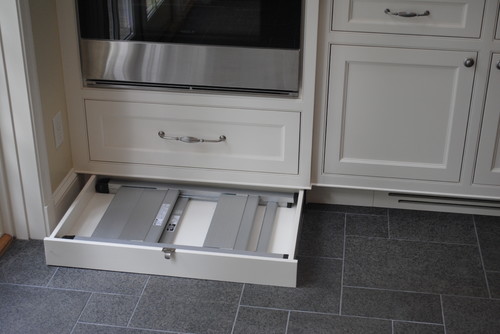
To eke out storage in every last corner of your kitchen, utilize the space under the cabinets with kick drawers. (They’re tucked in behind the cabinet’s toe kick.) This one hides a folding step stool to reach those high shelves, but you could also use this space to hold trays or cookie sheets. 

Clean up your entryway and keep track of outerwear by hiding it in discreet drawers. The ones here are faced with beadboard that matches the wainscoting.


Instead of there being a traditional ladder to access the top bunks in this kids’ room, a cleverly designed stack of drawers acts as a staircase. 

Need extra space for guests? Add a bed in a drawer that disappears under a window seat when it’s not needed. 

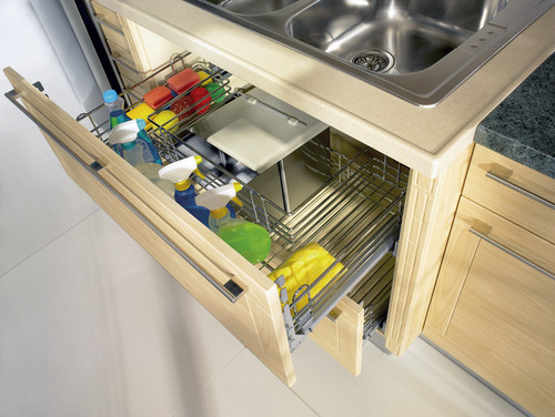
The pipes under a kitchen sink have always made it difficult to organize cleaning supplies. This drawer, with its U-shaped wire basket, is designed to fit around the piping, so you can easily access spray bottles, sponges and scrub brushes. 

This airy kitchen nook not only provides comfy benches for seating, but the drawers underneath can hide kitchen equipment.

Friday
Dec272013

Kitchen Color: 15 Fabulous Green Backsplashes

Article by:

Sure, your kitchen backsplash serves a very practical function: protecting the wall area above your countertop from splashes and spatters. But it’s also the perfect place to add a dash of fun color. The weather where I live in Central Texas has turned rather frightful, so I’m starting this new series on colorful kitchen backsplashes with happy, fresh, spring-inspired green hues. Here I’ve gathered some of my favorite examples with tips for working ones like them into your own kitchen. 

Create an eye-catching feature wall in your kitchen by extending a bold-colored textured backsplash tile all the way to the ceiling. This larger-format tile works best on a wall where you are forgoing upper cabinets, so the pattern can be fully appreciated.  

This backsplash has vibrant green hues, but the intensity is broken up due to the subtle shade variations of the handmade tile. I like the mix of greens and wood tones, as it has a very natural, organic feel. 


This gorgeous green onyx linear tile backsplash also has a nice mix of colors. (Always see a sample of your chosen backsplash material in person before you make a selection.) 

I love this kitchen for its openness to the outdoors as well as for its gorgeous splash of leafy green. The darker tile accent strip is a nice detail that helps break up the expanse of bold color and ties in well with the wood tones of the floor and table set. 

If you’re on the hunt for a kitchen backsplash material, you have no doubt noticed that tiles now come in every color, shape, size and texture imaginable, so I say why not go for something unusual? I’m a huge fan of these triangular tiles, which have a wonderful vintage-modern vibe. 
Large-format tiles are becoming increasingly popular, as are tiles in zingy colors. But the best thing about the tile here is that it was selected by the homeowner’s 2-year-old son. Very nicely done! 

What a fantastic grassy green color. It really brightens up and enlivens this kitchen, even on a cold winter day. This line of tile is available in a wide range of rich colors as well as interesting shapes and sizes, and it’s also manufactured in part from recycled materials. It works well with a variety of design styles, from traditional to contemporary, and has thus become one of my go-to tiles. 

If you go with a bold green backsplash tile, try picking up the hue in small bits around the room for color balance and cohesiveness. You can take your chosen backsplash tile to your paint retailer and have the color matched, or you can even have a paint color formulated for you that’s a few notches lighter or darker than the tile, should you want to break things up a bit. 

For those looking for a softer, mellower green backsplash, there are plenty of options. If you do go with a lighter and more subdued hue, try selecting one in a glossy finish, because it will add interesting sparkle and texture to the kitchen. These pretty glass tiles pair nicely with the rich dark brown cabinets and light and neutral countertop.  

Here’s another glassy, soft green backsplash. This particular shade of green reads as a neutral, so accents of other, bolder colors can be added, such as the red-orange on the base of that fantastic kitchen island.  

These hand-crafted tiles have subtle variations in color, which adds much charm and warmth to this gorgeous kitchen. 

This backsplash has a wonderful sheen and texture in addition to a slight hint of green. This is how to do a light and airy kitchen right.  

My favorite interior design style is contemporary with bits of industrial and rustic thrown in for warmth and charm. This kitchen captures that style perfectly with its clean, horizontal lines and minimal ornamentation. The exposed ceiling beams, colorful salvaged-wood-clad island and vintage metal stools are perfect decorative elements. As is the light spring-green glass backsplash, which adds a nice hit of color but keeps to the clean, minimalist and contemporary vibe of the kitchen.  

Not a fan of grout lines? Looking for a clean and modern alternative to tile? Consider a back-painted glass backsplash. It’s an easy-to-clean surface that has a cool and contemporary vibe.  

Or you could skip the tile and glass entirely and paint the wall a fun hue. If you go this route, I’d recommend installing at least a short splash to give you a finished edge where the countertop meets the wall, and to protect the area from splashes. Then use a paint in a semigloss finish to give the wall extra protection and allow for easier cleaning. 

Thursday
Dec262013

Splendor in the Bath: Art Deco Brings on the Elegance

Article by:

I realized a few years ago that our upstairs bathroom — with its leaky tiles, rusty faucets and crumbling walls — was due for a major rehab. I still loved its retro seafoam-green bathtub and sink, and its champagne-bubbly black and white wallpaper, so I wanted to hold on to those features and design around them. The room lent itself to an art deco treatment, and I knew that the aesthetic would make it chic at minimal cost.

There’s just something about art deco — the exuberant decorative style that had its heyday in the period between the two world wars — that has beguiled the public for nearly a century. Perfectly suited to both grand communal spaces (think Radio City Music Hall and the Chrysler Building) and intimate home interiors, it has never really fallen from fashion since its introduction at Paris’ Exposition des Arts Décoratifs in 1925. Since then art deco’s signature parallel lines and repeated geometric motifs have been incorporated into vacuum cleaners and ocean liners, toasters and martini shakers. The style exudes an urban, industrial essence, as well as a sense of optimism and fun.

Here are some art deco bathrooms that inspired me and a couple of photos of our new bathroom. I hope they inspire you

With its jazzy tile pattern, classic black and white color scheme, and streamlined, linear look, this bathroom projects the art deco sensibility in spades. The ziggurat pattern in the tiling evokes the image of a skyscraper; it’s a popular deco look. It’s based on an ancient Mesopotamian design. (Egyptian motifs were popular during the King Tut craze of the 1920s.) 

This bathroom exudes the self-confidence and futurism of the art deco age. This flamboyant fan-shaped mirror would look great in a larger space (such as the ladies’ room at Radio City Music Hall), but the simple white sink and black accessories (as well as the shower’s relatively restrained tile pattern) manage to tone down the energy level.


As people began to speed across the ocean in airliners and across the continent in locomotives, design became filled with allusions to transportation. The parallel vertical lines on this vanity base recall a rocket preparing for liftoff and express the style’s sense of speeding headlong into the future. The broad curving line of the top evokes ocean liner furniture and gracefully avoids sharp edges that would detract from the desired sleekness.


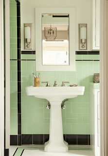
This bathroom has the whole art deco package, with its classic color combo of black, white and seafoam green; creative linear touches in black; and elegant glass and chrome wall sconces. The vertical-horizontal dynamic is enhanced by the placement of the green wall tiles, which alternate between horizontal and vertical pairs.


Cleverly incorporating the nautical look that is a hallmark of art deco design, this recently made piece functions as both a light and a mirror. Circular windows have always evoked the portholes on ocean liners, and this one even comes with a fish. 

A shiny black vanity top rests on a sturdy chrome base against a backdrop of black and white ceramic floor tiles and glass light fixtures, evoking the high-gloss aura of art deco. The wallpaper’s pattern of powder-gray lines (reflected in the mirror) echoes the open vertical spaces in the light fixtures, providing a clever softening touch.


This bathroom is a little more restrained than the usual art deco confection, but it still includes the basic elements. The chrome towel rack at the foot of the tub is a nice touch, while the suspended shower curtain ring and elongated shower stem give the room the illusion of greater verticality.


Cleopatra would have loved this elegant black, white and apple-green bathroom, with its ziggurat motif and touch of Nile-blue glass. The gleaming walls are made of Vitrolite, a lustrous structural glass that was very popular in the 1930s. You could get a similar look today with back-painted glass tile.


This is a corner of our new bathroom. We redid the wall in period-appropriate (and easy-care) subway tiles, with a horizontal line of green glass tiles on the shower wall and a vertical black line that’s out of view. A green glass shelf (with rounded corners) and chrome plumbing fixtures complete the look — although we’re still searching for a circular, black-framed mirror that will fit in the small space above the sink.


We treated ourselves to an accent panel depicting Charles Rennie Mackintosh’s popular Glasgow rose. We’ve incorporated Glasgow roses into other places in our house; we like the idea of repeating favorite motifs from room to room. Mackintosh’s visionary design work — most of it executed during the era of Victorian fussiness — is often considered a foundation of art deco.


Thursday
Dec192013

9 Hard Questions to Ask When Shopping for Stone

Article by:

Deciding to use stone and choosing the kind to use are more complicated than just picking a finish you like. Because stone is a natural material, its appearance, durability and production can vary from one quarry to another, and from one batch to another, causing problems (or in some cases, providing benefits) you might not have anticipated. 

Here are nine questions you should consider before buying stone. 

How thick does it need to be? Floor and wall tiles for interiors are usually ⅜ inch thick, while countertop slabs are typically 2 centimeters (¾ inch) or 3 centimeters (1¼ inches) thick. Exterior stone pavers could be 1½ inches or thicker. 

Differences in counter and paver thicknesses can usually be accommodated if planned for in advance. It’s also not unusual to add a laminated edge to the front of a 2-centimeter counter to make it appear thicker. Tile for floors, however, can be tricky, particularly if you want your floor to flow to adjacent rooms without a transition. The best practice is to select floor tile early in the process and choose a material with consistent thickness.

We opened a box of specified slate tile on a project and discovered that each piece was a different thickness, with some well over ½ inch, making them higher than the adjacent wood floors even without thinset below. The clients opted to send it all back and ended up selecting a ceramic tile with similar colors but very consistent thickness.


Are there fissures? This is a question not just for countertop slabs but for tiles, as well. A fissure is a natural weak point in the stone, usually visible as a hairline crack. A fissure’s location can prevent you from using the stone if cuts will result in the weakest point’s being located where the stone needs to be strong, like around a sink or on an overhang. It can also result in the slab’s breaking during fabrication.

Fragile stone tile can also break during cutting, which means tile setters have to anticipate more waste. Instead of ordering the usual 5 to 10 percent extra for waste, they might add 15 to 20 percent more. The best practice is to select a slab and have the fabricator review it for flaws and fissures, so that you’ll have time to select something else if it won’t work.


What’s your finish? The most common finishes for stone are polished and honed. Both have a sheen, although honed has a fine texture that minimizes reflection. A heavier texture can be achieved with acids, buffing and heat, resulting in “antiqued,” “tumbled”and “flamed” finishes. Which one you choose depends upon personal taste, except when it comes to matters of safety. The larger the tile and the more polished the finish, the more likely it will be slippery under wet feet or shoes. 

An easy way around slipperiness is to install the material in a smaller size — 4 inches square or less — or to select a material with more texture.


How well will samples match what arrives at your home? Because stone is a natural material, it can vary in color and in many other ways. If you can, get a large sampling of what’s in stock — five to 10 pieces of 12- by 12-inch tiles, for example — so you can see what you’re likely to get in a typical box. If there’s a huge variation in color or quality, you may want to look at something else. 

This backsplash (far end) is a mix of onyx and glass mosaic tile. The onyx tile arrived at the jobsite with some bright red streaks across the face, which weren’t visible in the sample. The clients opted to buy additional tile and piece in nonred stone to make the results more consistent. 


Is it strong enough to span? Countertops are sometimes designed to span significant distances — over dishwashers, breakfast bars and desks, for example. Manufactured materials like quartz have specific maximum spans, but the fabricator may recommend a variety of solutions with stone, depending upon how large the unsupported portion is: a decorative corbel or other support; a concealed steel brace; or even a routed area under the stone for a steel or fiberglass rod. Your fabricator will help you determine how much support your counter needs. 

How porous is it? All stone is not created equal. Some stones, such as limestone and marble, are more porous than others, and are more likely to absorb stains from substances like red wine and coffee. Acidic substances like lemons can etch surfaces, and even hair dye can stain a shower. Some stones, such as soapstone, are softer than others and can be scratched. 

Before committing to a stone, think carefully about how you plan to use it, and how much contact it’ll have with potentially damaging substances.
 

Will it hold up? The answer to this question depends on your lifestyle, how much you plan to use the stone surface and how careful you are with cleaning. (Cleaning products can etch limestone, marble and other materials.) 

We once had clients whose old limestone counters were covered in coffee stains and had to be removed. They replaced them with Caesarstone, which remains in great shape many years later. My own granite counters are pristine almost a decade after installation, with no resealing.


To seal or not to seal? Sealants are frequently used on grout and sometimes on natural stone.Some sealants darken or even give a shiny look to otherwise honed or textured surfaces. If you’re considering a sealant for your stone, request a sample showing you different options, so you’ll know how the finished surface will look.


What’s the source? Stone comes from quarries across the globe, including the United States. Part of selecting a material involves thinking about where it comes from, how it is produced, the environmental impact of transporting it to your locality, and whether it is a sustainable, sensible and long-lasting material. 

If you still have questions, ask your local supplier, fabricator, contractor or designer about the specifics for your project.

Page 1 ... 8 9 10 11 12 ... 52 Next 5 Entries »