twitter Facebook Google+

                 linkedin pinterest houzz  

Click for the BBB Business Review of this Countertops in Denver CO 

Google Review 

Sales & Promotions!

Architects, interior designers, and more ∨

Hire a decorator to find that just-right couch and coffee tables for your living room.
Find wall shelves, a customizable closet organizer and stylish furniture for home to whip your closet into shape.
Remodeling and Home Design

Qualify Us Now! ProView 

Cambria logoUp to $45,000 interest free for your project!Finance by Cambria

 convenient and easy.

  • No Money Down
  • Interest-free financing for up to one year without payments
  • Financing up to $45K for any project that includes Cambria (including cabinets, flooring, sinks, plumbing, install & more)
  • Secure paperless telephone application
  • Credit decision in less than 10 minutes


Monday
Nov182013

Countertop + Backsplash: Making the Perfect Match

Article By:

Which do you select first — kitchen counter or backsplash? How do you coordinate colors? Is it OK to mix patterns? The seemingly unlimited countertop and backsplash choices can feel overwhelming.

I've had homeowners approach me after weeks or months of looking at and collecting samples of materials that they love separately but just don't love together. Some settle on a combination that looks good together, but they don't actually like either material on its own. 

Here are 10 examples of stunning and successful countertop and backsplash combinations to help you plan your own mix of kitchen finishes, along with tips to ease your selection process. 

Approach 1: Select the Countertop First

If you feel overwhelmed by the countertop and backsplash options, try focusing on countertop selection first. Your countertop is the workhorse in your kitchen and can constitute a good chunk of your budget, so you'll want to get it right. Your budget and the way you use your kitchen will narrow things down. Plus, there are generally fewer color and pattern options for countertop materials, whereas backsplash options are practically unlimited. Countertops will also be installed before the backsplash, so you definitely need to decide on them first if construction has already begun.

Browse the Houzz photo database for countertop materials that appeal to you and the compare pros and cons in the Houzz guides to countertops. If you want to see something in person, check out what's available at your local stone yard, kitchen and bathroom design showrooms, and home improvement stores.

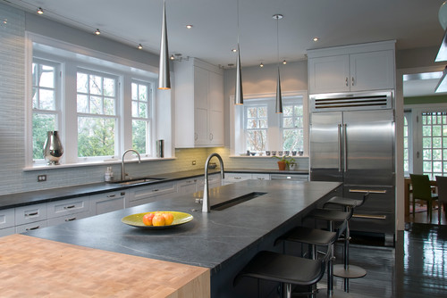
Shown: Soapstone and butcher block counter; linear glass tile mosaic backsplash
 

Once you've homed in on your countertop of choice (congratulations!), you have immediately narrowed the field of options for the backsplash. Trust me, this makes your life easier. 

Now, you don't necessarily need to exactly match the color or pattern of your countertop to that of your backsplash, especially if you go for an unusual hue or a countertop material with a lot of movement in it. In these cases a simple and neutral-hued backsplash is a good choice, so that the countertop takes center stage and does not fight with the backsplash for attention.

Shown: Orange quartz counter (get the look withOne Quartz from Daltile); Oceanside Glasstile'sTessera mosaic blend in Veil backsplash


If you want to go bold with both your countertop and backsplash, bring a sample of your chosen countertop material with you as you shop for backsplash tile. You will be able to instantly limit your backsplash options to those that work with your countertop material. If you are struggling with finding the right backsplash to work with your countertop selection, consider hiring a pro, even if it's for just a few hours, to help you nail the selections. Or enlist the help of a color- or design-savvy friend.

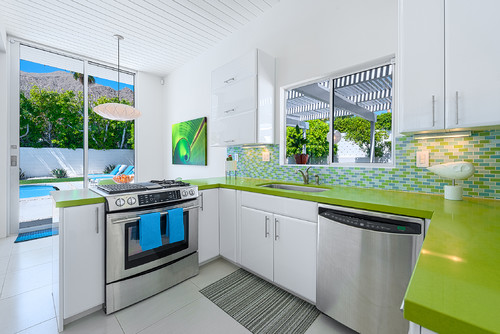
Shown: Green quartz counter (get the look with Silestone); mosaic glass tile backsplash
 

Approach 2: Select the Backsplash First

Of course, if you happen to find a backsplash you absolutely love before you've even looked at countertops, I say go for it. Making this selection will absolutely help you narrow down the options for the countertop. If you go for a statement-making backsplash such as the one here, find a quiet, subtler countertop material so it doesn't fight with the backsplash.

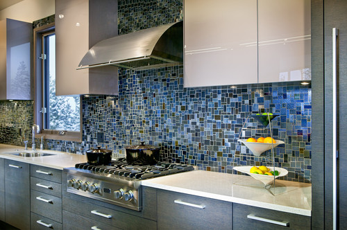
Shown: Pietra del Cardoso stone counter; Stone & Pewter Accents mosaic glass tile backsplash


I prefer that either the countertop or the backsplash be the star of the show, with the other material playing a supporting role. This stunning backsplash has lots of color and movement and, in my opinion, should not have to compete with an equally attention-grabbing countertop.

Shown: Caesarstone counter; glass mosaic Waterworks backsplash
 

That's not to say you shouldn't consider a mix of colors and patterns for both your countertop and backsplash. But if both of your materials feature multiple hues and have different patterns, aggregates or movement, stick to one overriding color palette for both materials. This will give the materials a nice cohesiveness, so they don't fight with each other.

Shown: Bianco Romano granite counter; stained glass mosaic tile backsplash
 

Approach 3: Use the Same Material for Both Counter and Backsplash

Love your countertop selection and want to keep this process simple? Consider running your countertop material up onto the wall as the backsplash. This is an especially smart option if you are required to purchase entire slabs of your chosen countertop material and you happen to have enough material left over to use the remainder as the backsplash.

Shown: Get the look with a Pietra del Cardoso stone counter and backsplash.
 

You can also use the same or similar countertop material for your backsplash but break it up by selecting a tile format for your backsplash rather than a slab. This can be a budget-friendlier option than purchasing extra slabs to create a backsplash.

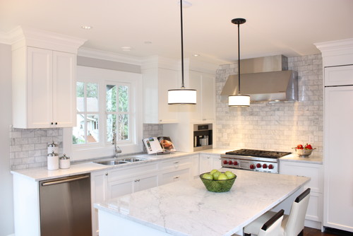
Shown: Get the look with a Carrara marble counter or, for a more durable option, check out Misty Carrera from Caesarstone; Carrara marble subway tile backsplash
 

Another cost-effective approach is to run your countertop 4 to 6 inches up the wall as a short splash. It will give you a nice finished edge where the countertop meets the wall, and it will also provide protection to the part of the wall most likely to get wet or dirty. Just be sure to check your local building code requirements regarding the minimum height of noncombustible materials on the wall area above the range or cooktop.

Shown: Uba Tuba granite counter; colbalt-blue Daltile subway tile backsplash
 

Approach 4: Hire an Expert

Some homeowners just have a difficult time visualizing their finished kitchen, which is why material selection can prove so challenging. And all too often you are asked to make too many decisions in too short a time period. If you know you are prone to analysis paralysis, do yourself a favor and give yourself enough time to weigh your options, but with a firm deadline to make the decision. Engage the assistance of a friend whose taste you admire, or hire a design professional to help guide you or bless your selections.

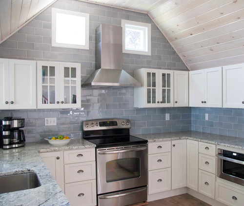
Shown: Gray and white granite counter; oversize ceramic tile backsplash


Friday
Nov152013

8 Ideas for High-Functioning Mudrooms

Mudrooms help us transition from our adventures in the great outdoors to the comforts inside our homes. But when packed with clever built-ins, space-maximizing storage and nifty organizers, a mudroom can also become a high-functioning, double-duty space that can accommodate anything from folding laundry to making crafts. 

Don't believe me? Check out these fantastic mudrooms and my space-saving mudroom organization tips to see how you can make the entry to your home attractive, functional and clutter free.

Office space. Transform your mudroom into a double-function space with a built-in desk and file storage. One wall is all you need if you plan it right. The cubbies and hooks help keep outdoor gear and clutter separated from the desk area. 

Helpful hooks. Turn an awkward or a dead space into something you'll actually use. A row of simple hooks around the perimeter and a few well-placed wire baskets have turned this once-empty nook into a valuable drop zone near the home's entry. 


Neat and clean. Not all of us like to have our jackets and coats on display. These floor-to-ceiling cabinet doors keep clutter out of sight and add an architectural statement.


Laundry time. If you have a spacious mudroom at the back of your house, take advantage of all that room. Consider including a laundry section to make life a little easier. A washer, dryer and small sink mean you can throw dirty clothes right into the wash as soon as you get home. 
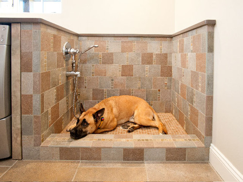
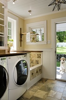
Pet station. If you share your home with furry friends, your mudroom is the perfect place for a doggie stop. This pet-friendly mudroom's special space for cleaning pets means the owners will never see a muddy paw print in their house again. A sophisticated palette of durable materials makes it feel sleek, despite its practical purpose.


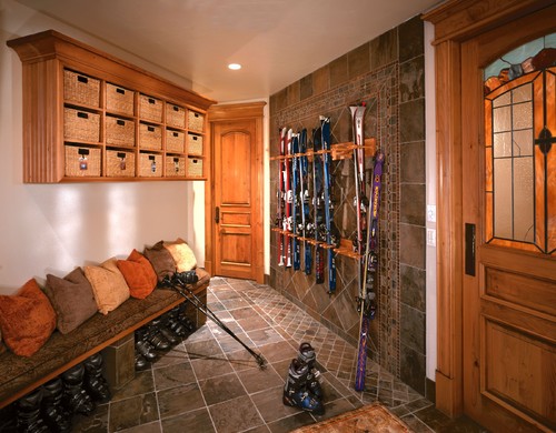
Seasonal storage. Mudrooms can be the perfect place in which to store outdoor sports gear for all four seasons, with the right organizational techniques. This ski-loving family came up with a great solution to keep their winter gear under control: Cubbies for gloves and hats up top, spots for boots below the bench and custom ski racks keep everything neat and tidy.

Personalized. Clever and colorful solutions help bring this mudroom to life. Let your little ones choose a favorite color to make their special space in your mudroom more fun. Color-coordinated baskets add a little personality to an all-white space with minimal cost and effort.


Get crafty. If you have the room, incorporate a workstation into your mudroom. Wrap a gift, help your child with a school project or prepare a package for the mail on your way out the door. Having everything in one spot will make multitasking much easier. 

Wednesday
Nov132013

15 Doggone-Good Tips for a Pet Washing Station

Article By:

This is going to sound harsh, but your dog stinks. Don't feel bad — it's natural, and you are nice to let him swim in that creek and run in the mud and roll around in yucky things. You don't notice anymore, because your schnoz is used to it. But when I come over to visit, the smell of your dog's bed and the smell on my hand after I pet him is very noticeable, so chances are, the same smell is in your carpets, car and any furniture Fido lounges on. 

You probably mean to wash the dog more often, but it's a pain in the neck. Large dogs are tough to get into bathtubs, the big shake afterward makes a mess, and the whole thing can be quite an ordeal. 
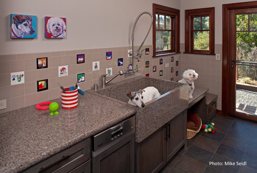
Now that we've got that out of the way, a home pet washing station isn't looking so crazy. In fact, you can use them for other things, too. A builder who's been adding them for years, Vincent Longo, says that one client uses his pet care station for cleaning dirty golf clubs, gardening tools and even the kids after a busy day making mud pies. 

Whatever your thoughts about pet wash stations, there's no denying their popularity. If you're thinking about adding one, here are some ideas to consider. 

Incorporate the washing station into the mudroom. Mudrooms are a very popular spot for dog wash stations. Dogs enter from the back or side door, and their muddy paws never make it into the rest of the house.


Include a handheld showerhead or sprayer. Not only will it help you get your dog's entire bod nice and clean, but it will also let you do a quick paws-only wash.


Be prepared for the big shake. Anyone who has ever washed dogs knows that afterward they shake off the water with gusto and get the entire area wet (including the person doing the washing). Having a surround and floor that can stand up to water will keep the big shake from damaging drywall and floors. 

If your dog is the type that runs around the house in crazy circles after a bath, all I can recommend is shutting the mudroom door until Sparky dries off and calms down, or else letting him into the garage for the runaround.


Go bigger with the drain. Longo recommends using a 3-inch drain in a pet washing station. It will handle dog hair better than the standard 1½- to 2-inch shower drain. He also recommends adding a hair filter over the drain.

Clearly, this dog loves the pet wash station and is just begging for a rinse.
 

Consider an elevated dog bath for smaller pets. It will be easier on your back and knees in the long run, as long as your dog is willing and able to jump into it, or you don't have a problem lifting your pet into place.


Step it up. In this clever design, the counters double as steps up to the basin. The middle step serves as a drying station and has room for a cozy pet bed underneath. 

For smaller dogs a large utility sink plus a sprayer is all you need. 

Use what the pros use. You can find professional bathing stations complete with ladders or ramps at places like ProGroom. 

Combine gardening and pet grooming. Pet washers are also great places to water plants, rinse off mucky Wellies and clean your gardening tools.


Incorporate your own style. This custom dog bath utilizes vintage tiles that the homeowner had been collecting for years.


Have drying towels handy. An overhead drying rack is a handy spot for drying dog towels as well as laundry. If you utilize this kind of system, be sure to remove your people laundry before the big shake. 

Embrace the theme. This area celebrates dogs in the wallpaper and has plenty of shelves for dog supplies.


Consider going high-end. Do you and your pet have luxurious tastes? If so, try a dog-specific tub. When family-owned company Hydro Systemsdecided to dip into dog bath design, the owners collaborated with their groomer of more than 20 years, adding features like skidproofing to prevent slips and slides, and even an optional jetted whirlpool system. 

Is your dog the spa type? Do tell, because this idea is certainly new to me, and I can't quite wrap my head around it. Unless the dog's name is Zsa Zsa. Then it makes sense. (Seriously, though, the folks who designed this tub and added the spa option say it's a matter of personality on a case-by-case basis.)


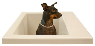
This model is for smaller dogs. I included it because a photo of a dog sitting in its own personal bath wearing a bling-bling necklace simply must be shared.


Think about storage for supplies. Just like a human shower area, this one has handy shelves for dog shampoo and sponges.


Take it outside. Homeowners are increasingly incorporating pet washing stations into their outdoor showers. All it takes is a handheld sprayer or showerhead that can reach down to the ground. Rinse off muddy paws here before they can get inside and muck up your rugs.


Provide a clean path to the door. A concrete, gravel or stone walkway will prevent your dog from dirtying up his paws on the way in from an outdoor wash. Unless, of course, the dog breaks free and does that crazy circle thing out in the yard.


Monday
Nov112013

The Kitchen Counter Goes to New Heights

Article By: 

Traditional counter heights are useful. They allow us to enter any kitchen and, even with our eyes closed, find the counter where we expect it to be. Despite this significant convenience, industry standard counter heights don’t work for everybody, because there’s no such thing as industry-standard human beings. 

You don’t have to stand for the one-size-fits-all mentality. I spoke with numerous designers who are bucking the norm to offer clients custom features that won't hurt (and might actually help) resale value. 

The benefits of multiheight kitchen counters. Do you feel overexerted every time you prepare a meal? Architect and universal design expert Carol Sundstrom explains why this might be. “If you are short, reaching up and extending forward to chop on a standard-height countertop contributes to shoulder strain,” she notes. “If you are tall and constantly bending forward to see the food you're prepping better, or extending your arms fully to reach a countertop that is too low for you, that contributes to both back and shoulder strain.” 

Having multiple counter heights is a great solution for multiple users. “I prefer to see more than one height of countertop in a kitchen, rather than all the counters raised up because the owners are tall, or all the counters lowered because the owners are petite,” Sundstrom continues. “Aside from making friends and family who may not share your same proportions feel comfortable when they are helping you, you also preserve your resale value.” 

A good height. Though there is no industry standard to such custom features, Sundstrom suggests raising and lowering counter heights in 2-inch increments when mocking up a kitchen, then fine-tuning them. 

Features that can be stepped up or down in a kitchen. Eat-at counters offer great benefits, as this one by Yvonne Randolph shows. The 12-foot island was divided in half to form a table-height eat-at counter. "The clients, who are in their 60s and entertain a lot, didn't want the clunky effect of sitting at bar stools," Randolph says. "They have a deaf son and daughter-in-law, so they decided to round the edge. It's much easier to sign around a table without corners."


You don’t need to communicate through sign language to appreciate such a feature.
 

Counters that work for every preference and body. This kitchen, designed by Toni Sabatino, offers a lowered sink area, the height of which is 31½ inches, as opposed to the standard 34½ inches. The motive was purely aesthetic. “We chose to make the copper sink the focal point and felt the break in the counter would draw the eye.” 

In another of Sabatino’s designs, two stepped-down eating areas bring the food and conversation down to a comfortable seated level, rather than forcing bodies to climb up to the action. 

The idea for this kitchen design, by M.J. Lanphier, was to have standard dining-table-height seating for the clients' children. The homeowners didn't want any chairs to be too tall for them, especially in light of the island's above-standard height of 36½ inches. 

A bonus of varying heights. This lowered table also provides a physical separation between the children's clean homework area and the food prep station. 

Though this table purposely can fit only two chairs for the two children, your own stepped feature can just as easily fit more with judicious leg placement. 

“A center pedestal leg on a table allows people to pull up at the counter anywhere without straddling a leg or bumping into one as you get into place," Sundstrom says. "It also offers the ability of fitting more people around comfortably without triggering the need for table leaves.” 

Aside from dining counters and prep counters, baking centers and cooktops can also have stepped features.


Dishwashers, too, can be taken to new heights — either in their conventional form, as shown here, or as drawers. “Two separate dishwasher drawers, each mounted right under the counter, can ease back strain,” Sundstrom says. “This also enables a dishwasher to be installed in a lower-than-standard countertop height.”


Friday
Nov012013

5 Common Bathroom Design Mistakes to Avoid

Article By: Dylan Chappell

Adding to or remodeling your house is one of the most exciting and creative processes you can go through. But with all that responsibility comes pressure to make informed decisions that will last for decades. How can you make sure to get the right design for your lifestyle, stay within your budget and maximize the return on your investment? Start with a great design for every room in your house — including (or especially) the bathroom.

Bathrooms, whether big or small, should always be well thought out and carefully located, and should function with multiple users in mind. We're long past the era where there was one bathroom for every three bedrooms in the house, and everyone had all the time needed to use it. Today's bathrooms need to be beautiful, use space efficiently and serve the users functionally. Avoiding the common design blunders below can help you be happier with your bathroom for the long haul.  

1. No view out. No one likes a dark, damp bathroom with bad circulation — it's no fun spending time in a space like that. If you're building or relocating a bathroom, try to site it on an outside wall with windows. If windows are not an option, installing an operable skylight can allow for the fresh air and natural light needed to make the space feel comfortable.


2. A clear view in. I once worked on a large remodel for which the existing design had a bathroom in the dining room — seems kind of like a conflict of interests, right? Whenever possible, avoid locating the bathroom directly off one of the home's public rooms — like the kitchen, living room or dining room. 

This doesn’t necessarily mean you have to put in long hallway, but create some sort of formal separation to break up the line of sight. The last thing you want is to be sitting in the living room with a glass of wine and looking straight into the bathroom at the toilet.


3. Making it all about the toilet. That leads me to my next blunder: Avoid making the toilet the first thing you see in the bathroom, and avoid any sight lines to it from adjacent rooms. I like to put the toilet and shower in their own room while keeping the sink separate. This allows someone to take a shower while someone else gets ready at the sink. In the bathroom floor plan here, the wall between the two rooms adds only a couple of inches to the overall size of the bathroom but doubles the room's functionality. 

4. Curbed-shower enthusiasm. curbless shower makes a bathroom feel bigger and look cleaner — plus, it's very practical for aging-in-place homeowners, since it adheres to universal design principles. This look is fairly easy to achieve in a new bathroom or a remodel — just make sure you mention it to your architect or contractor prior to construction. 

5. Thinking bigger is better. That's right: Bigger isn't better; better is better. Whether you're designing a large master bathroom in your dream home or trying to figure out how to squeeze in an extra bathroom for your growing family, the most important aspect of your new bathroom is that it has a great design that functions efficiently for your specific lifestyle. 

The truth is, great design is less about how a bathroom looks (although it's always nice when it looks fantastic) and more about how it works. Great design translates to a house that functions better, costs less to build, is more efficient to maintain and gets you more for less.